Preview image. Unlock full-res
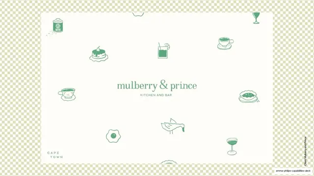
Case-study opener for Mulberry and Prince, a cream card scattered with green line-drawn food icons around a centered serif wordmark on a checkerboard backdrop.
Summary
The opener for the Mulberry and Prince case study: a cream card strewn with green hand-drawn food and drink icons, centered on a serif "mulberry & prince / kitchen and bar" wordmark.
Visual description
A cream rectangular card floats on a soft green-and-white checkerboard background. Across the card, green single-line illustrations of food and drink (a tin, layered cake, cocktail, teacup, fried egg, pie, goose, coupe glass) are scattered loosely around the edges. Centered, the wordmark "mulberry & prince" sits in a green serif with "KITCHEN AND BAR" spaced beneath it, and "CAPE TOWN" set small in the lower-left of the card. A vertical "Client: Mulberry and Prince" credit runs up the right edge. No studio footer; the slide is fully in the client's identity.
Key takeaway
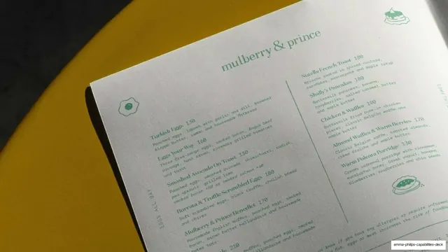
Opening a case study with the client's own patterned brand asset rather than a generic title, so the work introduces itself. The scattered single-line icons around a quiet centered serif wordmark feel like menu paper and instantly set a hospitality tone.
Reuse notes
A charming case-study cover pattern for food, hospitality or lifestyle brands with an illustrative identity. Relies on a genuine icon set and a refined serif lockup; would feel empty without the supporting illustrations.
From this deck: Mulberry and Prince patterned cover
View deck





More like this




Keep what you find
A free account saves references to boards and can send you a weekly email of picks based on what you save.
To see every result, go Pro.