Preview image. Unlock full-res
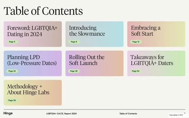
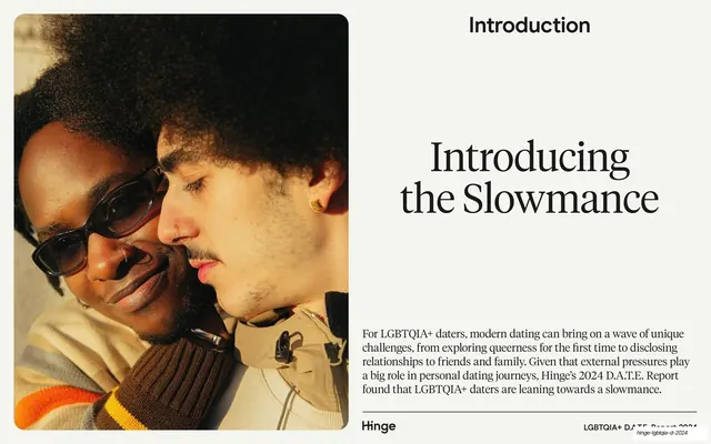
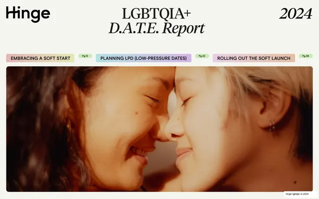
Cream cover with a serif "LGBTQIA+ D.A.T.E. Report" title, the Hinge wordmark, and a full-width close-up photo of two people touching foreheads beneath a row of pastel section tabs.
Summary
The title page: a cream field carrying the Hinge wordmark, a centered serif report title, the year, and a row of pastel section tabs sitting on top of a wide intimate photograph.
Visual description
Warm cream background. Top row holds the lowercase "Hinge" wordmark at left, a large centered title in high-contrast serif reading "LGBTQIA+" with "D.A.T.E. Report" set in italic below it, and "2024" in serif at far right. A horizontal row of three rounded pastel tabs (olive-green, blue, pink) labels the report's sections in all-caps sans, each with a small page-reference pill ("Pg.12", "Pg.22", "Pg.38"). Below, a full-width cropped color photograph fills the lower two-thirds: an intimate close-up of two people resting their foreheads together, smiling, warmly lit.
Key takeaway
Using the cover to preview the report's structure inline: the pastel section tabs with page numbers act as a contents teaser without a separate slide. The mix of upright and italic serif in the title adds editorial warmth, and the wide intimate crop sets a human, emotional tone for a data report.
Reuse notes
A good pattern for a research or trend report cover that wants to feel editorial and warm rather than corporate. The tab-as-teaser device works when the report has a few clear named sections. Depends on a strong emotive photograph and a real high-contrast serif.
From this deck: D.A.T.E. Report cover
View deck