Preview image. Unlock full-res
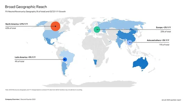
White slide with a pale-grey world map shaded by region, colored bubbles marking five geographies, and leader-line labels showing revenue share and y/y growth.
Summary
A geographic-reach slide: a pale world map shaded by region with five colored bubbles (North America, Europe, Asia, Latin America and others) connected by leader lines to labels giving each region's revenue share and y/y growth.
Visual description
White background. "Broad Geographic Reach" headline top-left, "FX-Neutral Revenue by Geography (% of total) and Q2'23 Y/Y Growth" subtitle. A light-grey world map fills the slide, with countries lightly tinted in blues. Five filled circles of different sizes and colors sit over regions (a large orange bubble on North America, a green bubble on Europe, a light-blue bubble on Asia, a blue bubble on Latin America). Thin horizontal leader lines run out to bold labels: "North America +21% Y/Y / 63% of total", "Europe +2% Y/Y / 23% of total", "Asia and others +3% Y/Y / 11% of total", "Latin America +9% Y/Y / 4% of total". A small note runs bottom-left above the bold footer.
Key takeaway
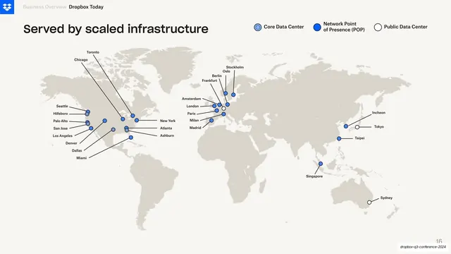
The map-plus-leader-line treatment: sized, colored bubbles on a muted map carry the geography, and clean horizontal leader lines park each region's two key figures (share and growth) in the margins, keeping the map itself uncluttered.
Reuse notes
A reusable "where revenue comes from" slide for any global business. Bubble size and color encode magnitude; leader lines keep labels off the map. Keep the base map low-contrast grey so the bubbles and accents read. The lone orange bubble doubles as the deck's accent on the dominant region.
From this deck: Broad Geographic Reach world map
View deck






More like this




Keep what you find
A free account saves references to boards and can send you a weekly email of picks based on what you save.
To see every result, go Pro.