Preview image. Unlock full-res
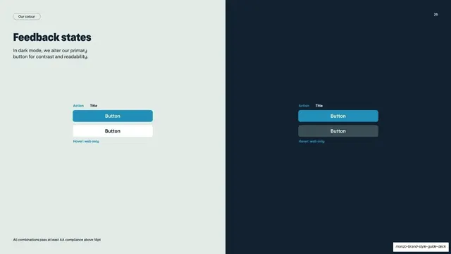
Split light/dark guideline page introducing button feedback states, with paired primary buttons shown in default and hover on each background.
Summary
A page split into pale mint and navy halves that introduces button feedback states, demonstrating the same buttons against both backgrounds.
Visual description
The slide is divided vertically: pale mint-grey on the left, deep navy on the right. The left half carries a "Our colour" pill, a "Feedback states" heading, and a line noting that in dark mode the primary button colour is altered for contrast. Centered on each half is a small specimen labelled "Action / Title" showing two stacked buttons, "Button" in teal and a secondary outlined "Button", with a "Hover: web only" caption. A footnote reads "All combinations pass at least AA compliance above 18pt."
Key takeaway
Splitting one page into light and dark halves shows a component surviving both modes side by side without two separate slides. The tiny "Action / Title / Hover: web only" labelling keeps interaction-state docs precise.
Reuse notes
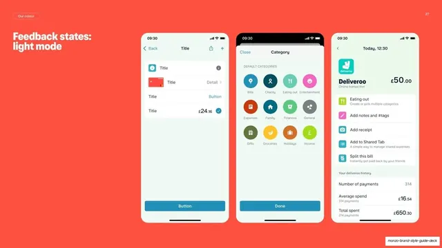
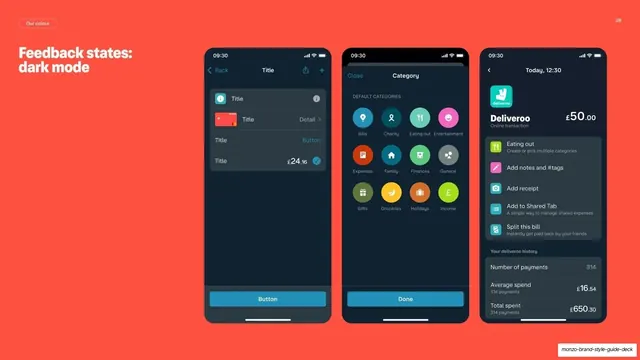
A neat opener for the interactive-states section of a product guideline. The split-background trick works for any component that must prove light- and dark-mode behaviour at once. Slides 27 and 28 expand this into full light- and dark-mode app screens.
From this deck: Monzo feedback states intro
View deck







More like this

Keep what you find
A free account saves references to boards and can send you a weekly email of picks based on what you save.
To see every result, go Pro.