Preview image. Unlock full-res
A 28-slide WebAR marketing guide from agency Reflektor that pairs near-black content slides with electric-blue section dividers, mixing a clean geometric sans with an italic high-contrast serif for emphasis words.
Summary
A 28-slide educational marketing guide from Reflektor, a Toronto digital agency, explaining WebAR (web-based augmented reality) to brands. Its personality comes from two moves: alternating near-black content slides with full-bleed electric-blue section dividers, and a clean geometric sans set against an italic high-contrast serif that swaps in for emphasis words.
Visual description
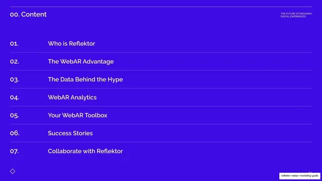
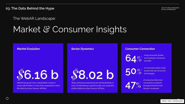
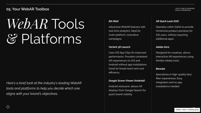
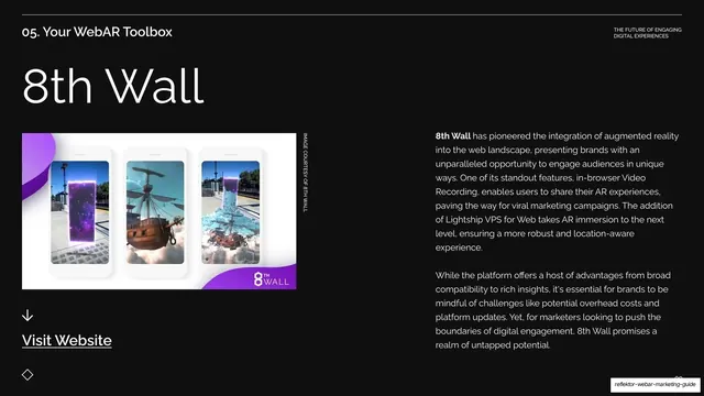
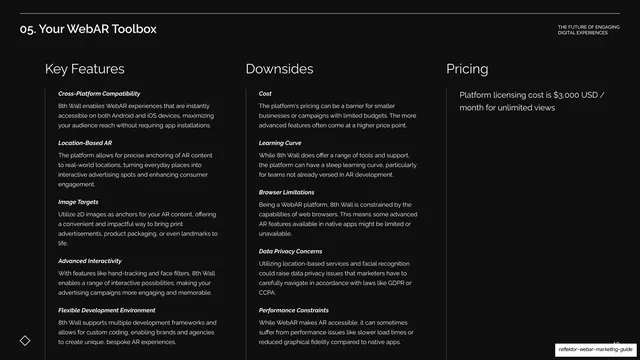
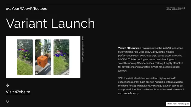
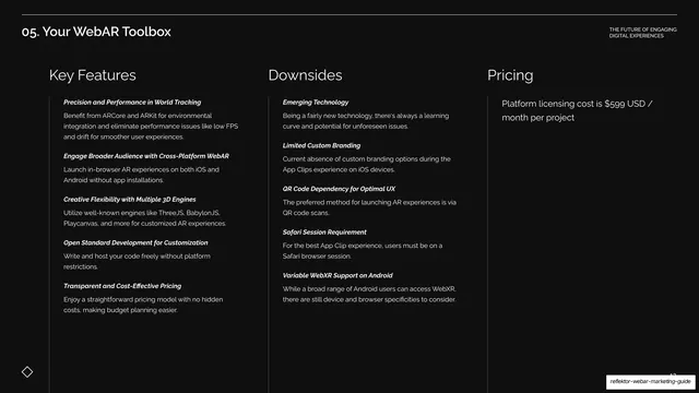
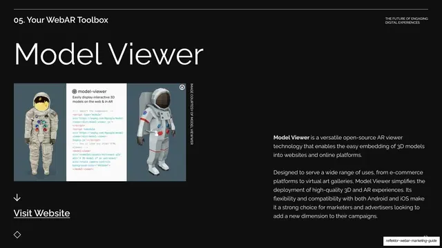
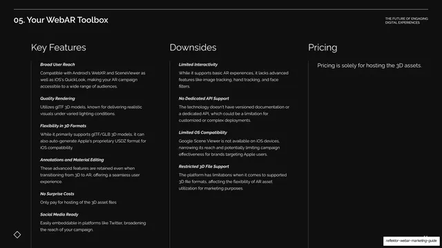
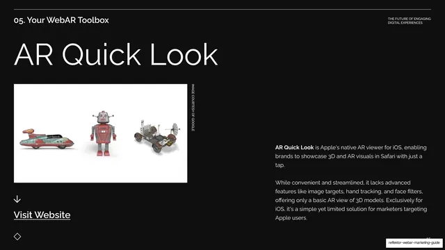
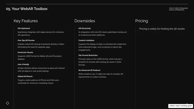
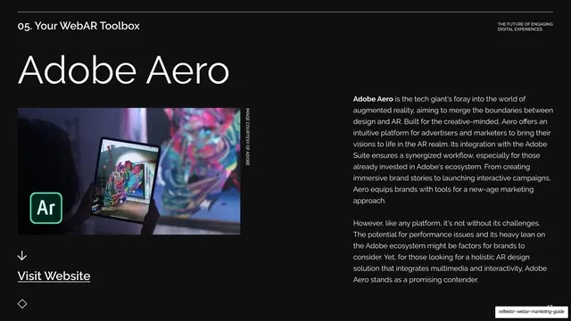
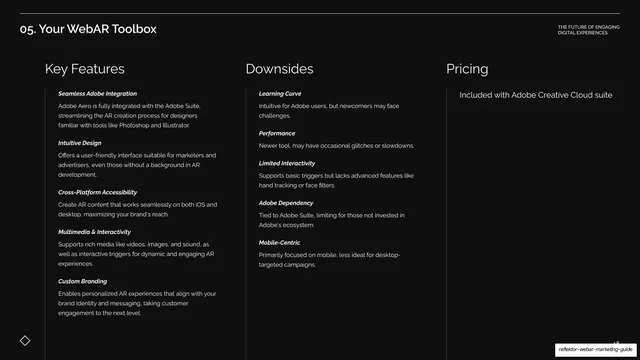
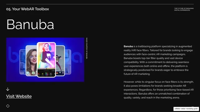
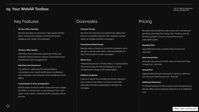
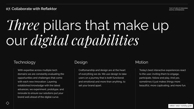
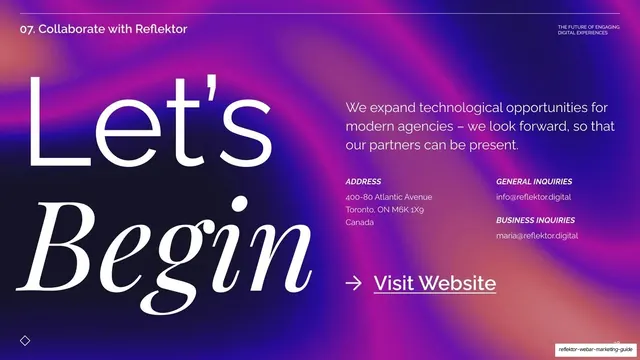
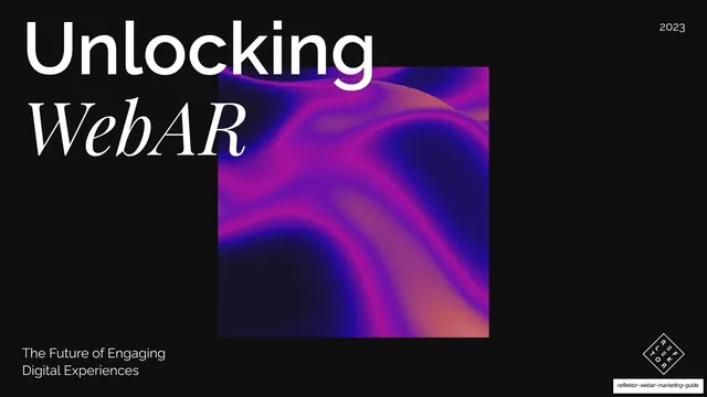
Slides run 16:9 and split into two background systems: most content slides are near-black (#0A0A0A) with white type, while section dividers, the agenda, and the market-data slide go full-bleed electric indigo-blue (#3A1FE0). The cover and final slide carry a swirling violet-magenta gradient blob. Type is a two-voice system: a clean geometric grotesque sans handles section titles ("05. Your WebAR Toolbox"), tool names ("8th Wall", "Adobe Aero"), and all body copy, while a high-contrast italic serif (Didone-style) drops in for emphasis words inside otherwise-sans headlines ("WebAR", "We are Reflektor", "Three pillars that make up our digital capabilities", "Let's Begin"). Persistent chrome frames every slide: a hairline rule across the top, a numbered section label top-left ("01. Who is Reflektor"), the all-caps utility line "THE FUTURE OF ENGAGING / DIGITAL EXPERIENCES" top-right, a small outlined diamond bottom-left, and a page number bottom-right. The deck has a strict layout grammar. The long "Your WebAR Toolbox" section repeats two alternating templates: a tool-spotlight slide (oversized tool name, a courtesy product image in three phone frames on the left with a vertical "IMAGE COURTESY OF..." caption, a body paragraph on the right, and a "Visit Website" link under a down arrow) followed by a three-column "Key Features / Downsides / Pricing" comparison table with italic bold sub-labels. Other recurring layouts: a numbered agenda list with hairline row rules; split headline-left / body-right intro slides; a three-card market-data slide on blue with oversized dollar and percentage figures; and full-bleed blue section dividers carrying huge mixed sans-and-italic-serif statements.
Key takeaway
The two-voice typographic system, where an italic high-contrast serif is dropped into a sans headline only on the words worth stressing, giving editorial flair without abandoning a clean default. The alternating dark / electric-blue rhythm that paces a long, text-heavy deck and signals section breaks without decoration. And the disciplined tool-comparison grammar: every platform gets the same spotlight-then-three-column-table pair, so a dense competitive roundup stays scannable.
Reuse notes
A strong reference for agency capabilities decks, educational or explainer marketing guides, and any long deck that has to carry a lot of comparison content while staying legible. The Key Features / Downsides / Pricing three-column template is directly reusable for product or vendor comparisons. The italic-serif-emphasis move needs a genuine high-contrast Didone to land; it falls flat with a generic serif. The courtesy-image phone-frame layout depends on having clean product captures to drop in.