Preview image. Unlock full-res
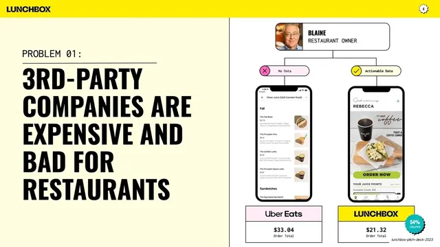
Cream split slide pairing a black all-caps problem headline with a right-side diagram comparing Uber Eats and Lunchbox order totals via phone mockups.
Summary
Problem 01: a big black statement that third-party companies are expensive and bad for restaurants, proven on the right by a side-by-side phone comparison of an Uber Eats versus a Lunchbox order.
Visual description
Pale cream (#FBF6D9) left two-thirds, white right third, divided by a thin vertical rule; yellow chrome bar with wordmark and "4" badge. On the left, a monospace eyebrow "PROBLEM 01:" sits above a hairline rule, then a six-line black condensed all-caps headline: "3RD-PARTY COMPANIES ARE EXPENSIVE AND BAD FOR RESTAURANTS." The right side is a comparison diagram: a rounded card at top shows a "BLAINE / RESTAURANT OWNER" persona photo, branching down into two paths, a pink "No Data" pill (with an X) and a yellow "Actionable Data" pill (with a check). Each path leads to a phone mockup, a generic third-party menu on the left and the branded Lunchbox app on the right. Beneath them, two labeled price boxes compare "Uber Eats $33.04 Order Total" against "LUNCHBOX $21.32 Order Total," with a small teal "54% CHEAPER" starburst badge.
Key takeaway
Arguing a problem with a literal two-path diagram (No Data vs Actionable Data) that ends in a concrete price comparison, so the abstract claim resolves into a hard number. The persona card at the top of the branch personalizes the stakes before the data lands.
Reuse notes
A strong template for any "the status quo is bad" problem slide that can be reduced to a head-to-head comparison. The branching persona-to-outcome diagram plus a final price-delta badge is reusable for fintech, SaaS, or marketplace pitches. Requires clean app mockups for both sides; the comparison only convinces if both phones look real.
From this deck: Problem 01 third-party ordering
View deck
More like this






Keep what you find
A free account saves references to boards and can send you a weekly email of picks based on what you save.
To see every result, go Pro.