Preview image. Unlock full-res
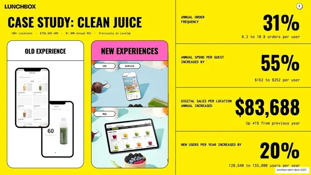
Yellow split slide pairing old-vs-new Clean Juice app mockups on the left with a stacked four-row ledger of black metric callouts on the right.
Summary
A Clean Juice case study slide: old versus new app experiences shown as mockups on the left, with four stacked metric rows on the right quantifying the impact.
Visual description
Full yellow (#FFE600) background with the "LUNCHBOX" wordmark top-left and an "8" page badge top-right; a thin vertical rule splits the slide. The left side leads with a black condensed all-caps headline "CASE STUDY: CLEAN JUICE" over a monospace stat line ("100+ Locations . $796,989 ARR . $1.4MM Annual ROI . Previously on LevelUp"), then two image panels labeled "OLD EXPERIENCE" (muted phone screens on white) and "NEW EXPERIENCES" (a pink-headed panel showing iOS, Android, and Web mockups over fresh juice photography). The right side is a four-row ledger divided by hairlines; each row pairs a small monospace label on the left with an oversized black number on the right: "ANNUAL ORDER FREQUENCY 31%," "ANNUAL SPEND PER GUEST 55%," "DIGITAL SALES PER LOCATION $83,688," and "NEW USERS PER YEAR 20%," each with a small supporting sub-line.
Key takeaway
Splitting a case study into proof you can see (old vs new mockups) and proof you can measure (a clean right-hand ledger of oversized numbers). The monospace label paired with a giant figure on each row makes the results scan in seconds.
Reuse notes
An excellent closing case-study template for a pitch or sales deck once you have a flagship customer and hard outcomes. The before/after mockup column plus a stacked big-number ledger is broadly reusable across SaaS and product decks. Needs real screenshots for the old and new states and genuine metrics; the ledger's impact comes entirely from the size and credibility of the numbers.
From this deck: Clean Juice case study
View deck
More like this







Keep what you find
A free account saves references to boards and can send you a weekly email of picks based on what you save.
To see every result, go Pro.