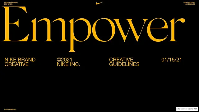
Preview image. Unlock full-res
A 270-page Nike brand and creative guideline deck built on a strict three-color system (black, signal yellow, red) plus electric blue, pairing an elegant high-contrast serif for emotive headlines with a bold neo-grotesque sans for structure.
Summary
Nike's internal Empower brand and creative guideline deck for 2021, 270 pages long. Its personality comes from a disciplined two-typeface, three-color system: an elegant high-contrast serif carries the emotive, manifesto-style headlines while a bold neo-grotesque sans handles structure, labels and body copy, all set on full-bleed fields of black, signal yellow and red.
Visual description
Slides run 16:9. The core palette is near-black (#0A0A0A), a high-chroma signal yellow (#FFE600), and a pure red (#FF1A1A), with electric blue (#1A3FE0) introduced in the later creative-direction and photography sections, plus a warmer amber (#FFB81C) on cover and section dividers. Color is used as full-bleed blocking: an entire slide is one color, or split into two color/photo halves. Two type families do all the work. The first is a refined high-contrast serif (Times/Didone-adjacent) set very large for the deck's emotional and narrative lines ("The world is at an inflection point... and so is Gen Z."), almost always sentence case. The second is a bold neo-grotesque sans (Helvetica/Neue-like) used all-caps for big structural headlines ("BRAND STRATEGY", "PHOTO ART DIRECTION"), for the numbered 01/02/03 sub-points, and for small running labels and body copy. A persistent running header frames every page: "BRAND DEFINING / EMPOWER" top-left, two centered section labels flanking a small black Nike swoosh, and "2021 CREATIVE / GUIDELINES" top-right; the footer carries "©2021 NIKE INC." bottom-left. Recurring layouts: full-bleed cover and red/amber section dividers with oversized type; split text-left / photo-right brand-strategy slides; three-column numbered insight lists; a contents page with leader-dotted page numbers; and dense photographic grids and scrapbook-style collages (athlete portraits, campaign mockups) for the photography and creative-direction chapters. Localization sections show the same masthead system rebuilt in Spanish and French, often as small multi-aspect-ratio specimen grids ("Nuevas") with cyan keyline guide overlays.
Key takeaway
The radical restraint of locking an entire 270-page system to two typefaces and three colors, then getting all its variety from full-bleed color blocking and from switching register between the serif (emotion) and the sans (structure). The serif-for-feeling / sans-for-facts split is the strongest reusable idea. The consistent running header with the centered swoosh anchors a very long deck without decoration, and the specimen grids with cyan keyline guides are a clean way to document a flexible masthead across formats and languages.
Reuse notes
An excellent reference for brand and creative guideline decks, campaign playbooks, and any long-form internal document that must stay rigorous and on-brand across hundreds of pages. The serif/sans pairing and full-bleed color blocking translate well to editorial and fashion-adjacent brands. The system leans on signal yellow and high contrast, so it reads loud; tone the chroma down for calmer verticals. Photography-heavy sections need genuinely strong, diverse imagery to carry the collages. The Nike swoosh and "Play New" wordmarks are proprietary; swap in your own marks.
From this deck: Nike Empower Creative Guidelines 2021
View deck












































































































































































































































































More like this









Keep what you find
A free account saves references to boards and can send you a weekly email of picks based on what you save.
To see every result, go Pro.