Preview image. Unlock full-res
A 7-slide growth-stage pitch deck template on a near-black background with oversized condensed all-caps headlines, a single buttery-yellow accent, and cream data panels carrying the numbers.
Summary
A reusable Series B fundraising template built on a single strong system: a near-black canvas, very large condensed all-caps grotesque headlines, and one warm yellow accent that runs from highlighted words to full cream data panels. It carries placeholder copy ("Your Company", "Define the problem you're solving") meant to be filled in.
Visual description
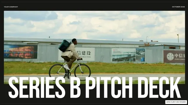
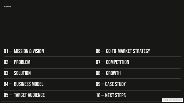
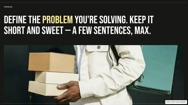
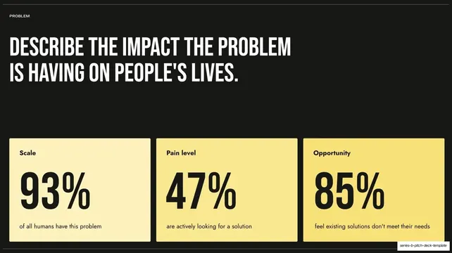
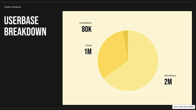
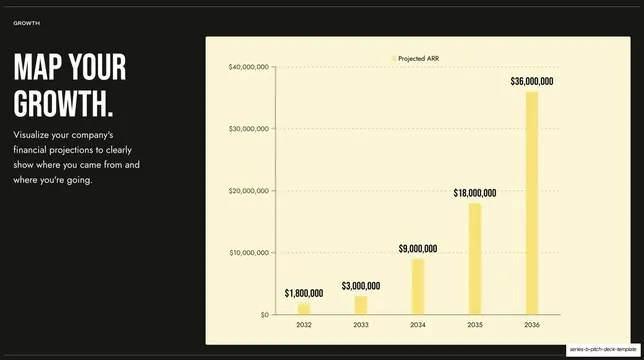
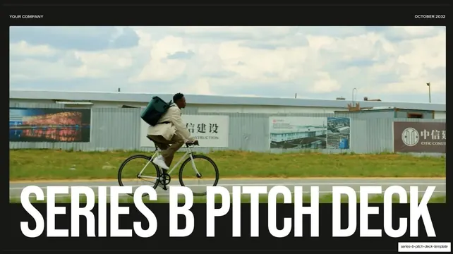
Slides are 16:9 on a near-black ground (#1A1916). Every interior slide opens with a small all-caps utility header on a hairline rule: a left section label (AGENDA, PROBLEM, SOLUTION, TARGET AUDIENCE, GROWTH) with a matching hairline rule at the bottom edge. Headlines are set in a heavy condensed grotesque, all-caps, very large, in near-white, with single key words pulled out in a buttery yellow (PROBLEM, FAVORITE APP). Two color worlds coexist: text and photo slides keep the dark ground, while data is moved onto solid cream and yellow panels (stat cards, a pie chart, a bar chart) that brighten the lower or right portion of the slide. Recurring layouts across the seven slides: a full-bleed photo cover with an oversized headline overlapping the bottom of the image; a two-column numbered agenda listing a ten-section framework (01 Mission & Vision through 10 Next Steps); a statement slide with a half-height photo band beneath the headline; a three-up stat-card row (93% / 47% / 85%) on cream-to-yellow cards; a split testimonial with a large pull-quote left and a portrait right; and split data slides pairing a left headline with a large cream chart panel right. Photography is warm, candid, real-world lifestyle imagery (a commuter on a bike, hands holding boxes, a hand on a phone).
Key takeaway
The discipline of one accent color doing two jobs: highlighting a single word inside a headline, and theming every data surface, so charts and stat cards read as one family. The headline-over-photo cover where oversized type overlaps the bottom of the image instead of sitting in clear space. And the move of lifting data off the dark ground onto bright cream panels, which keeps numbers legible without lightening the whole deck.
Reuse notes
A strong default skeleton for a growth-stage SaaS or B2B fundraising pitch, and for any dark, type-led deck that has to present hard numbers. The numbered ten-section agenda doubles as a content checklist for the full narrative even though only seven slides are shown. Because it ships as a template, the copy and stats are placeholders to overwrite. Depends on a heavy condensed display face and genuinely good candid photography; the cream data panels only pop against a near-black ground.