Preview image. Unlock full-res
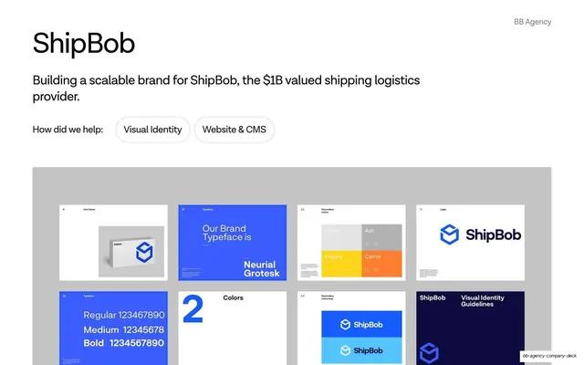
Light case-study opener for ShipBob with an oversized headline, pill-button service tags, and a grey panel holding a grid of brand-guideline thumbnails.
Summary
The opening slide of the ShipBob case study: a big "ShipBob" headline and one-line brief over a grey panel showing a four-by-two grid of brand-guideline page thumbnails.
Visual description
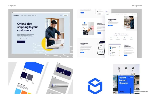
White slide with "BB Agency" as a grey running label top-right. Top-left, a large black "ShipBob" headline sits above a one-line description, "Building a scalable brand for ShipBob, the $1B valued shipping logistics provider." A "How did we help:" label is followed by two outlined pill tags, "Visual Identity" and "Website & CMS." The lower two-thirds is a flat grey panel containing a grid of eight small white brand-guideline thumbnails (use cases, brand typeface "Neurial Grotesk," secondary colors, the blue ShipBob cube logo, a type-specimen, a colors divider, a secondary colourway, and a dark "Visual Identity Guidelines" cover). The ShipBob blue cube and cobalt blue recur throughout the thumbnails.
Key takeaway
The case-study cover formula: oversized client name, a single sentence of context, outlined service-tag pills, then a contained grey panel that previews the deliverables as a tidy thumbnail grid. The grey containment panel makes a busy contact sheet read as one calm block.
Reuse notes
A strong template for opening a portfolio or sales case study where you want to tease the volume of work without detailing it yet. The pill tags double as a scannable scope summary. Needs real guideline pages to populate the grid; placeholders would look thin.
From this deck: ShipBob case-study cover with brand-system grid
View deck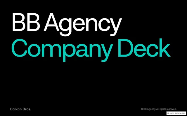





More like this





Keep what you find
A free account saves references to boards and can send you a weekly email of picks based on what you save.
To see every result, go Pro.