Preview image. Unlock full-res
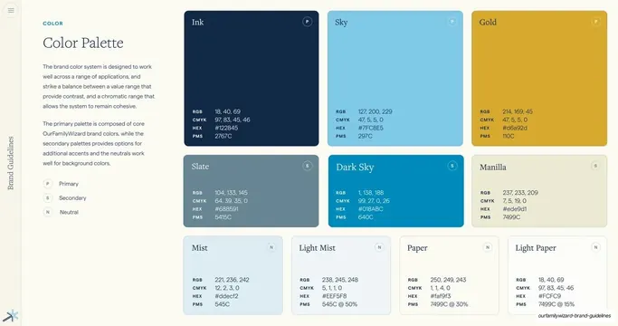
Core color palette page with large color swatch cards showing RGB, CMYK, HEX and PMS values, tiered into primary, secondary and neutral groups.
Summary
The master color page: named brand colors shown as large filled swatch cards, each with its full RGB / CMYK / HEX / PMS spec, organized into primary, secondary and neutral rows.
Visual description
Two-column editorial layout. Left column: teal eyebrow "COLOR", serif heading "Color Palette", two short grey paragraphs, then a small key marking Primary (P), Secondary (S) and Neutral (N). Right side: a grid of color cards. Top row of three large primaries (Ink navy #122845, Sky blue #7FC8E5, Gold #D6A92D), a middle row of three secondaries (Slate #688591, Dark Sky #018ABC, Manilla #EDE9D1), and a bottom row of four neutrals (Mist, Light Mist, Paper, Light Paper). Each card prints the color name top-left, a circular P/S/N tag top-right, and a small specs block (RGB, CMYK, HEX, PMS) bottom-left.
Key takeaway
Encoding the role of each color into the swatch itself with the P/S/N tag, so hierarchy reads at a glance, and giving every swatch a complete four-system spec block in one consistent corner. Card size scales with importance (big primaries, smaller neutrals).
Reuse notes
A definitive palette page for any brand guideline. Directly reusable: keep the card template and spec layout, swap colors and values. The tiering into primary/secondary/neutral is the part worth copying for any system that needs governed color.
From this deck: Color Palette swatch grid
View deck















More like this





Keep what you find
A free account saves references to boards and can send you a weekly email of picks based on what you save.
To see every result, go Pro.