Preview image. Unlock full-res
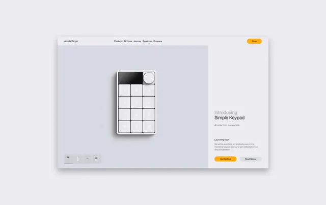
Product landing page mockup introducing a numeric keypad device against a light background, with navigation bar, product illustration, and CTA buttons.
Summary
A minimal website hero section for the "Simple Keypad" product, featuring a centered product illustration on a soft gradient background with navigation, headline, subheading, and two-button CTA arrangement.
Visual description
Light gray background with soft gradient. Top navigation bar includes "Simple Things" branding on the left and navigation links (Products, 24 Hours, Journey, Developer, Company) centered. A bright orange "Get Started" button anchors the top right. Large centered product illustration shows a numeric keypad/calculator device with grid layout. Headline "Introducing Simple Keypad" and subheading with descriptive text. Two buttons at bottom: orange "Get Started" and gray "Read Docs" aligned left.
Key takeaway
The minimal, centered layout with muted colors lets the product illustration be the focal point while the orange accent color creates action points that guide toward conversion without overwhelming the clean aesthetic.
Reuse notes
Works well for B2B SaaS, developer tools, and productivity apps targeting professional audiences. The minimal aesthetic and clear information hierarchy make it effective for product discovery and first-time visitors.