Preview image. Unlock full-res
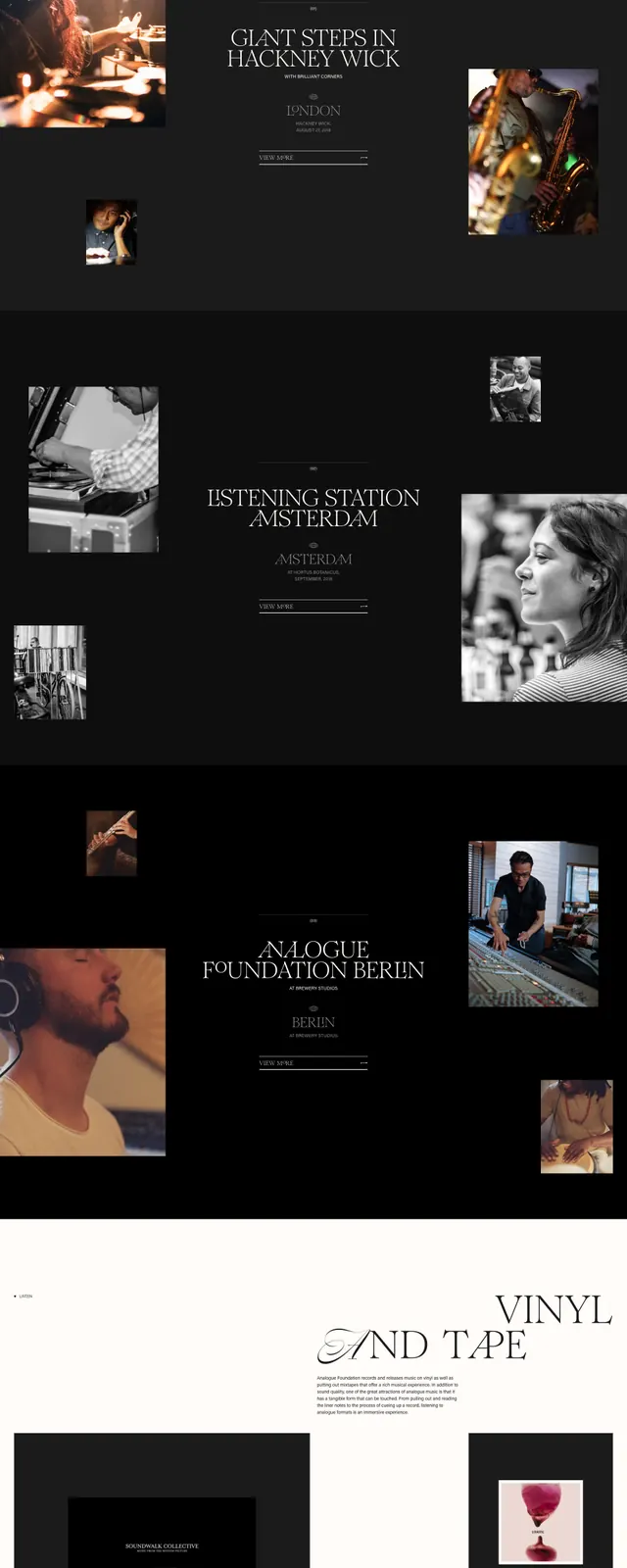
A high-contrast, editorial-style landing page for a creative collective focusing on analogue arts.
Summary
A high-contrast, editorial-style landing page for a creative collective focusing on analogue arts.
Visual description
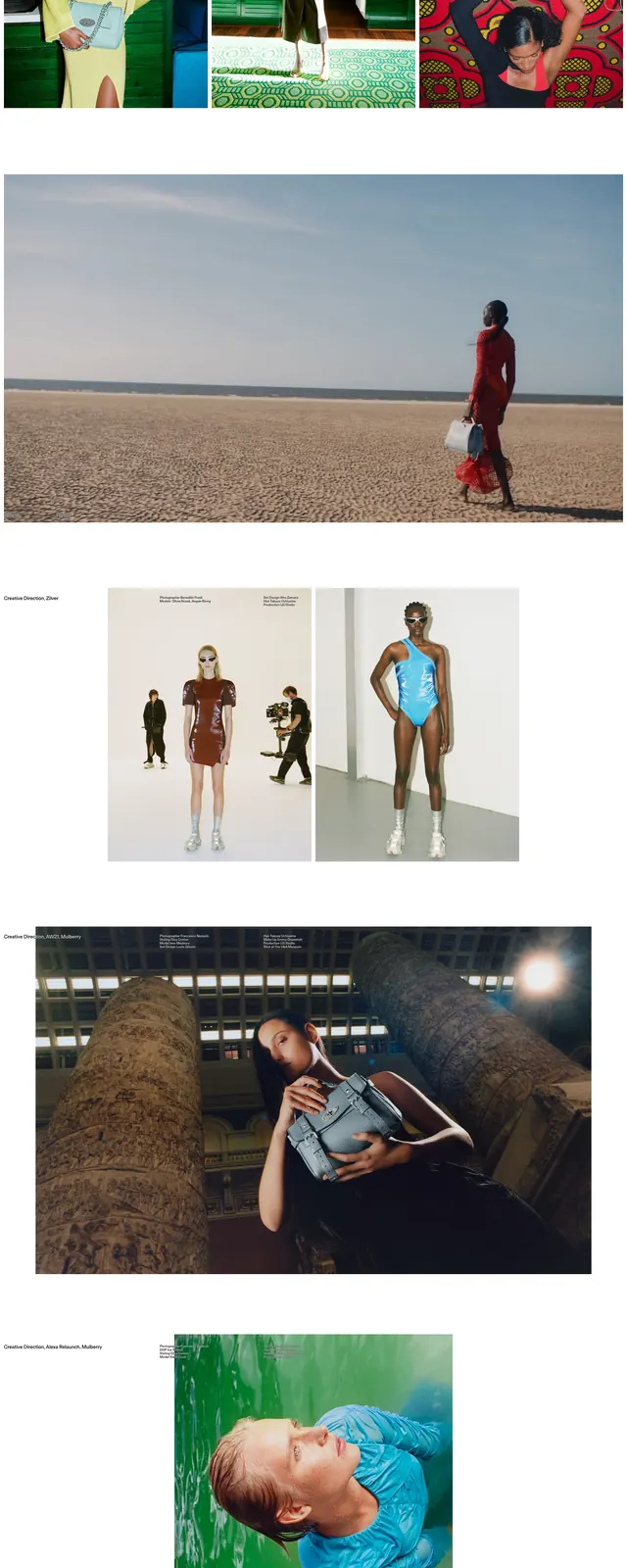
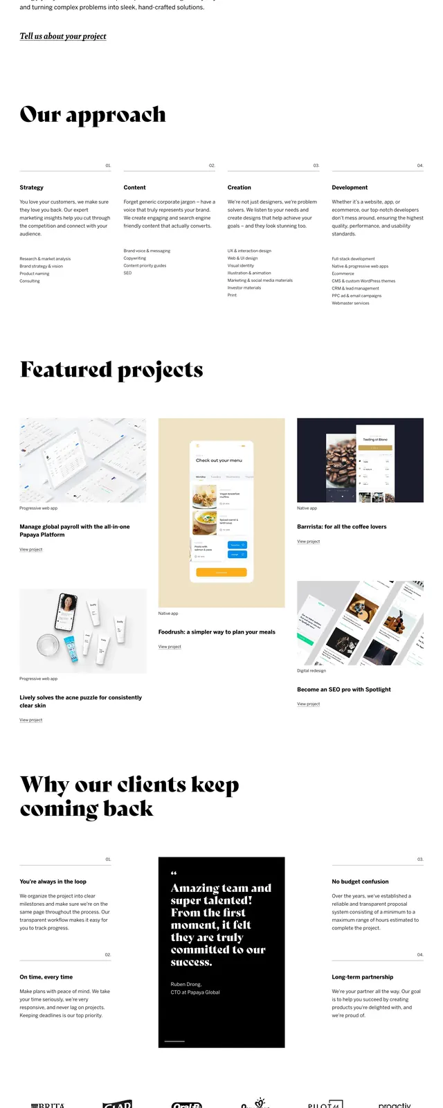
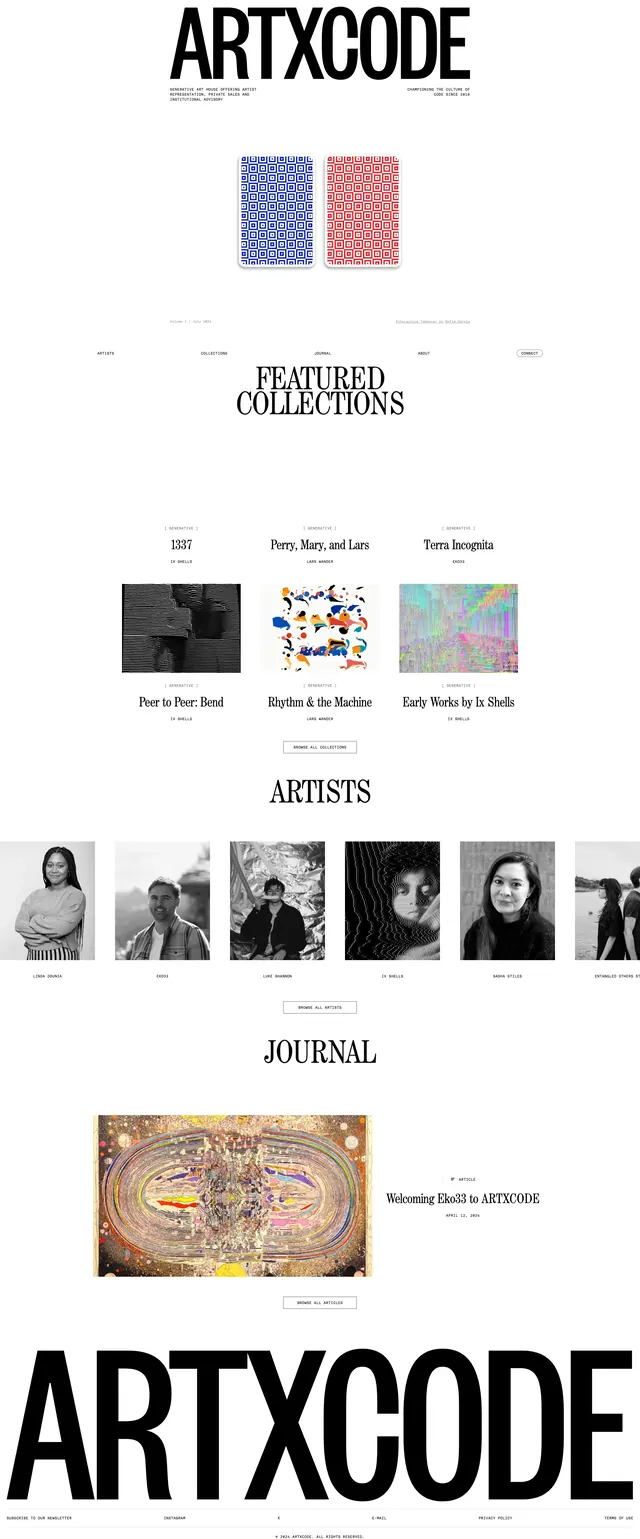
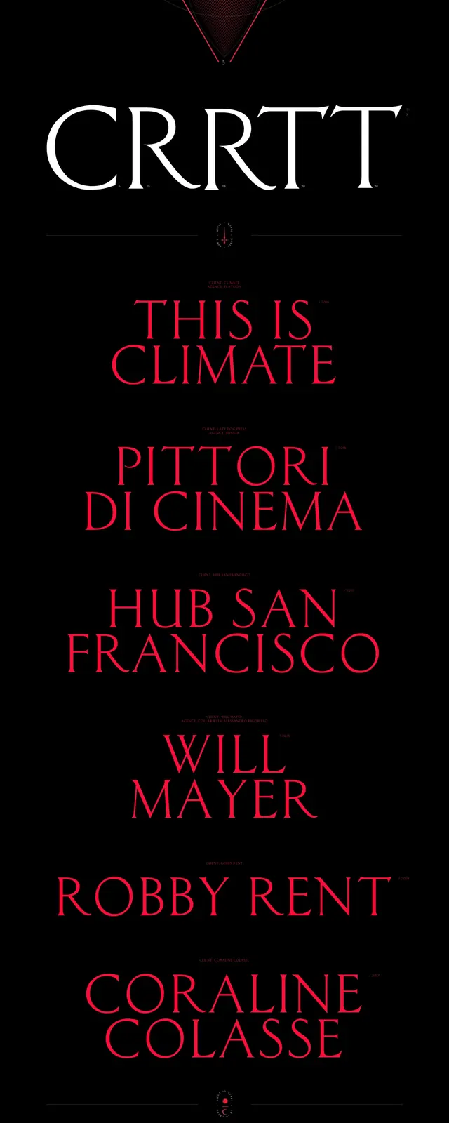
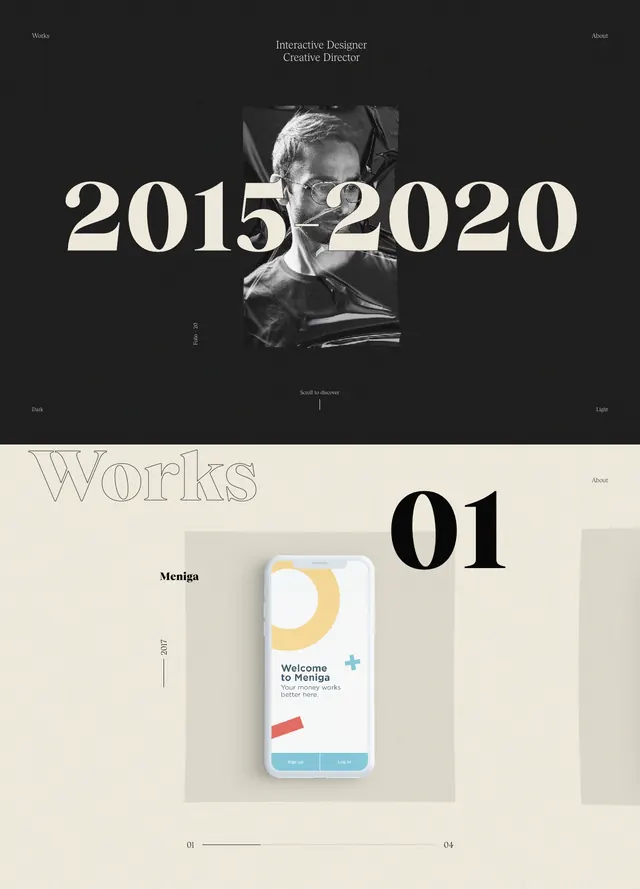
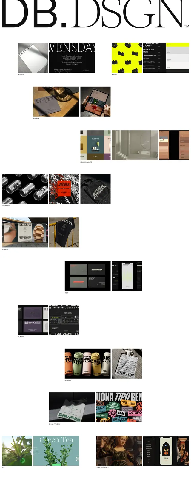
The design utilizes a stark black-and-white palette with massive, overlapping serif typography that breaks the traditional grid. High-grain photographic imagery is placed asymmetrically, creating a dynamic tension between white space and dark blocks. The layout transitions between light and dark sections to separate different event locations and stories.
Key takeaway
The use of oversized, overlapping typography creates a strong brand identity that feels more like a printed magazine than a traditional website.
Reuse notes
Ideal for luxury brands or creative portfolios wanting to convey an avant-garde, artistic sensibility through extreme typographic scale.