Preview image. Unlock full-res
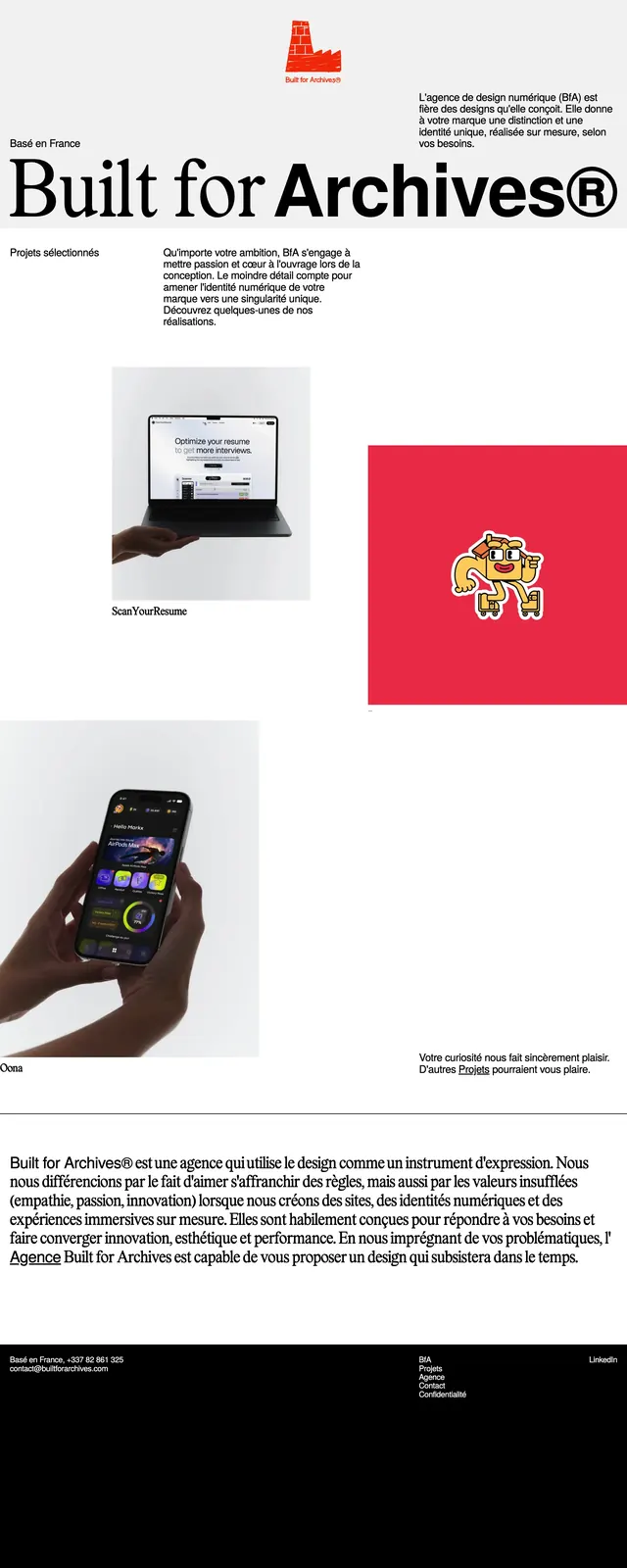
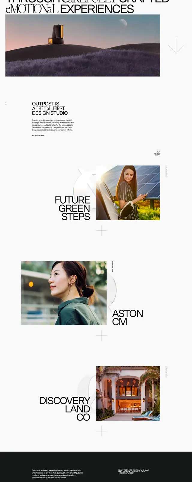
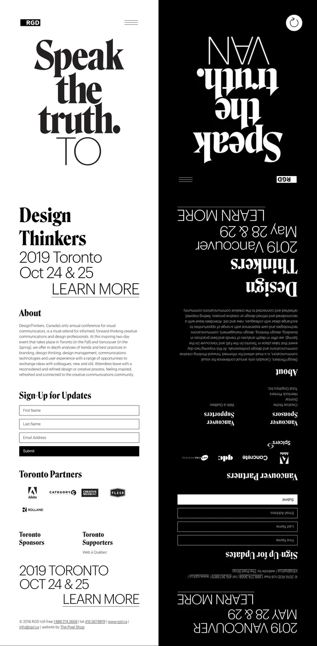
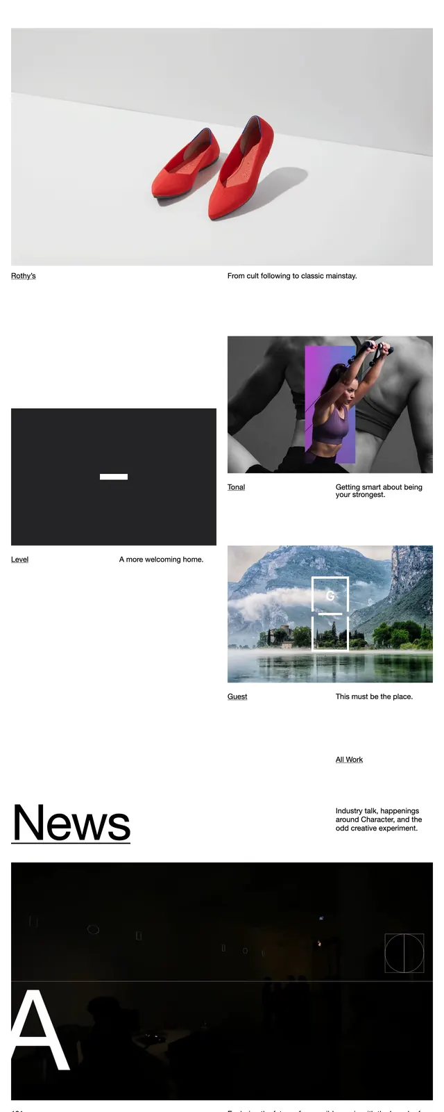
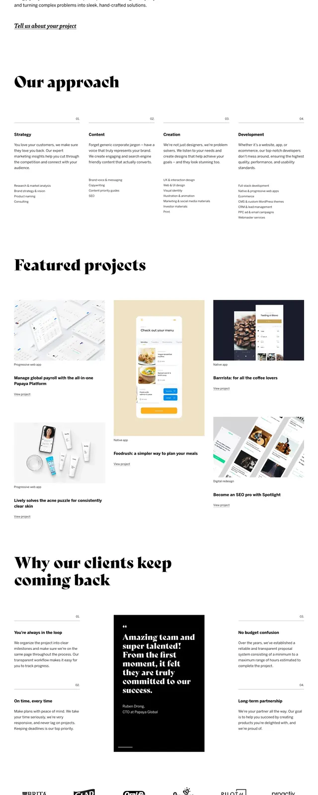
A stark black-and-white agency landing page built around oversized serif headlines, sparse copy, and a grid of featured projects.
Summary
A stark black-and-white agency landing page built around oversized serif headlines, sparse copy, and a grid of featured projects.
Visual description
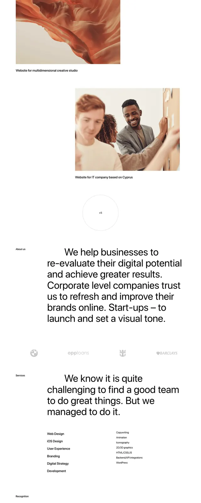
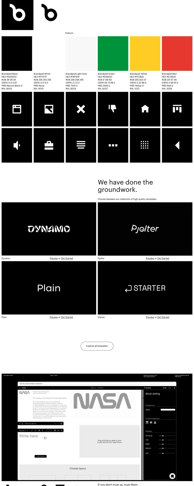
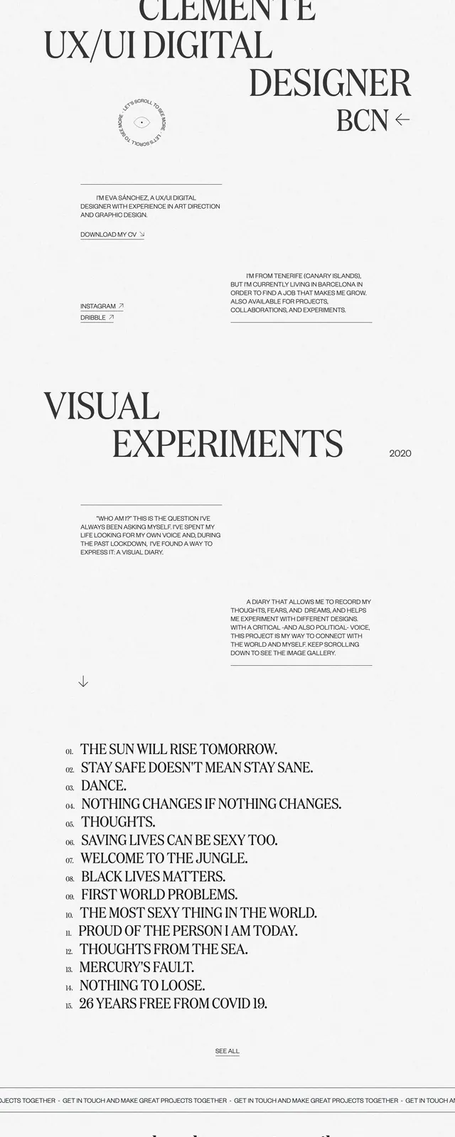
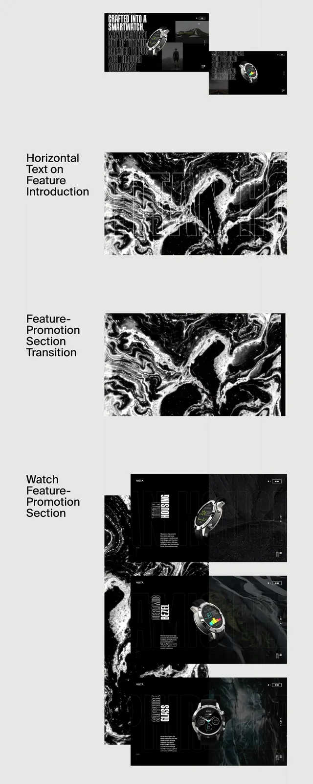
The page opens with an enormous stacked serif headline reading "HELLO WE'RE CURRENT HAUS" on a white background, followed by a short intro paragraph and a small underlined text link. Below that is a featured projects section with a three-column mix of project image cards, captions, and small text links, using generous whitespace and strict alignment. Farther down, there is a slim row of client logos, then a large closing contact statement with an email address and a minimal footer line. The entire page stays black, white, and highly restrained, with typography carrying most of the visual weight.
Key takeaway
The standout move is the extreme typographic hierarchy: oversized editorial serif headlines used as the primary brand signal. The rest of the page stays intentionally quiet so the work thumbnails and contact CTA feel elevated.
Reuse notes
Use this pattern for creative agencies, studios, or portfolio sites that want a fashion-editorial feel without decorative UI. It works best when the content is strong enough to support very sparse framing and high-contrast black-and-white styling.