Preview image. Unlock full-res
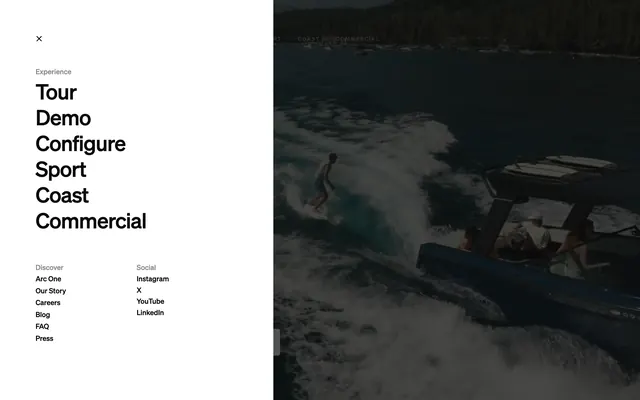
Full-screen menu split with white Experience nav links left and wakesurfing lake photo right, plus Discover and Social columns footer-left.
Summary
A 50-50 menu overlay with large Experience links on white left and full-height wakesurfing photo right, X close top-left, and Discover and Social link columns bottom-left.
Visual description
Vertical split. Left white panel: X close top-left, small gray Experience label, large bold black links Tour, Demo, Configure, Sport, Coast, Commercial. Bottom-left two columns: Discover (Arc One, Our Story, Careers, Blog, FAQ, Press) and Social (Instagram, X, YouTube, LinkedIn) in smaller type. Right half: moody full-bleed photo of wakesurfer behind dark boat on lake with forest shore; faint ghost nav visible at top of photo half.
Key takeaway
Half-screen lifestyle photo keeps the menu from feeling like a dead end. Primary paths at display size, secondary links tucked bottom-left. Split layout preserves brand atmosphere while navigating.
Reuse notes
For luxury product sites with strong photography. Requires portrait-capable hero image. Left panel needs scroll on small screens if link count grows.