Preview image. Unlock full-res
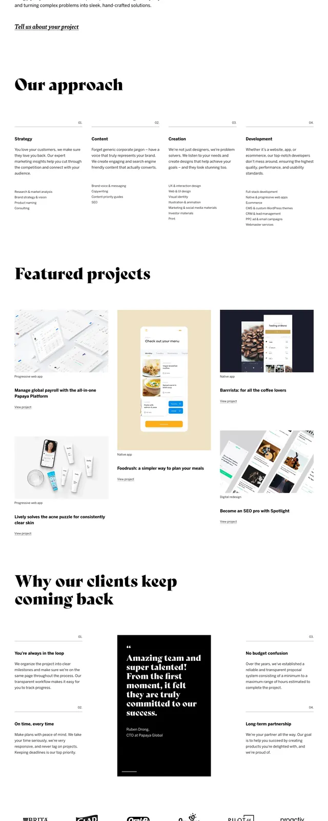
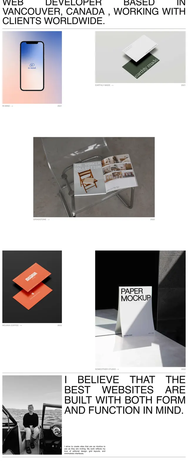
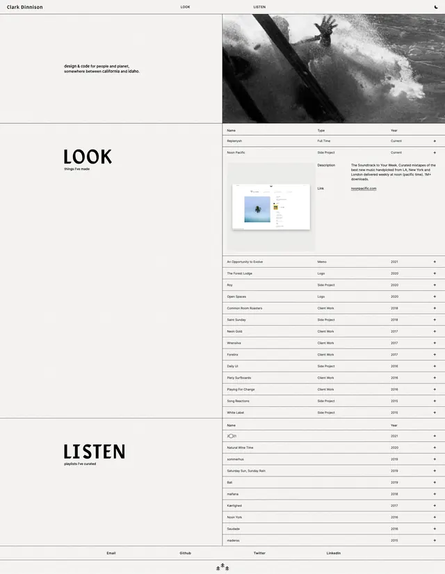
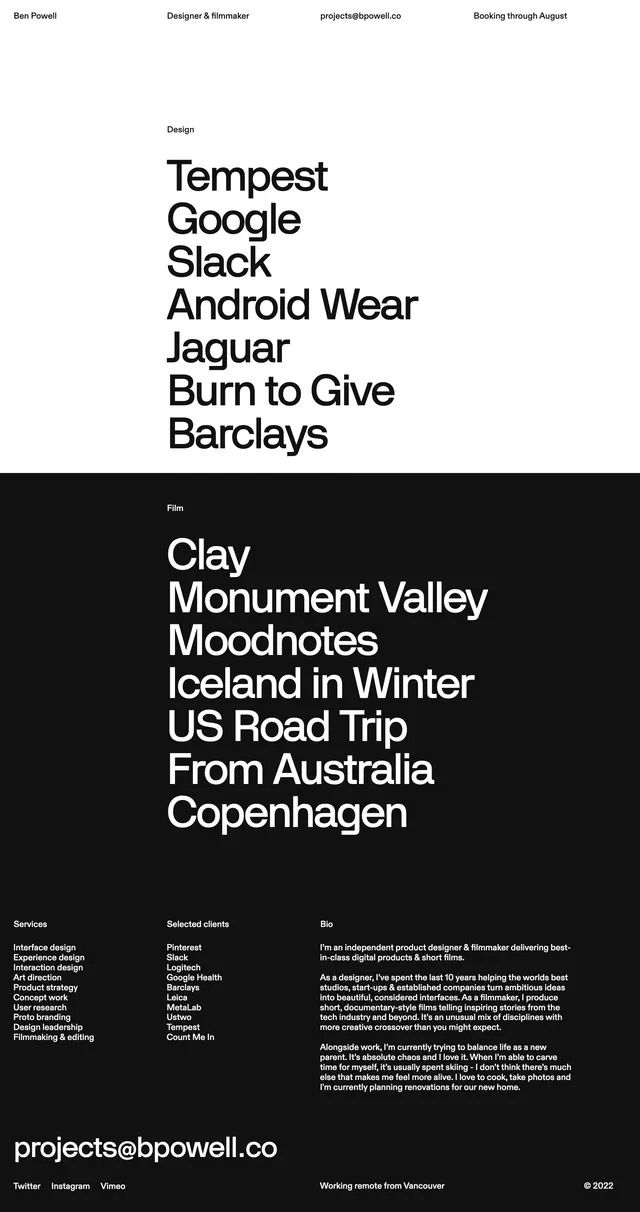
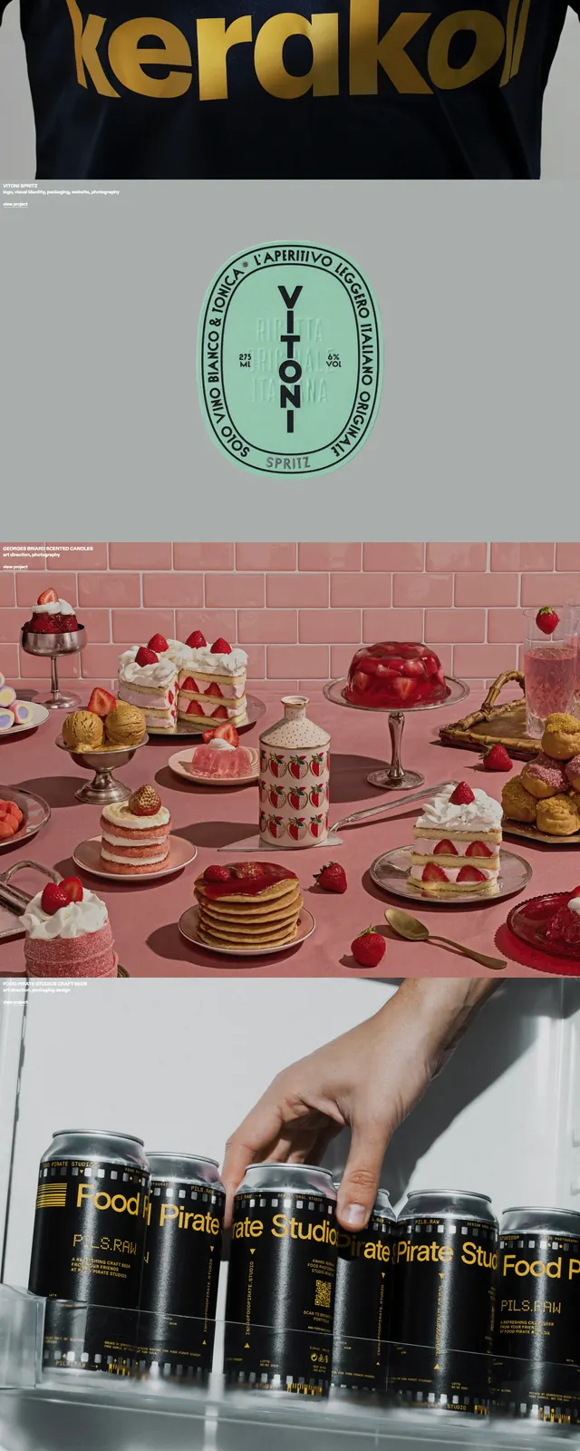
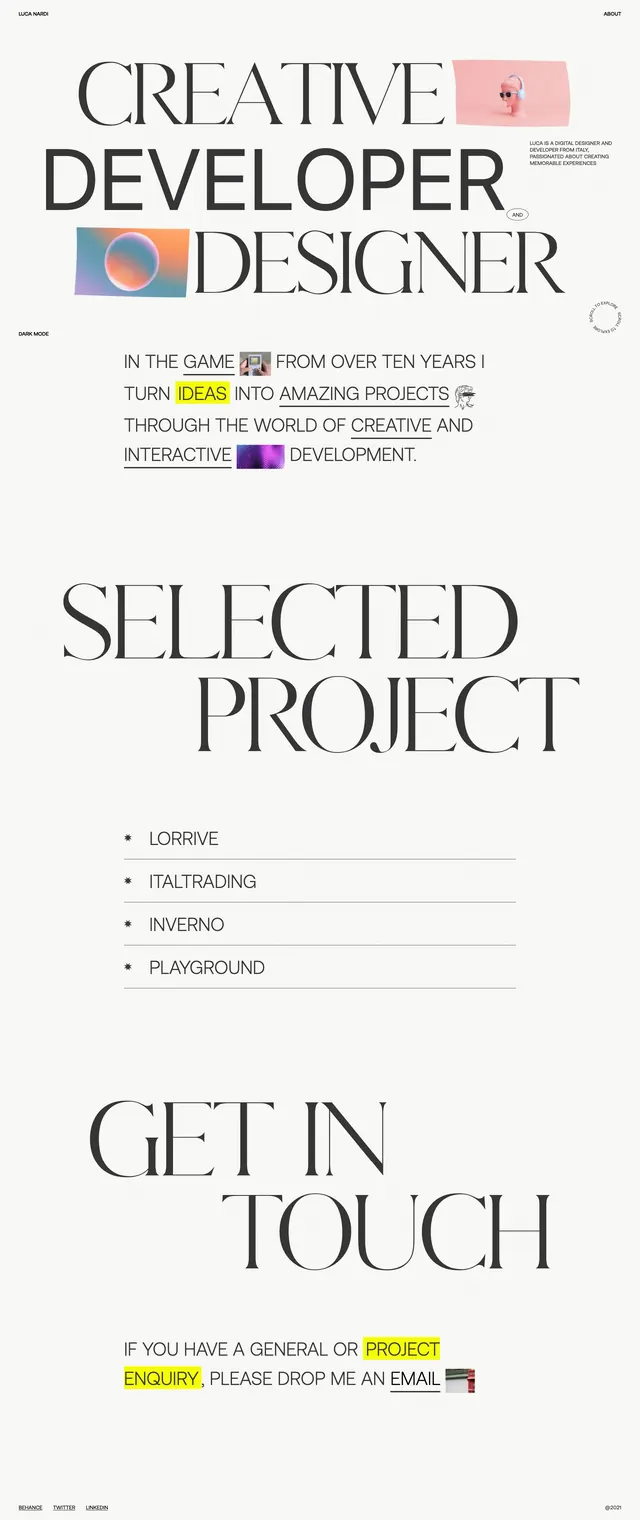
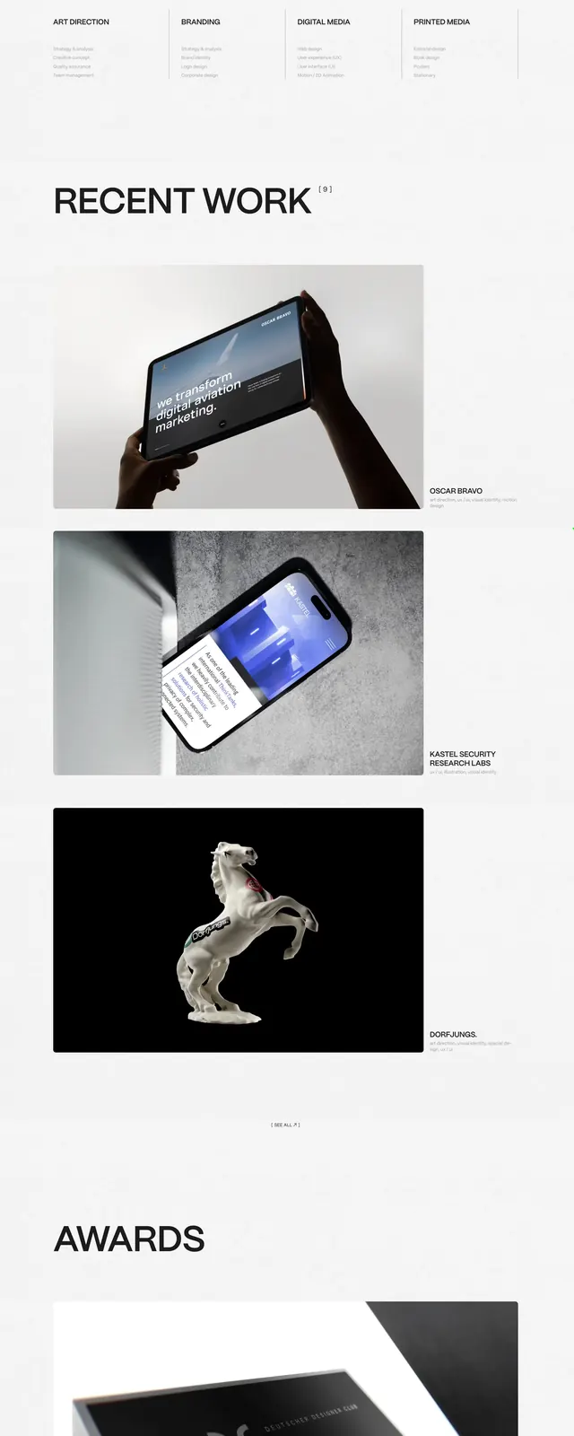
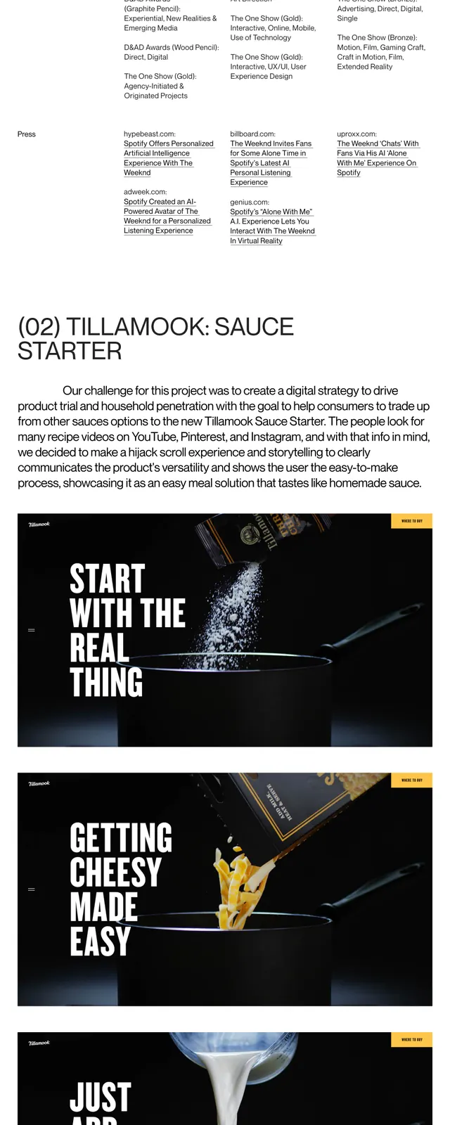
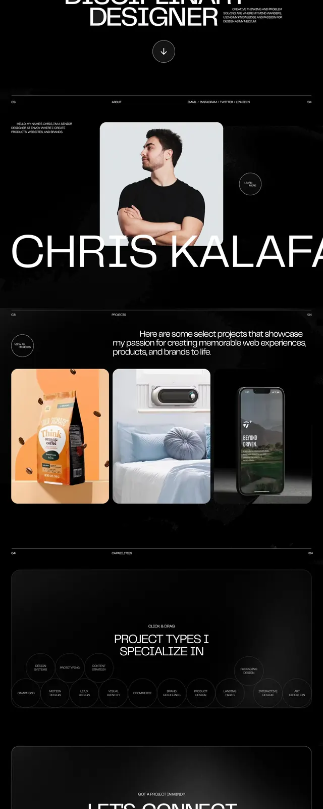
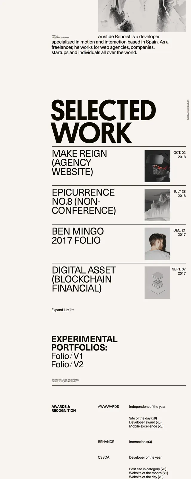
A high-contrast, minimalist portfolio featuring oversized typography and a stark monochrome palette.
Summary
A high-contrast, minimalist portfolio featuring oversized typography and a stark monochrome palette.
Visual description
The design uses a strict black-and-white color scheme with massive, bold sans-serif headings. The layout is asymmetric, featuring a clean left-hand navigation sidebar and a grid-based project list with right-aligned thumbnails. High-contrast imagery is used sparingly to create a sophisticated, gallery-like feel.
Key takeaway
Leveraging extreme scale in typography can create a strong visual hierarchy and a bold brand identity without needing complex graphics.
Reuse notes
Ideal for creative portfolios or agencies wanting to convey confidence and a 'less is more' aesthetic. Use a high-quality sans-serif font to maintain the Swiss-style precision.