Preview image. Unlock full-res
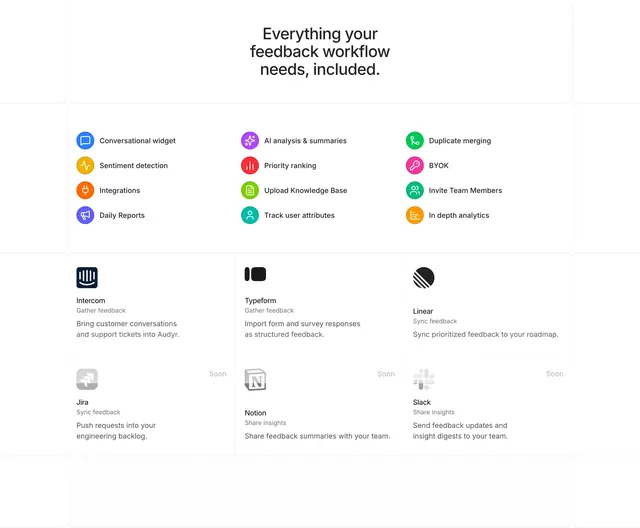
Audyr section listing twelve icon features in three columns above a 2x3 integration card grid with Soon badges.
Summary
An Audyr capability overview combining a colorful three-column feature checklist with a bordered integration matrix mixing live and coming-soon partners.
Visual description
Centered bold headline "Everything your feedback workflow needs, included." Below, three columns of twelve features each with a small saturated circular icon and label (widget, AI analysis, duplicate merging, integrations, analytics, etc.). Lower half is a 2x3 grid with thin gray borders: top row shows full-color Intercom, Typeform, and Linear cards with role subheads ("Gather feedback", "Sync feedback") and short descriptions; bottom row shows grayscale Jira, Notion, and Slack cards each marked "Soon" in a corner badge.
Key takeaway
Separate "everything included" features from partner logos so prospects see product depth before ecosystem fit. Desaturating upcoming integrations avoids looking incomplete while still signaling roadmap.
Reuse notes
Good for integration-heavy SaaS near pricing or footer. Keep feature count scannable; twelve items works because icons replace paragraphs.
More integrations sections
See all



More like this


Keep what you find
A free account saves references to boards and can send you a weekly email of picks based on what you save.
To see every result, go Pro.