Preview image. Unlock full-res
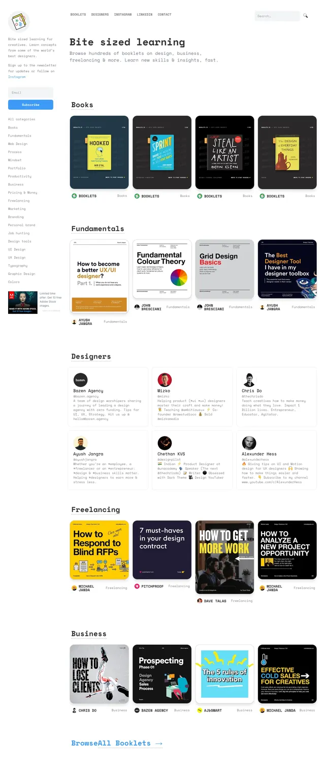
A minimalist editorial landing page for browsing bite-sized learning booklets, with a left sidebar, large headline hero, and categorized content grids.
Summary
A minimalist editorial landing page for browsing bite-sized learning booklets, with a left sidebar, large headline hero, and categorized content grids.
Visual description
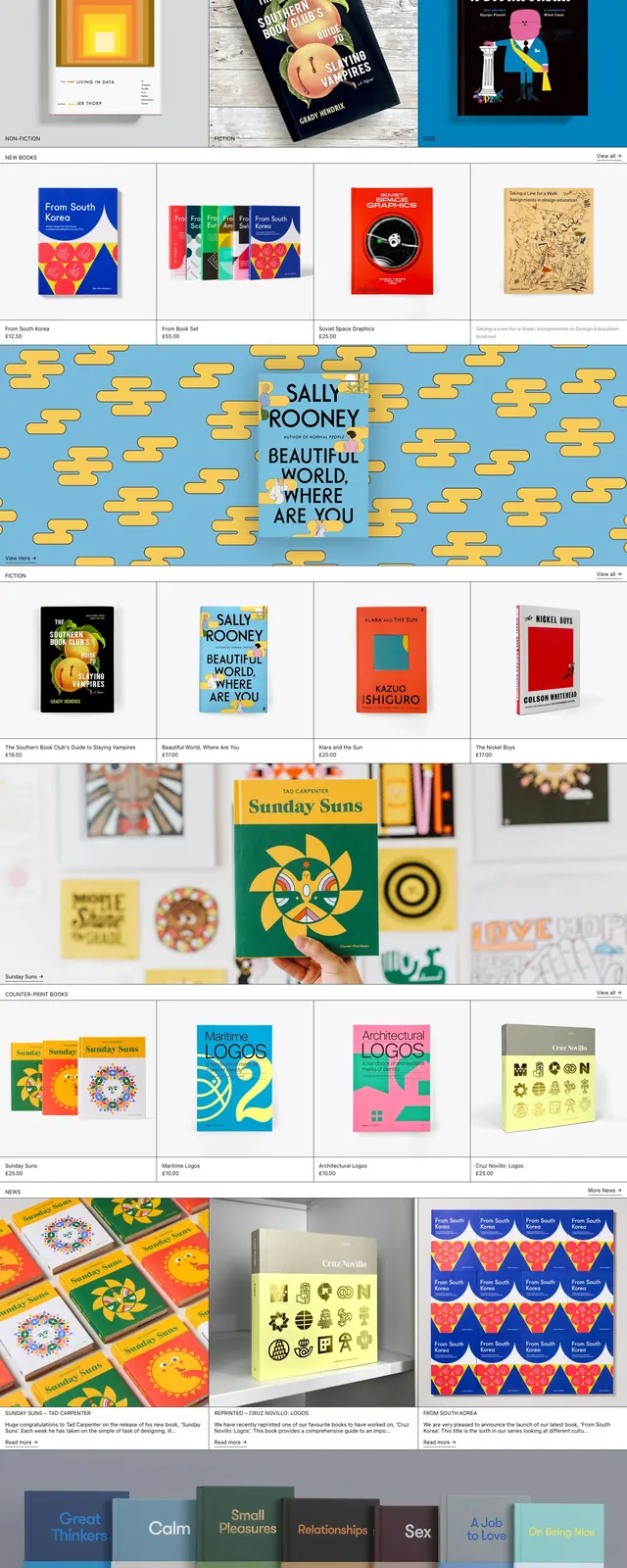
The page uses a pale background with a narrow left sidebar for intro copy, email signup, and category links. Across the top is a simple horizontal nav and a search field, while the main area starts with a large headline reading "Bite sized learning" and a short supporting line. Below, content is organized into clearly labeled sections such as Books, Fundamentals, Designers, Freelancing, and Business, each shown as rows or grids of book-cover cards and profile cards. Most elements are white or dark cards with thin borders, generous spacing, and subdued grayscale navigation text with occasional bright accent colors on book covers and buttons.
Key takeaway
The strongest pattern is the combination of a persistent sidebar with large section headings and dense card grids, which makes a large library feel scannable. The design stays light and quiet so the colorful covers become the focal points.
Reuse notes
Use this structure for curated content libraries, learning hubs, or resource directories where browsing by category matters. It works best when the content itself is visually rich and you want the interface to stay unobtrusive.