Preview image. Unlock full-res
A light, airy travel and hotel marketplace landing page with a split hero, product mockups, feature sections, team cards, and a dark newsletter CTA.
Summary
A light, airy travel and hotel marketplace landing page with a split hero, product mockups, feature sections, team cards, and a dark newsletter CTA.
Visual description
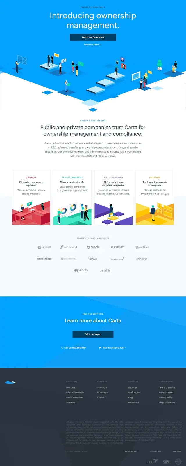
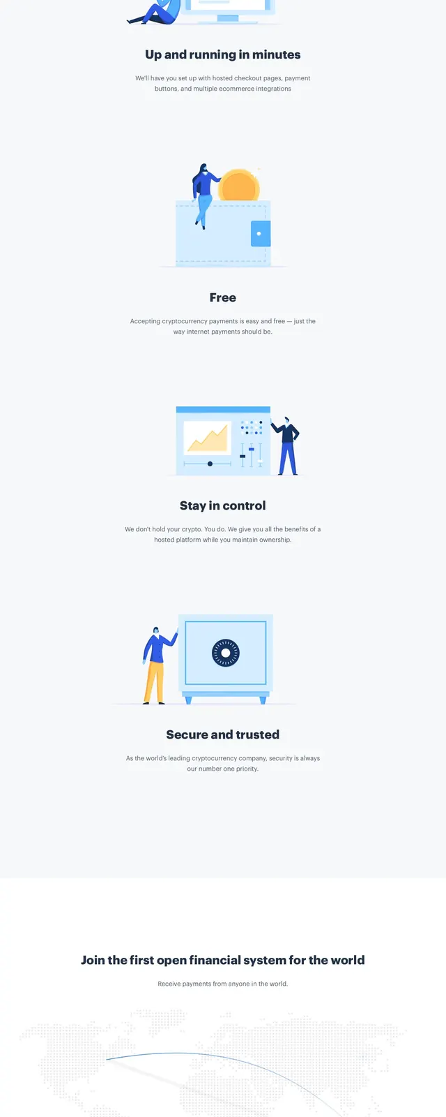
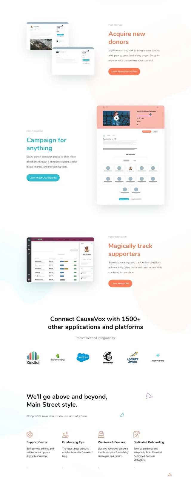
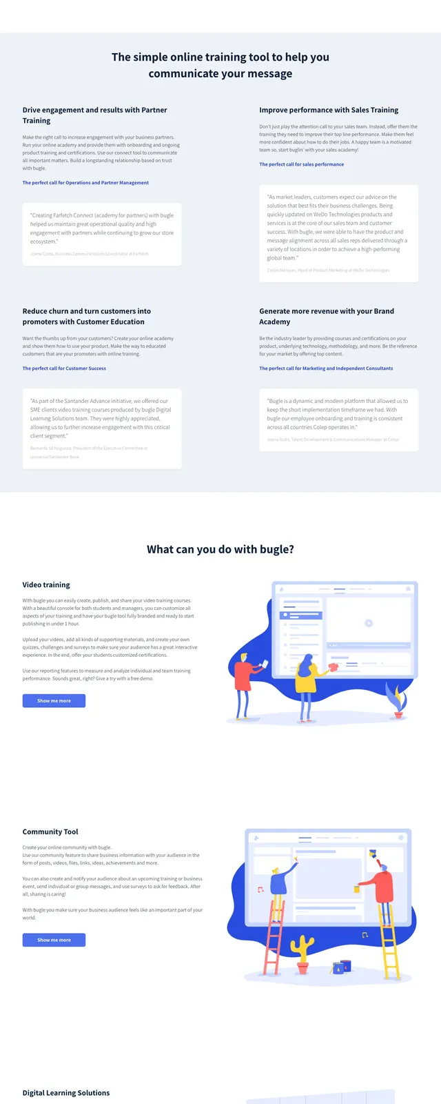
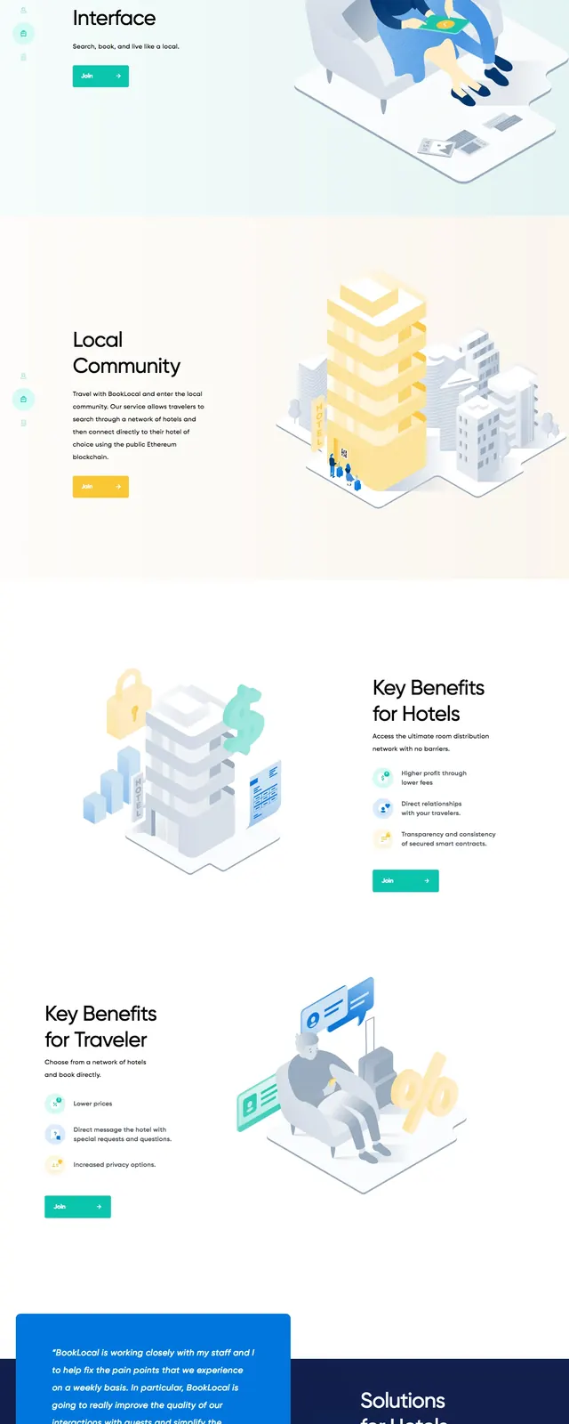
The page uses a bright white and pale blue background with a very soft gradient and lots of empty space. The first screen is a split hero: a large headline and two CTA buttons on the left, with overlapping desktop and mobile product mockups on the right. Lower sections include a wide hotel feature band, a benefits section with an illustrated building graphic, a four-person team row with headshots, and a dark blue newsletter signup panel. A simple footer ends the page with the BookLocal logo, small social icons, and contact details.
Key takeaway
The design relies on airy spacing, soft gradients, and clean product imagery to make a travel SaaS feel calm and credible. Overlapping device mockups and a dark CTA block give the page enough contrast without breaking the minimal feel.
Reuse notes
Useful for travel marketplaces, booking platforms, or any hospitality product that needs a polished, low-friction landing page. The layout works best when you have strong mockups, illustrations, and a concise set of feature sections to support the hero.