Preview image. Unlock full-res
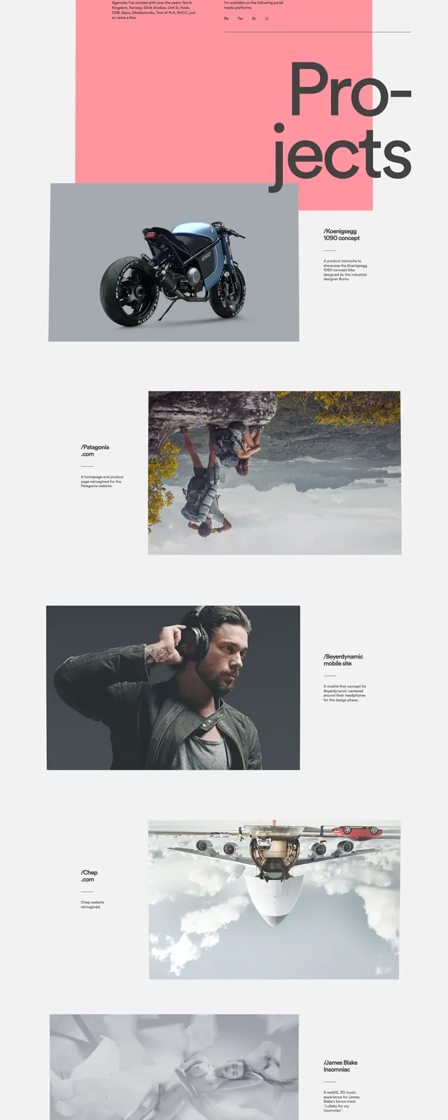
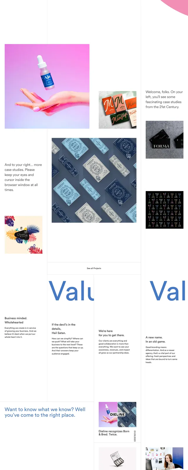
A light, editorial agency homepage with oversized split typography, lots of whitespace, and bold project imagery punctuated by a pink circular graphic.
Summary
A light, editorial agency homepage with oversized split typography, lots of whitespace, and bold project imagery punctuated by a pink circular graphic.
Visual description
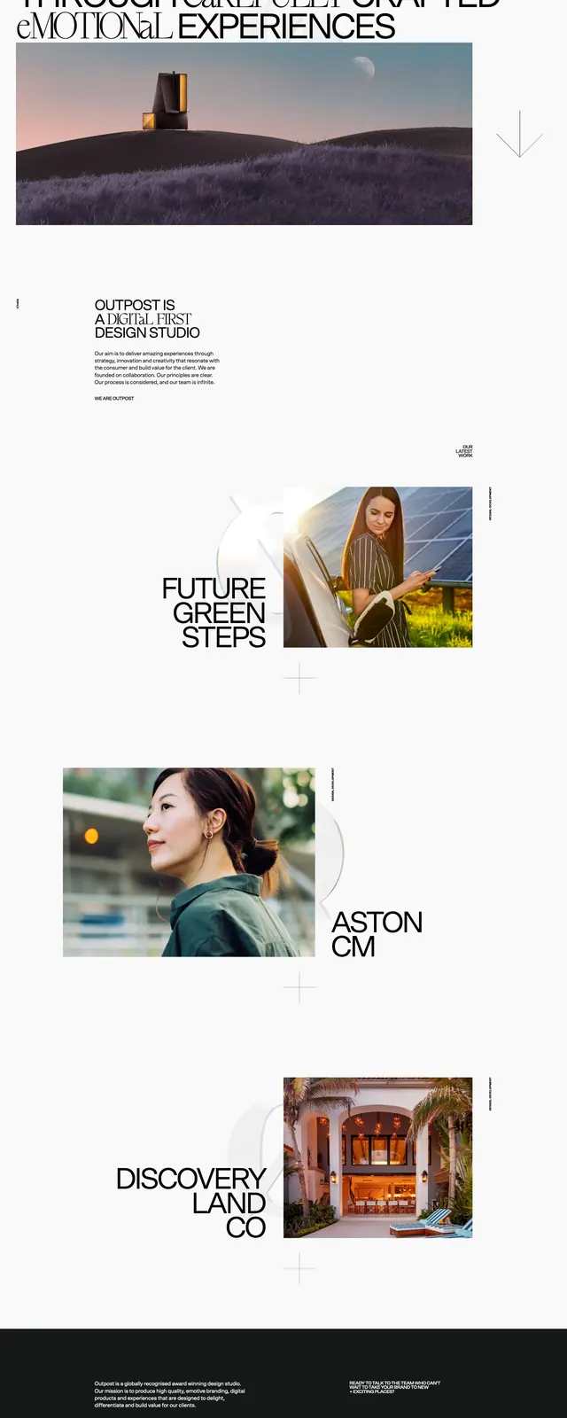
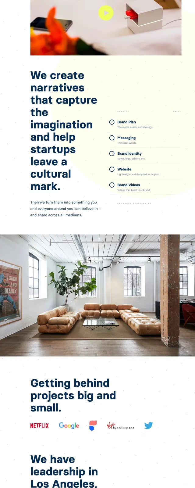
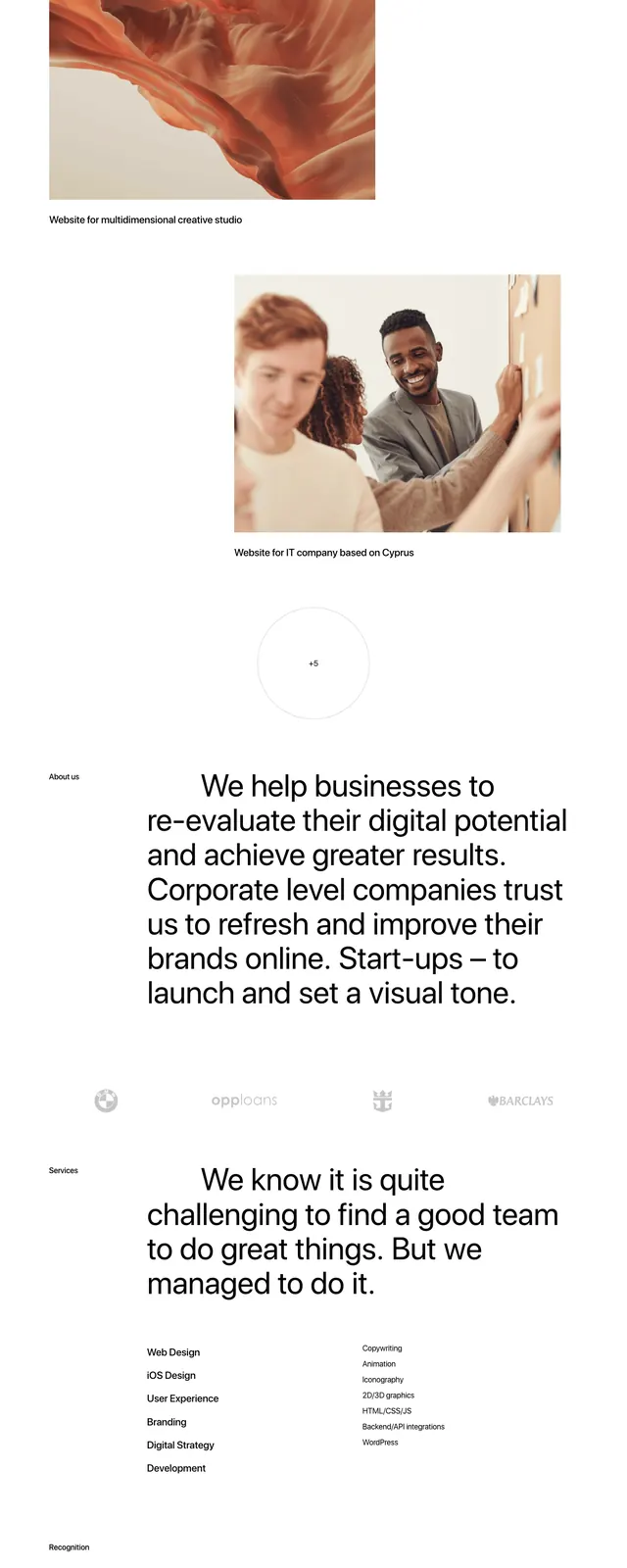
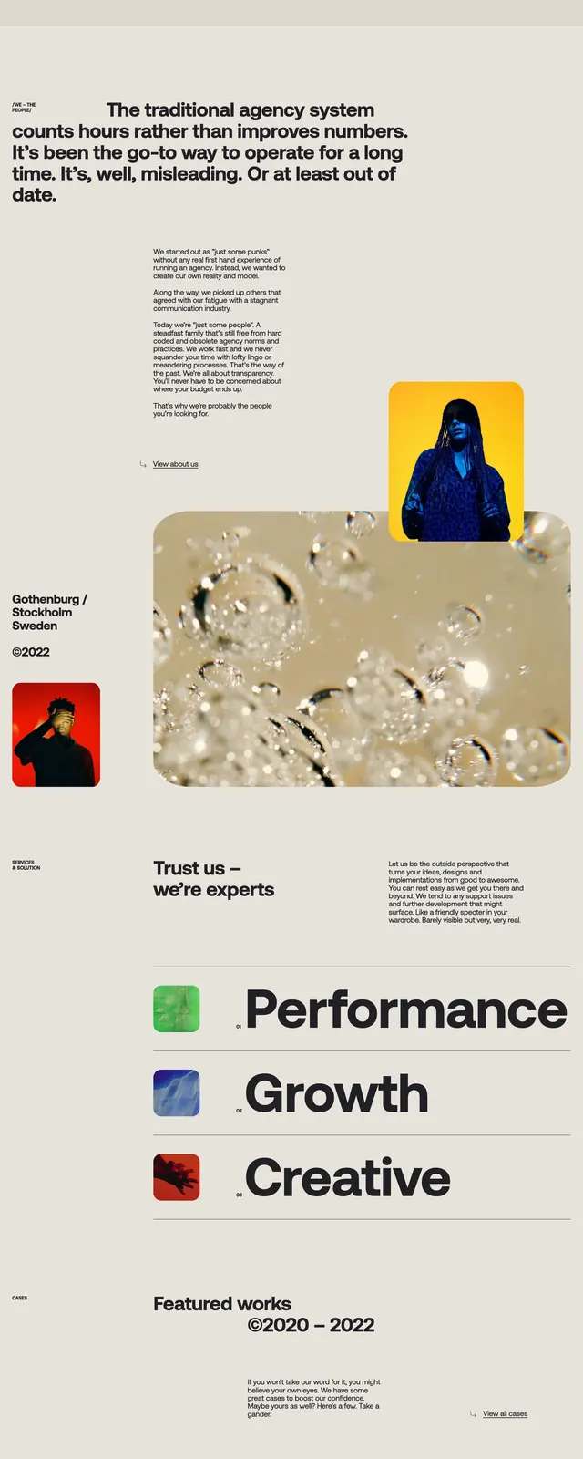
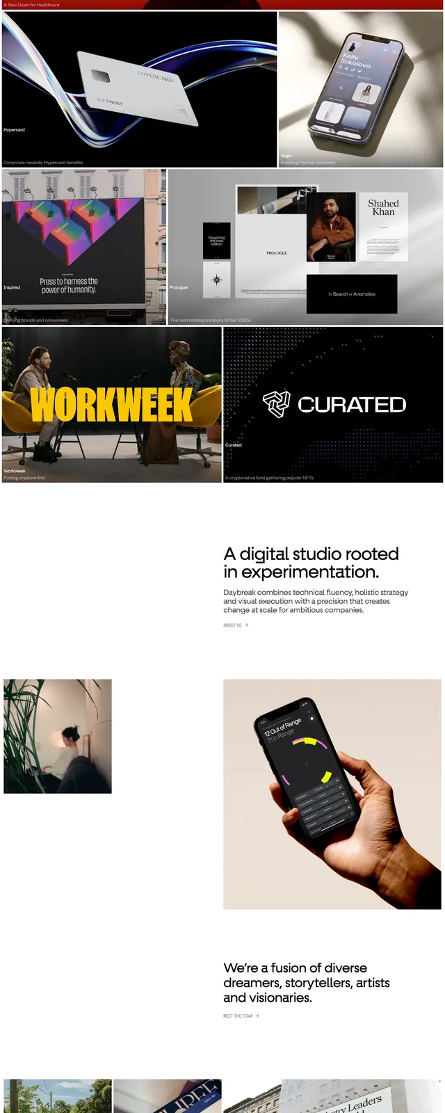
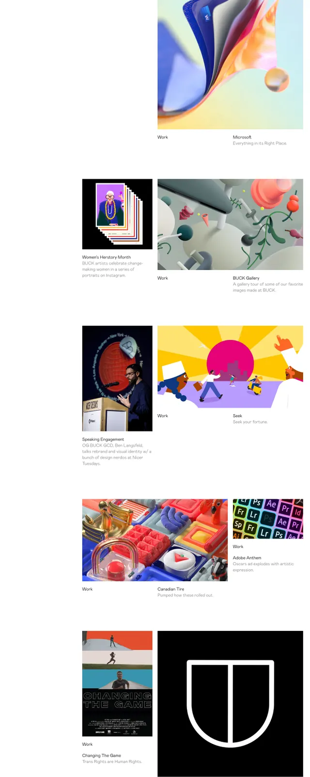
The page uses a mostly white canvas with thin divider lines, a compact top navigation, and a large hero statement split across the screen: "Born" on the left, an ampersand in the center, and "Bred" over a large pink circle on the right. Below the hero, short editorial copy sits beside a grid of project thumbnails and small article cards, including several image tiles and a narrow text-only column. The lower portion shifts into a dark footer with social links, a centered navigation row, and a large closing slogan in oversized white type.
Key takeaway
The strongest move is the contrast between airy white space and oversized, sharply placed typography. The pink circular form gives the hero a memorable anchor without adding visual clutter.
Reuse notes
Works well for agency, studio, or portfolio sites that want an editorial feel with strong brand personality. Reuse the split headline treatment and sparse grid below the fold when the visual assets are varied and high quality.