Preview image. Unlock full-res
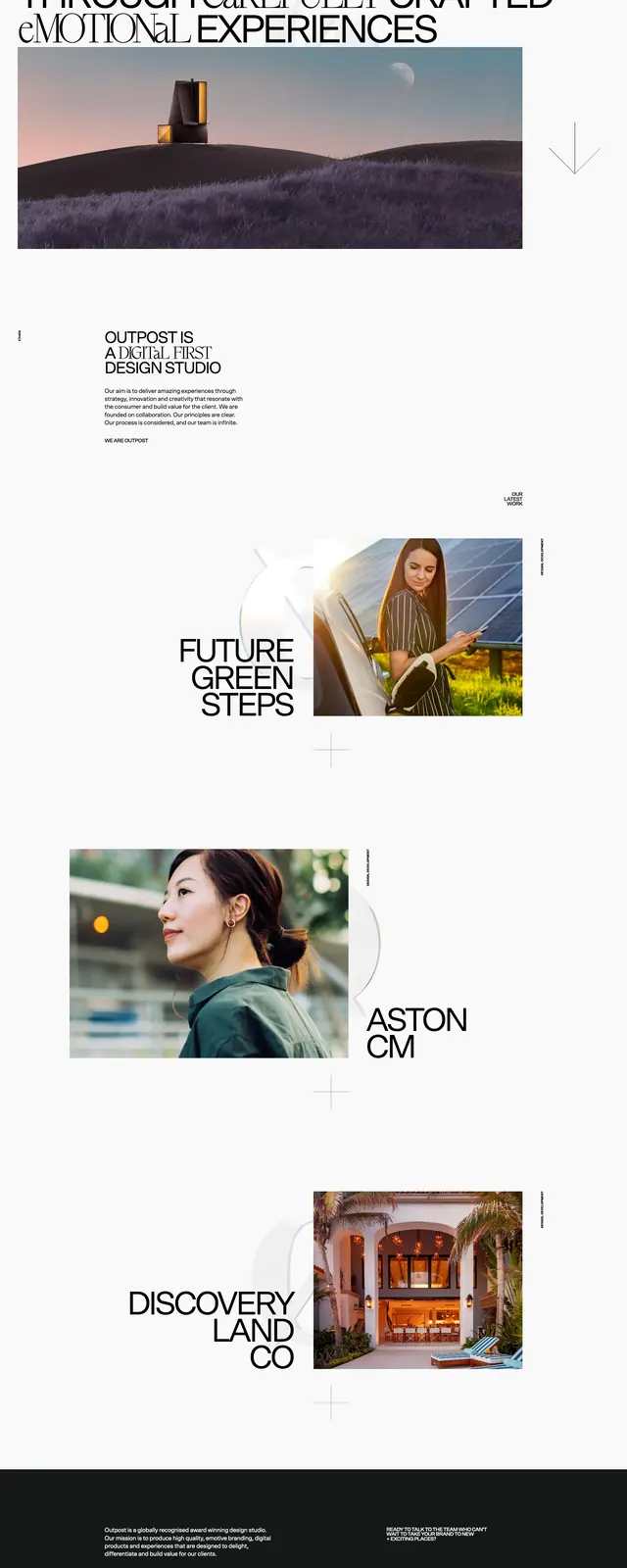
A minimalist agency landing page with oversized editorial headlines, large project imagery, and generous white space.
Summary
A minimalist agency landing page with oversized editorial headlines, large project imagery, and generous white space.
Visual description
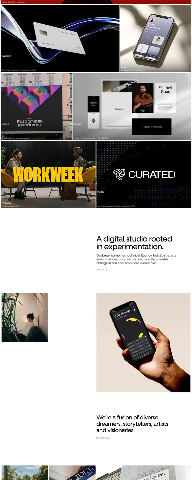
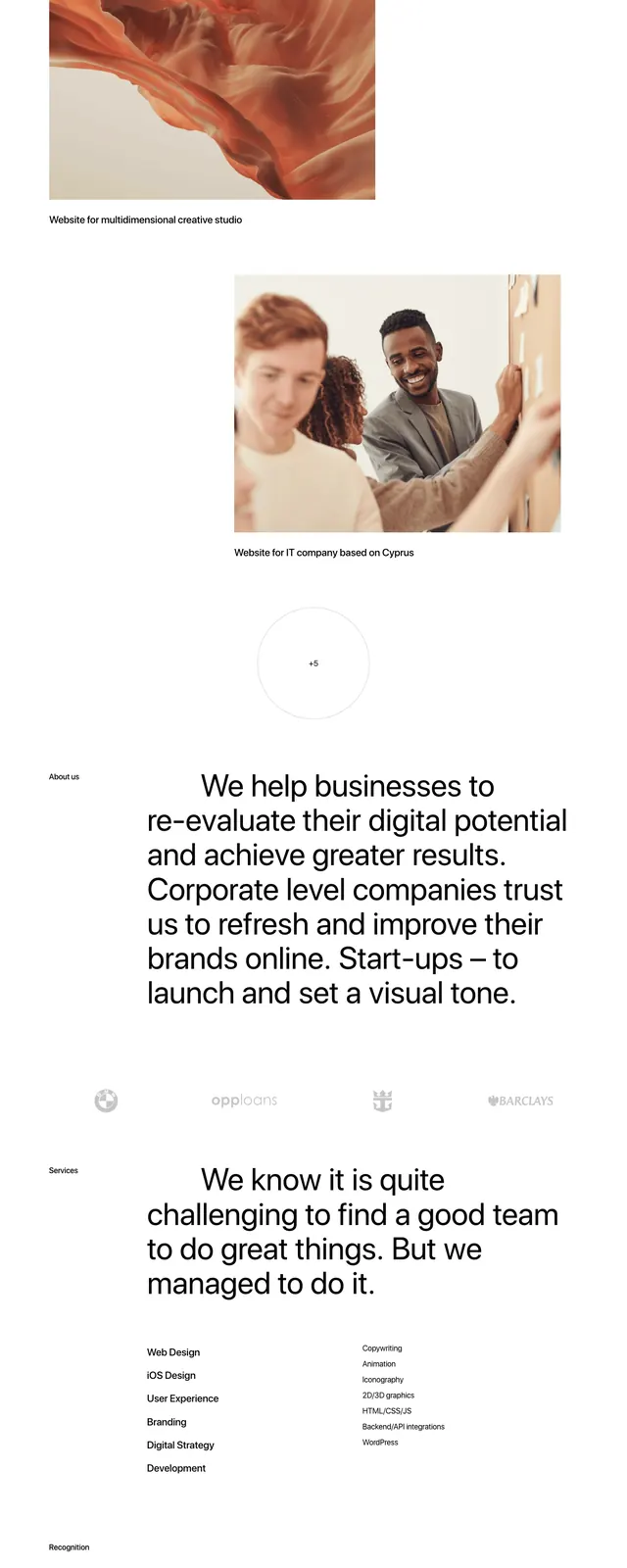
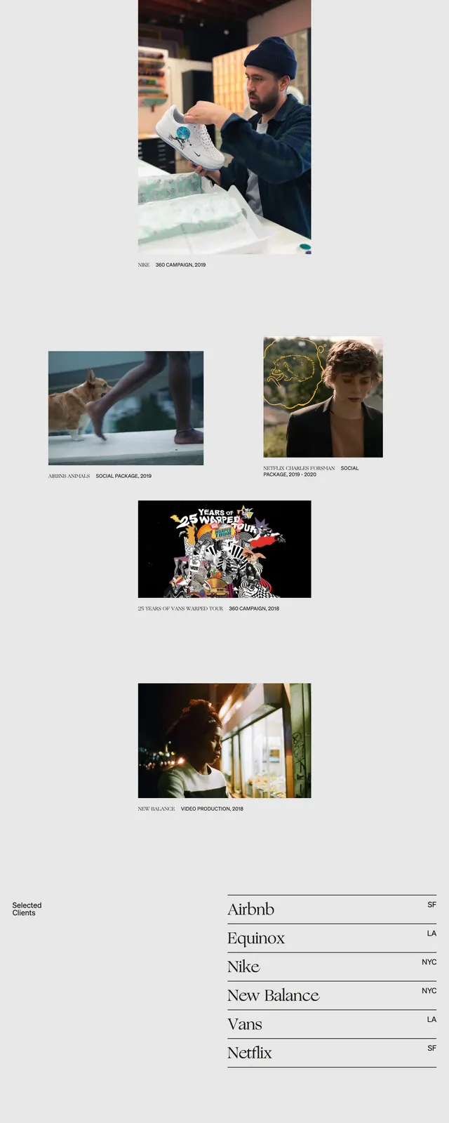
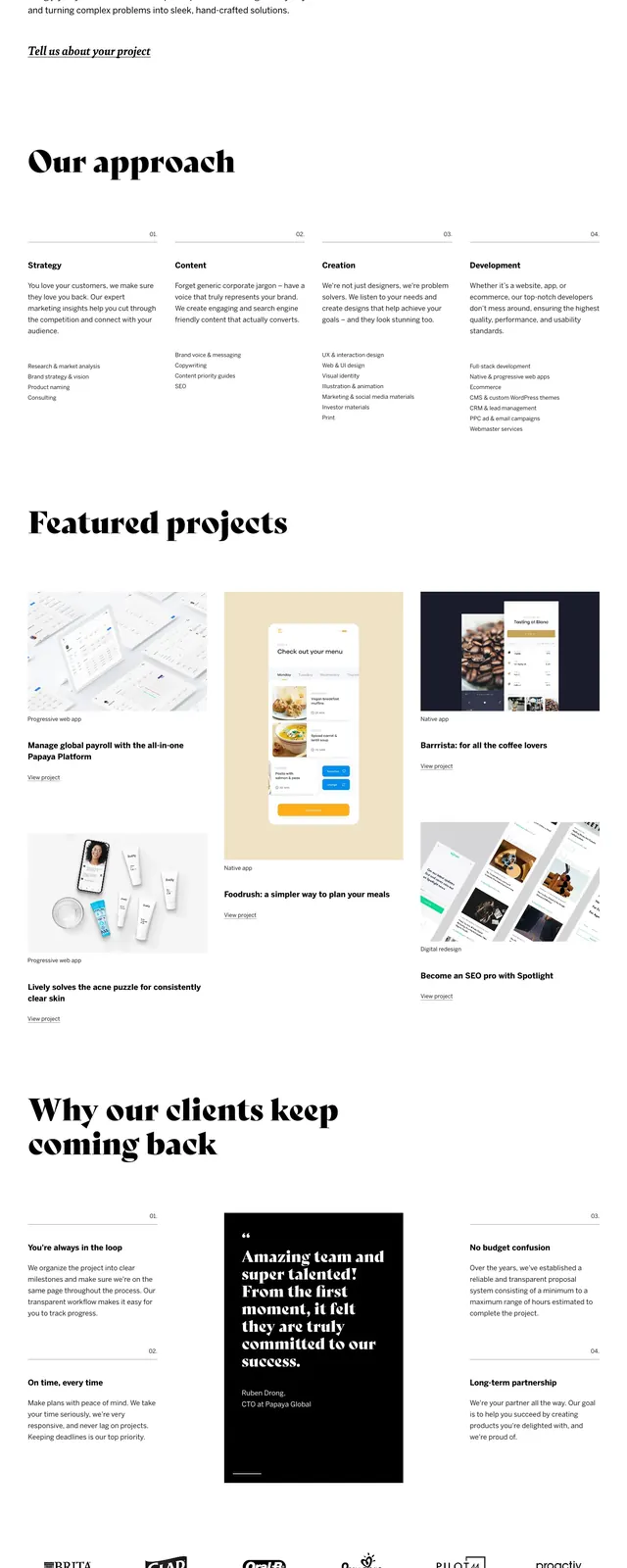
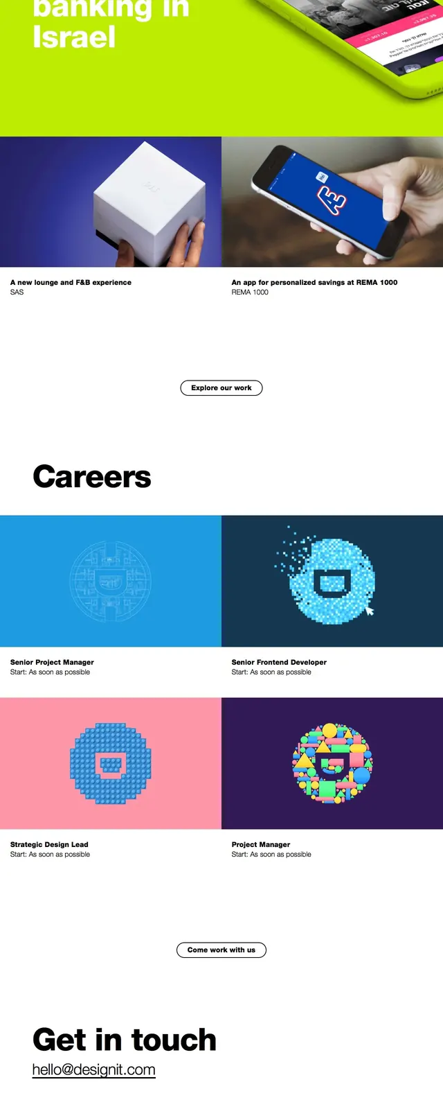
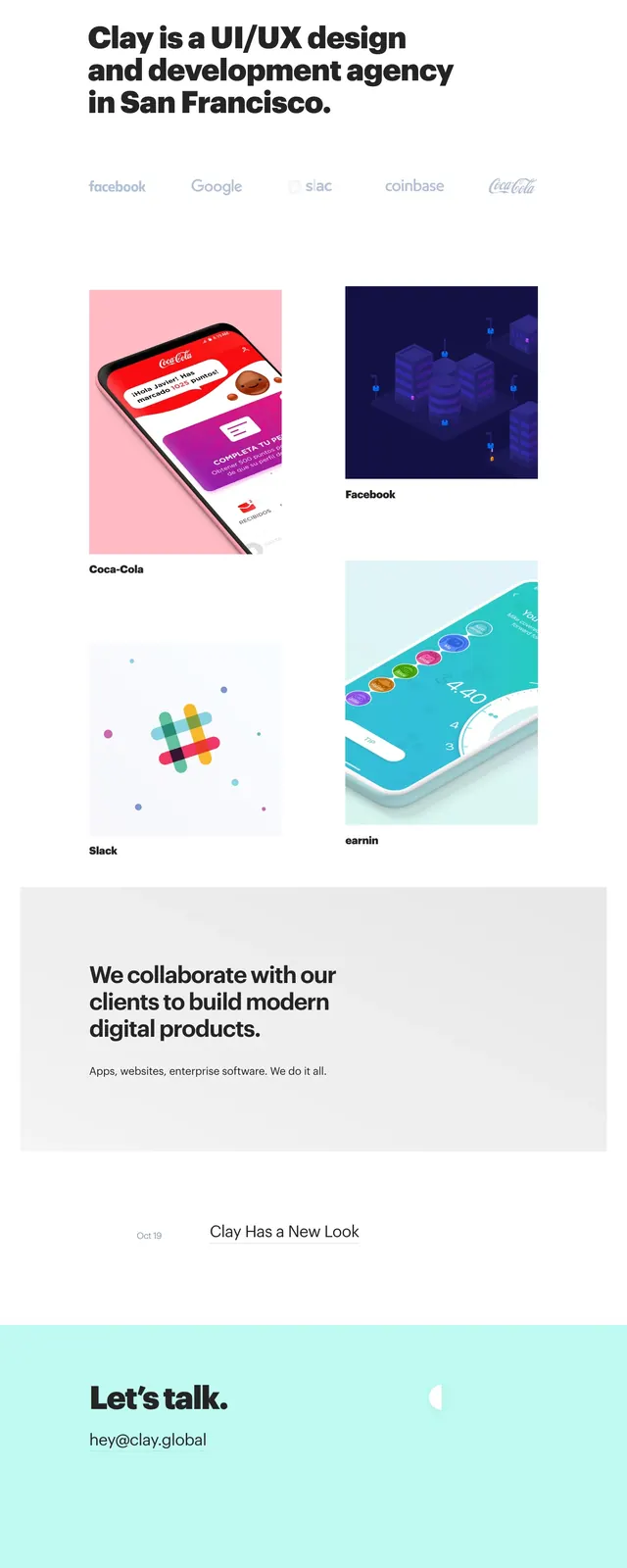
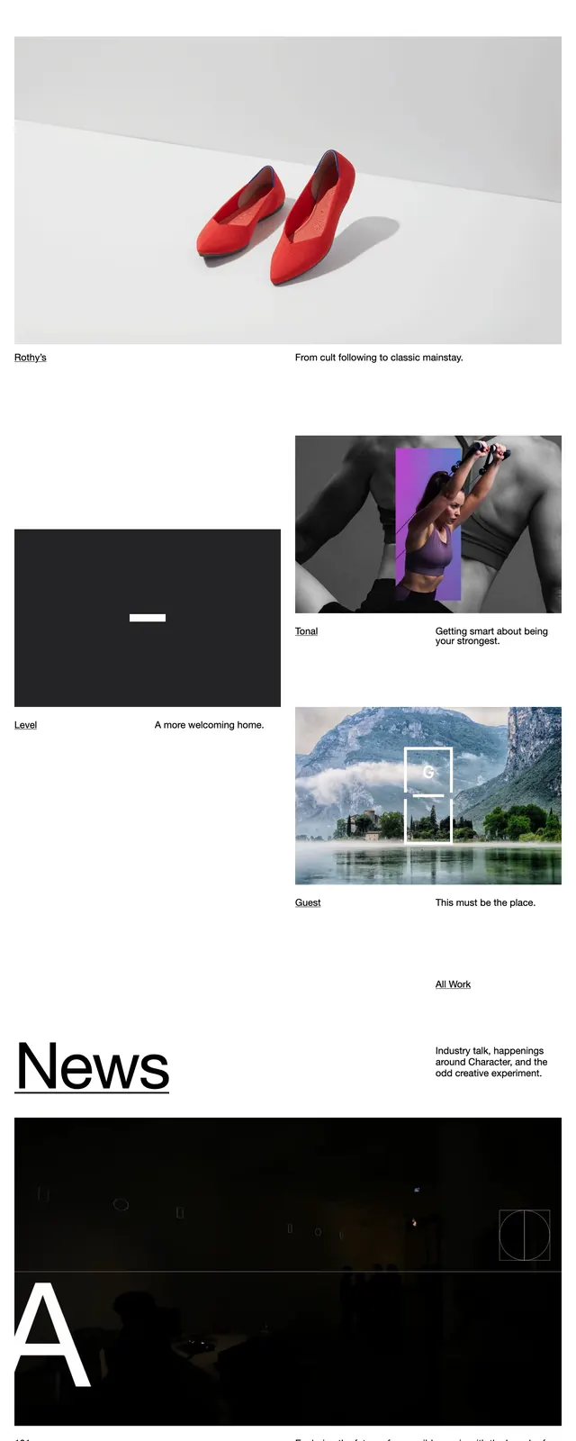
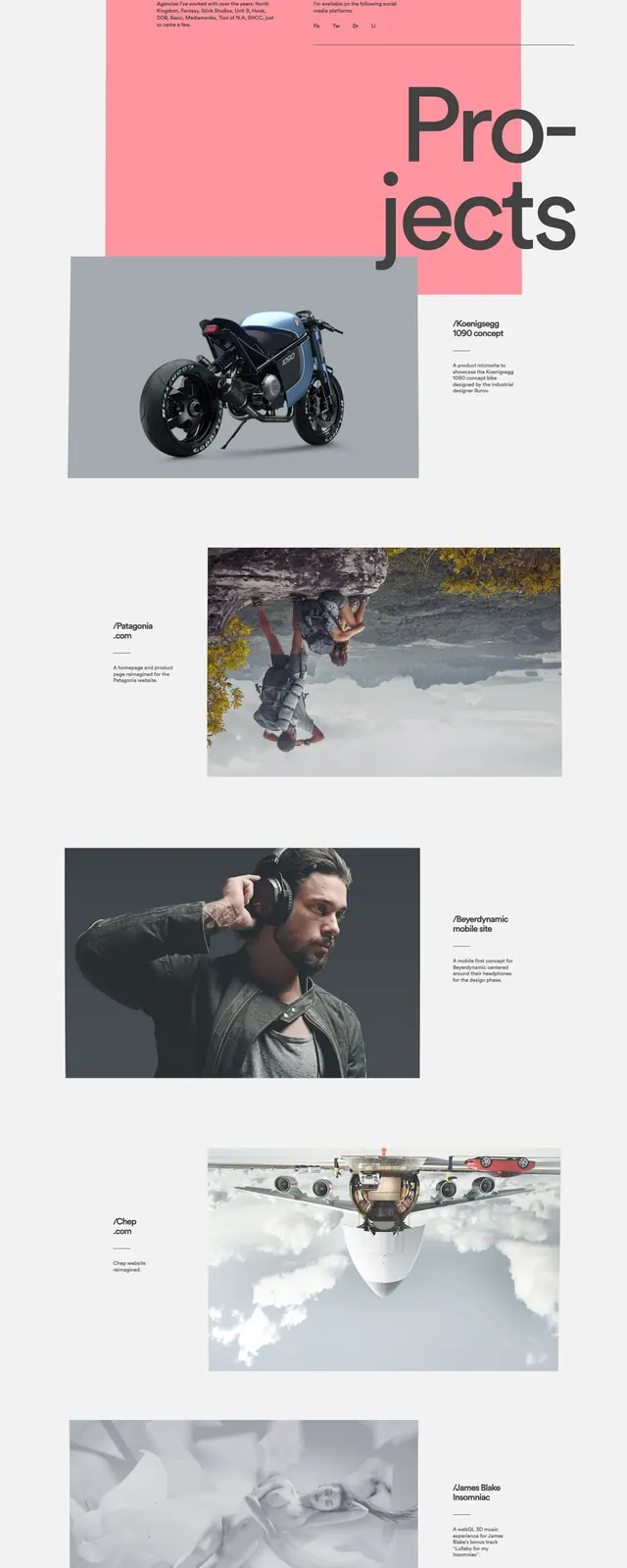
The page opens on a white background with a small wordmark at top left, compact utility text at top right, and a massive multi-line headline set in black across the upper half. A wide landscape image sits directly under the hero copy, followed by a sparse about block and then alternating portfolio-style project sections with large imagery and bold titles. The lower portion ends in a dark footer with small contact and location text arranged in columns.
Key takeaway
The strongest move is the tension between oversized editorial typography and restrained spacing. The alternating project layout keeps the page feeling curated without adding visual noise.
Reuse notes
Use this pattern for agency, studio, or portfolio homepages where the brand wants to feel premium and design-led. It works best when paired with strong photography or project visuals and a very limited color palette.