Preview image. Unlock full-res
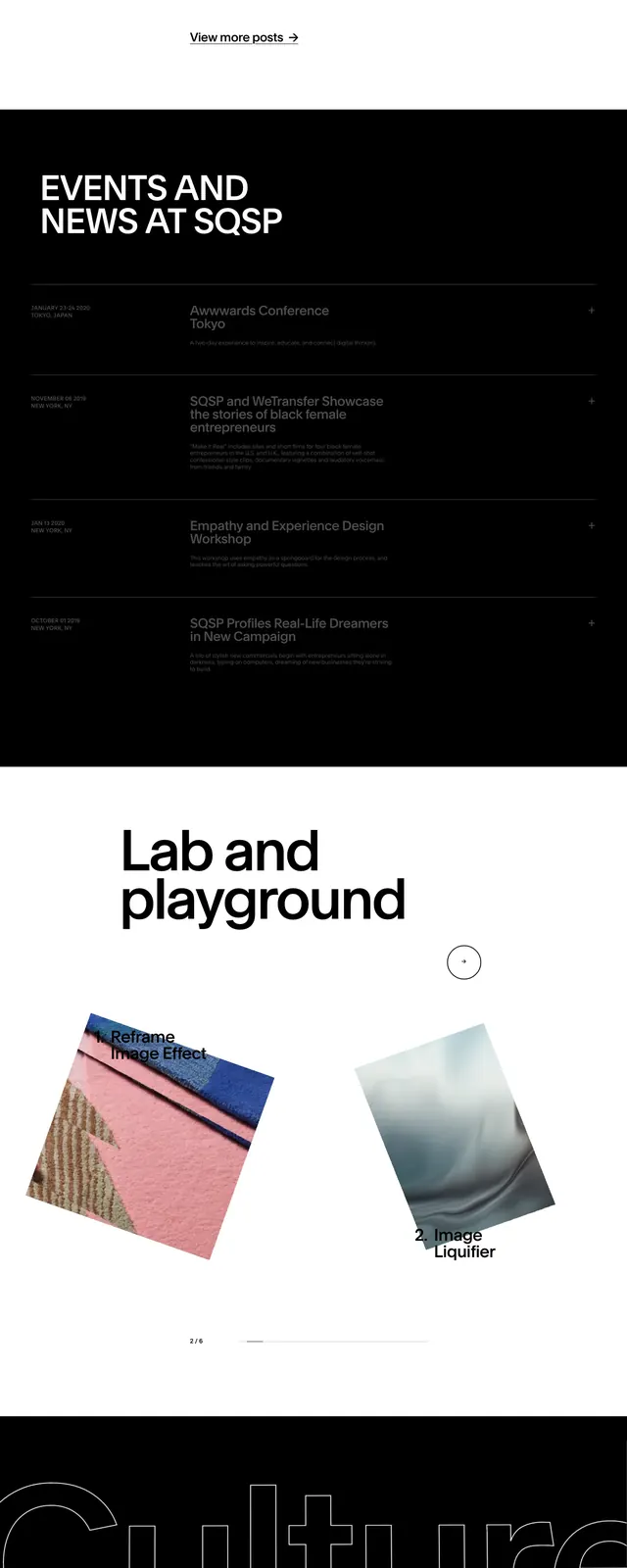
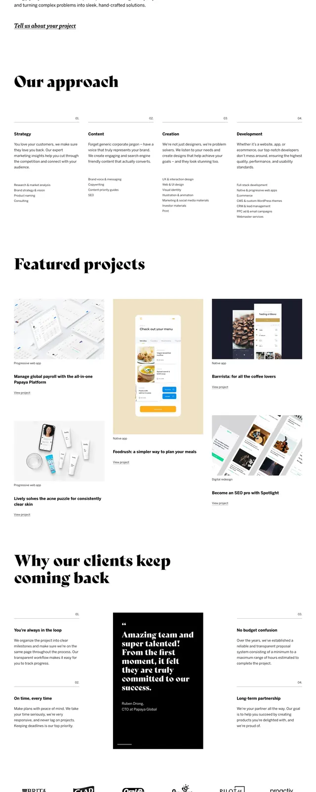
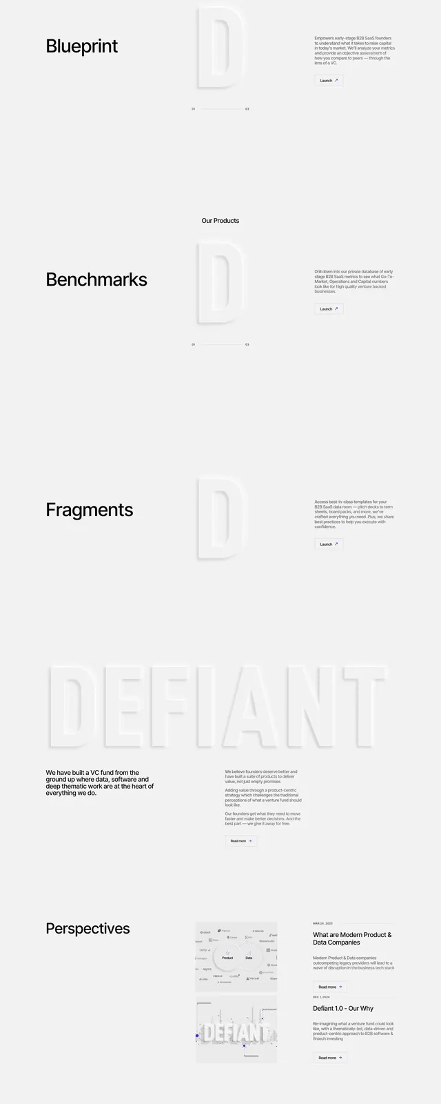
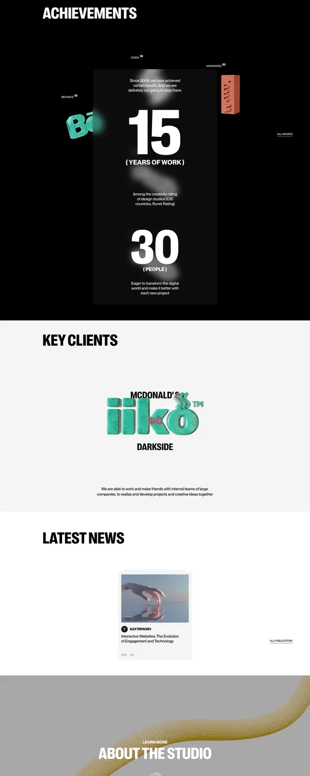
A stark editorial agency homepage with oversized typography, centered hero composition, and high-contrast black-and-white presentation.
Summary
A stark editorial agency homepage with oversized typography, centered hero composition, and high-contrast black-and-white presentation.
Visual description
The page uses a clean white background with a small top navigation, a circular logo mark, and a centered hero headline in heavy black uppercase type. A large portrait image overlaps the headline area, with thin outlined location text layered behind it. Lower on the page, the design shifts to a black contact section with a large request prompt, a name input line, and three avatar-style contact cards. The overall composition is sparse, vertical, and highly typographic.
Key takeaway
This layout relies on scale, contrast, and negative space to create a premium agency feel. The strongest reusable pattern is the centered hero with layered imagery and oversized stacked headings.
Reuse notes
Reuse the formula for high-end agency or portfolio landing pages where visual confidence matters more than dense content. It works best with one strong image, minimal navigation, and a bold CTA section below the fold.