Preview image. Unlock full-res
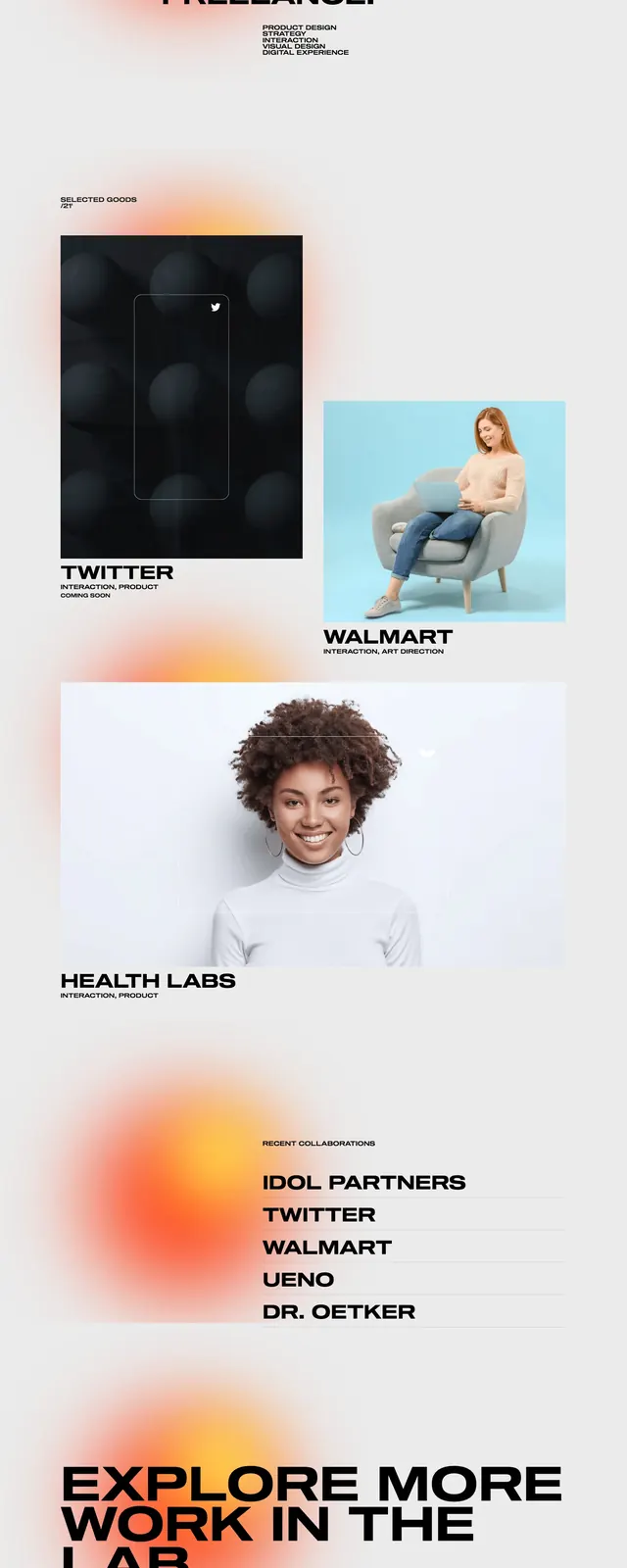
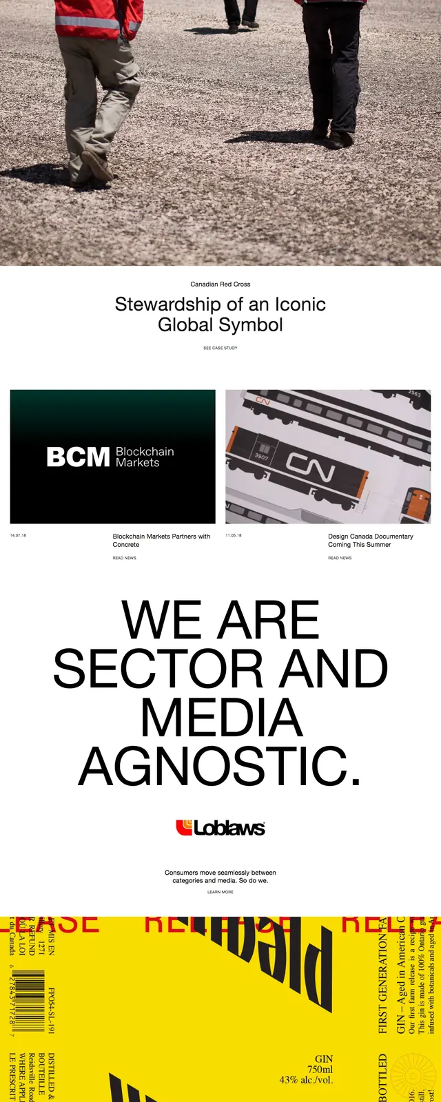
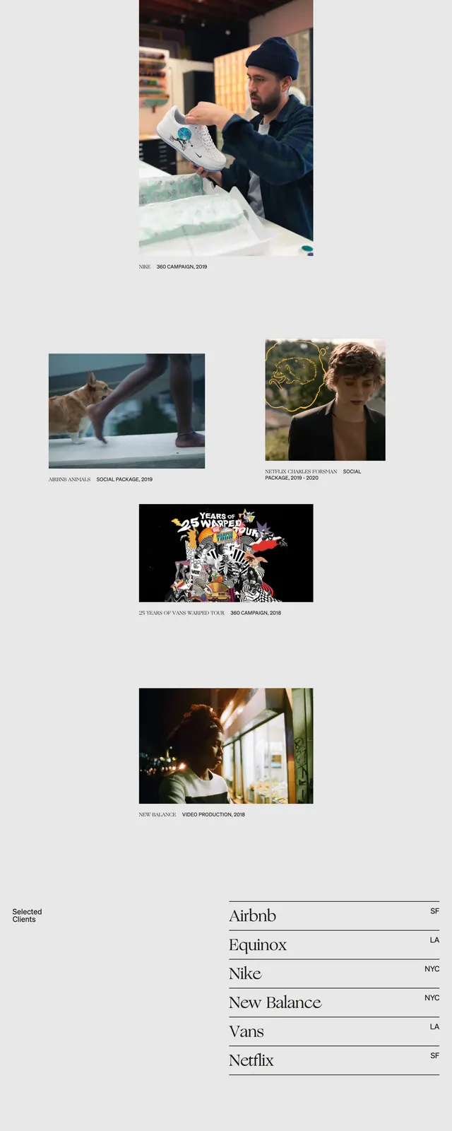
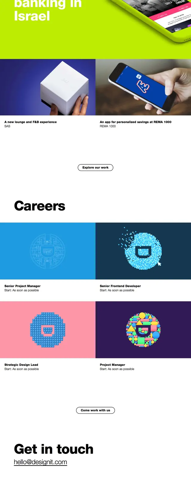
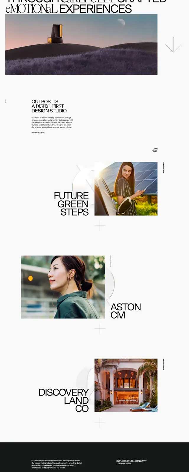
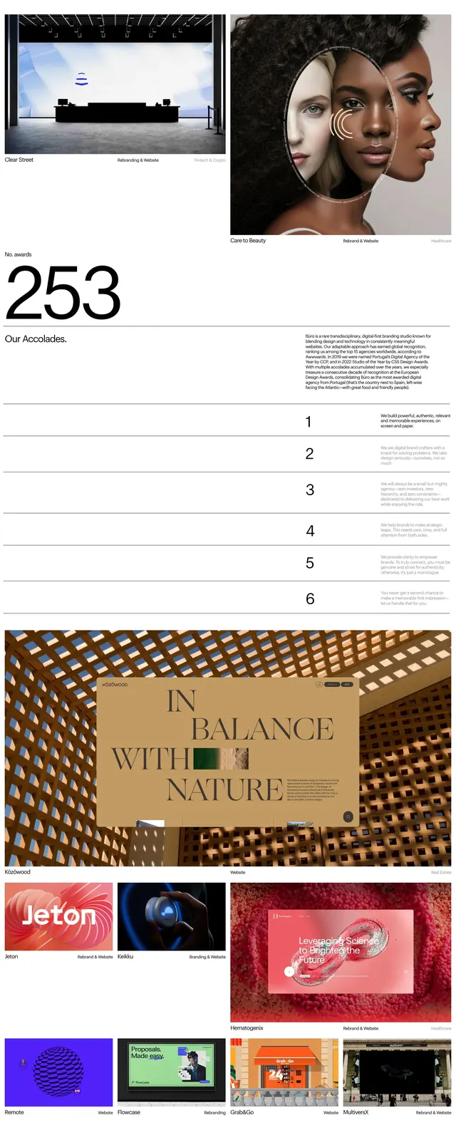
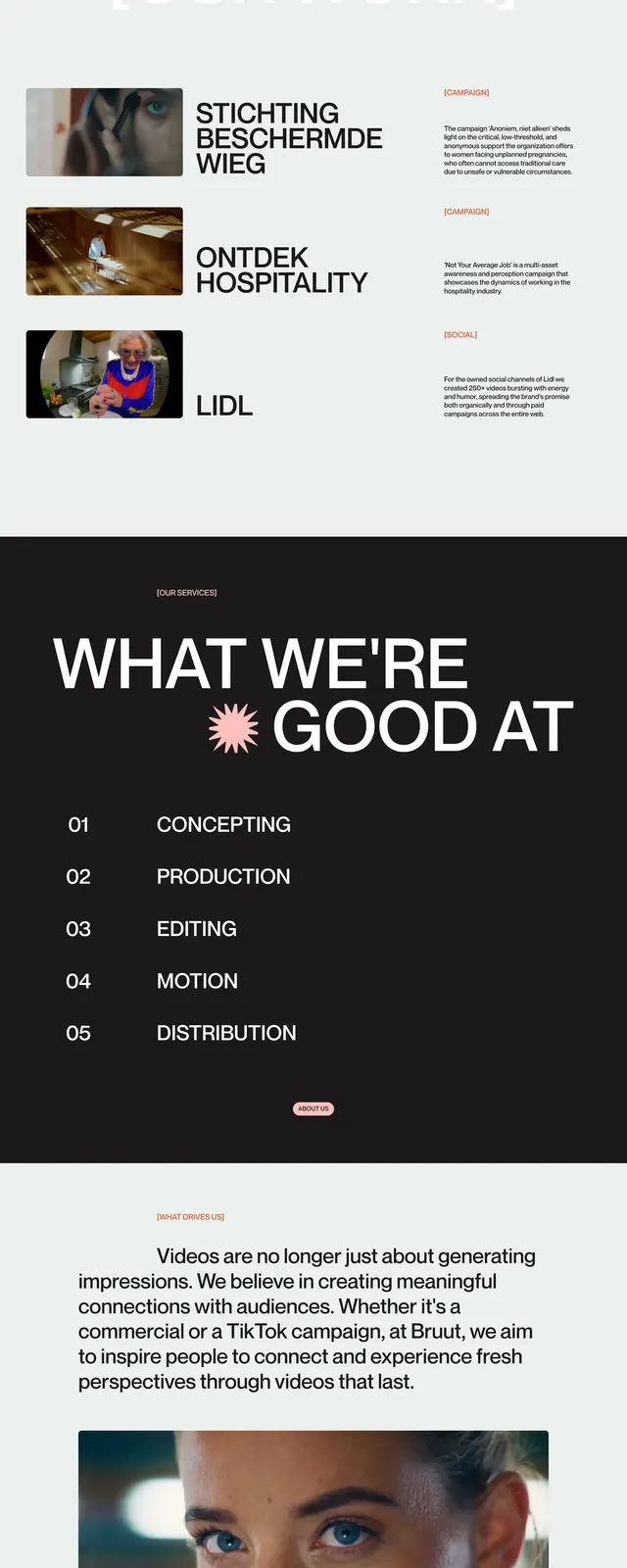
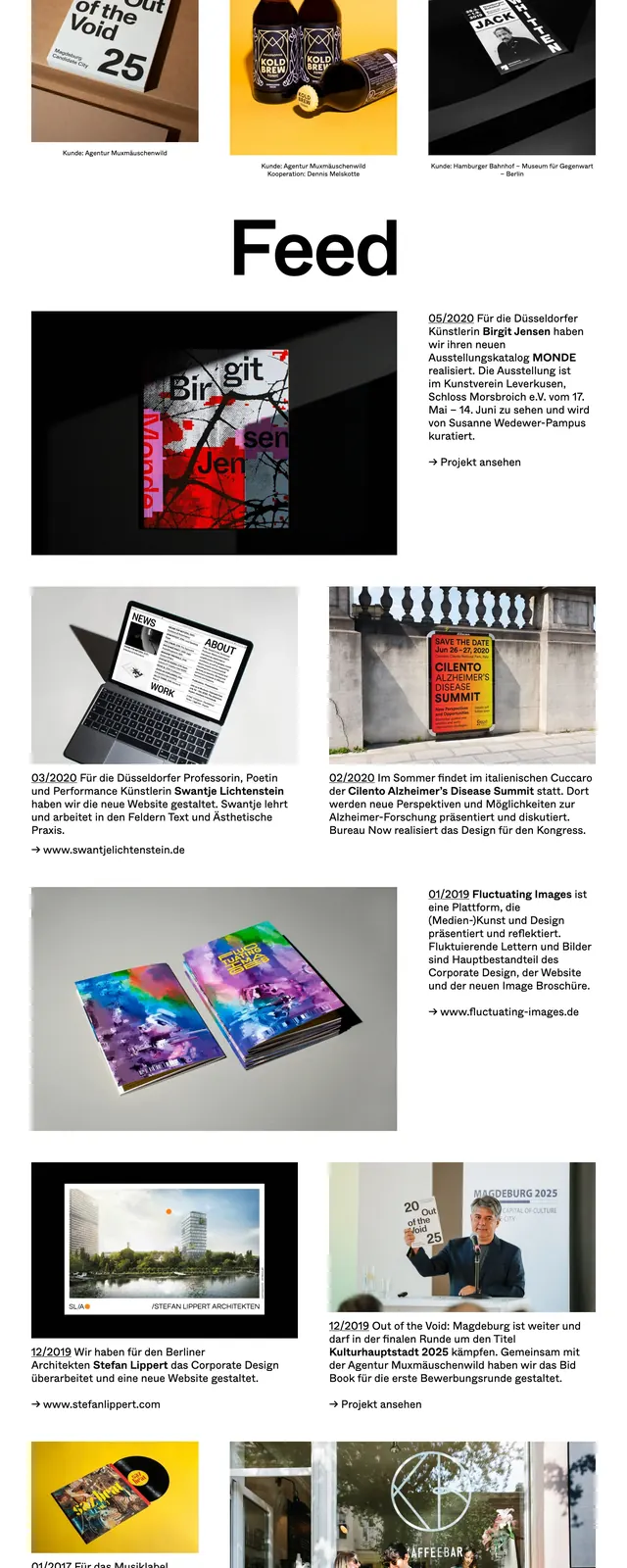
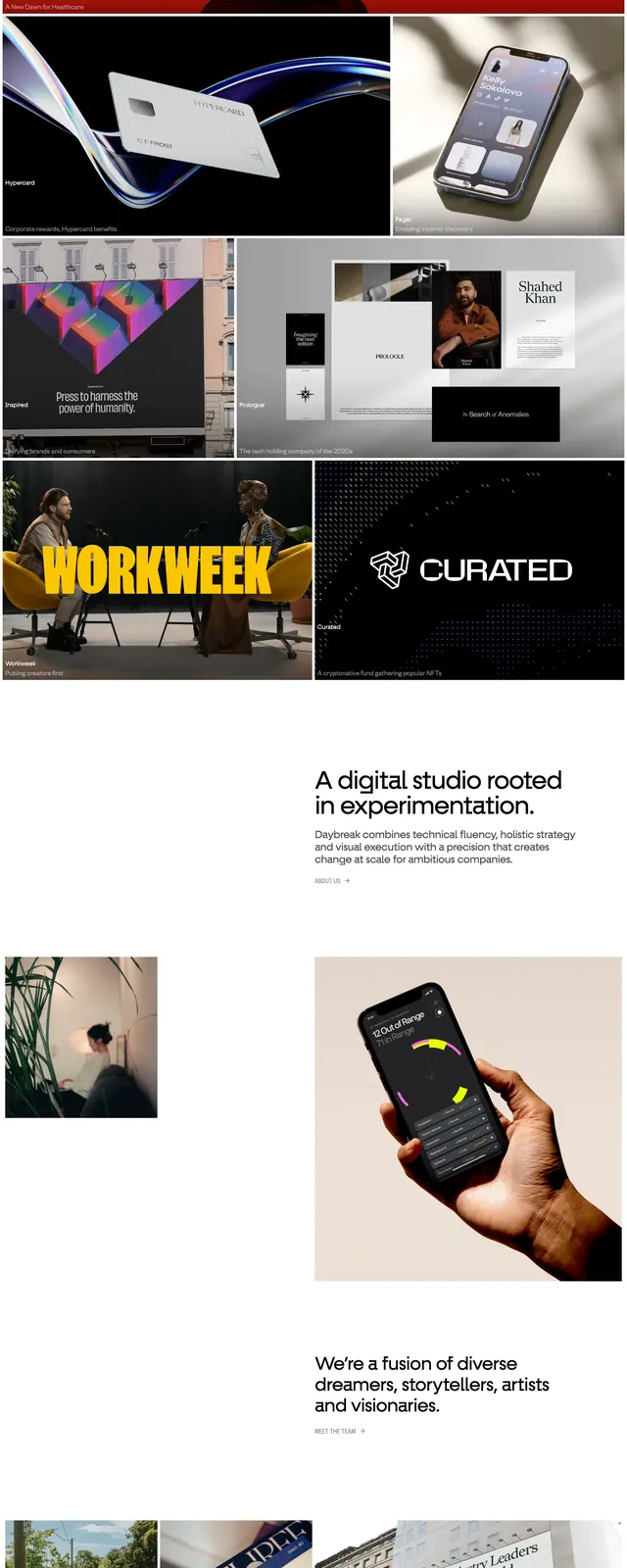
A sparse, image-led agency homepage with oversized branding, strong white space, and a grid of editorial project tiles.
Summary
A sparse, image-led agency homepage with oversized branding, strong white space, and a grid of editorial project tiles.
Visual description
The page opens on a very large white hero with a short descriptor in the top-left, small contact and social links in the top-right, and the Daybreak wordmark set low on the page. Below it is a wide full-bleed orange-to-red image banner with a silhouetted profile, followed by a mixed grid of project images and bold project labels such as Workweek and Curated. Farther down, the page shifts into a centered about statement, a pair of smaller imagery blocks, a three-image strip, a testimonial quote, and a minimal footer with contact details and social links.
Key takeaway
The strongest move is the combination of extreme whitespace with oversized image blocks, which makes the work feel premium and editorial. The site uses almost no decorative UI, relying instead on typography hierarchy, image scale, and spacing to carry the experience.
Reuse notes
Use this structure for studio, agency, or portfolio sites that need to feel selective and art-directed. It works best when the content is mostly visual case studies and when the brand can afford a very restrained navigation and CTA treatment.