Preview image. Unlock full-res
A high-energy produce brand homepage with oversized typography, bright color blocking, and illustrated food visuals.
Summary
A high-energy produce brand homepage with oversized typography, bright color blocking, and illustrated food visuals.
Visual description
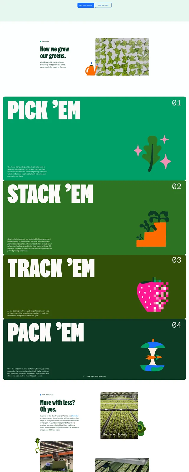
The page opens with a full-bleed hero in vivid blue, dominated by huge white headline text and a large organic leaf image overlapping the fold. Below, stacked sections use bold green color fields, oversized headings, and mixed image-and-illustration compositions to explain product benefits and growing methods. A story section adds article cards in a clean grid, followed by a bright newsletter-style footer with decorative produce illustrations. The overall layout alternates between spacious editorial sections and dense, playful visual blocks.
Key takeaway
This design combines editorial pacing with farm-fresh visual identity, using scale, color, and organic imagery to make a produce brand feel memorable. The oversized type and illustrated accents are the main reusable ideas.
Reuse notes
Reuse the large headline treatment, saturated section color shifts, and overlapping product imagery for impact. The section structure works well for a brand story page, product benefits, and content cards below the fold.