Preview image. Unlock full-res
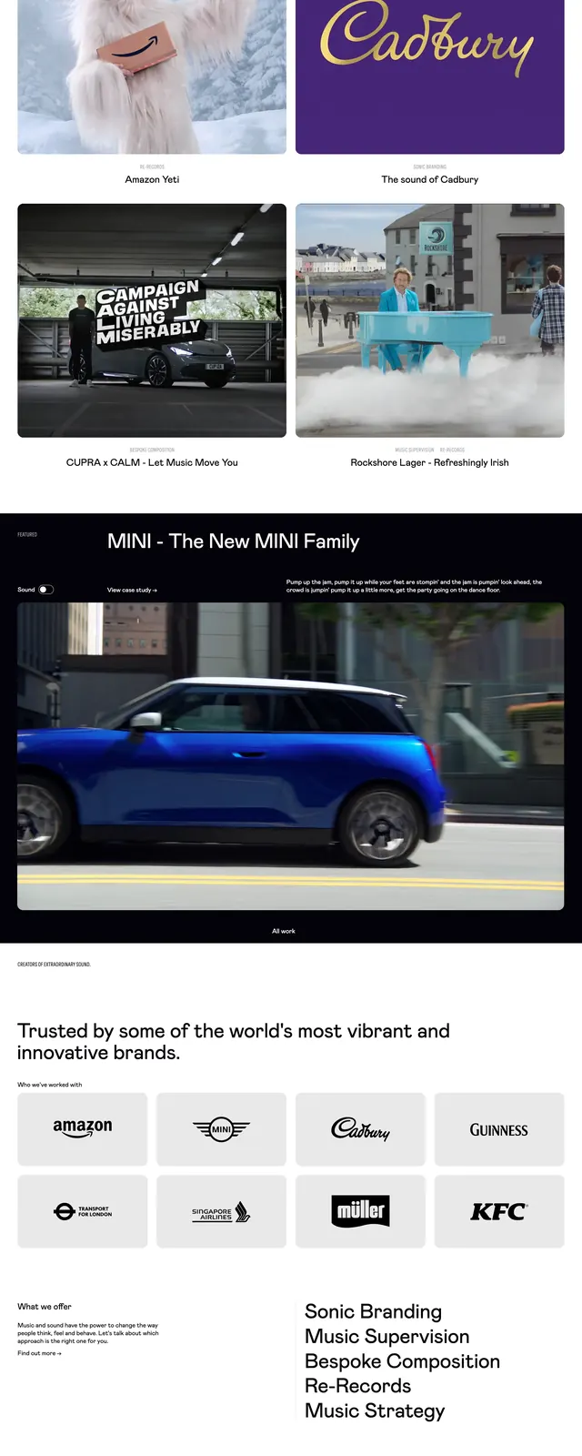
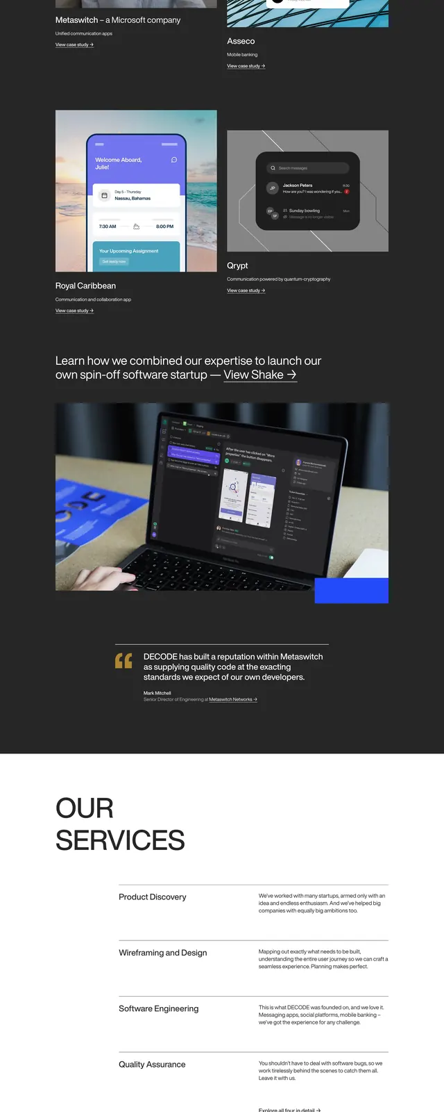
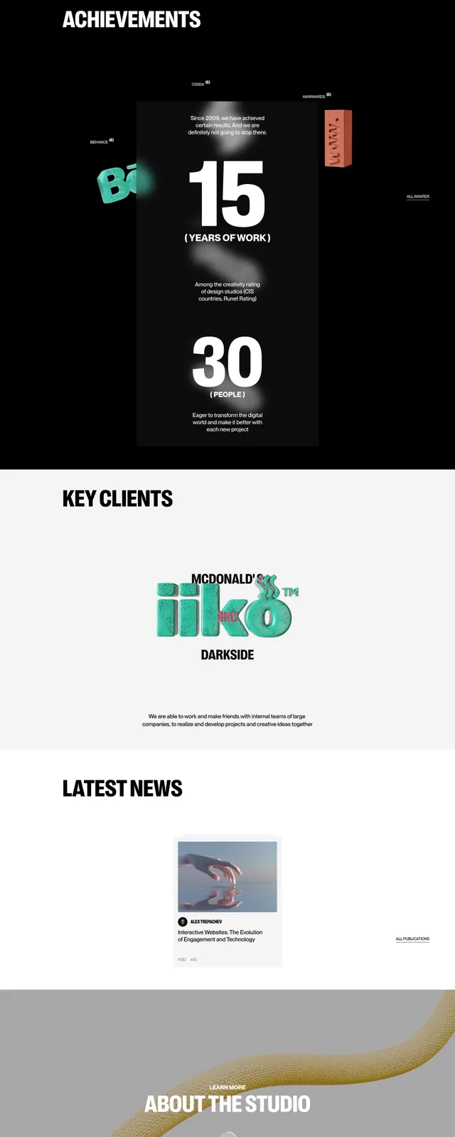
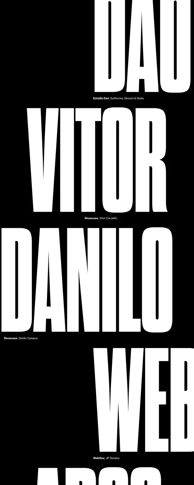
A dark, editorial agency homepage with oversized hero type, large case-study imagery, and a minimal footer treatment.
Summary
A dark, editorial agency homepage with oversized hero type, large case-study imagery, and a minimal footer treatment.
Visual description
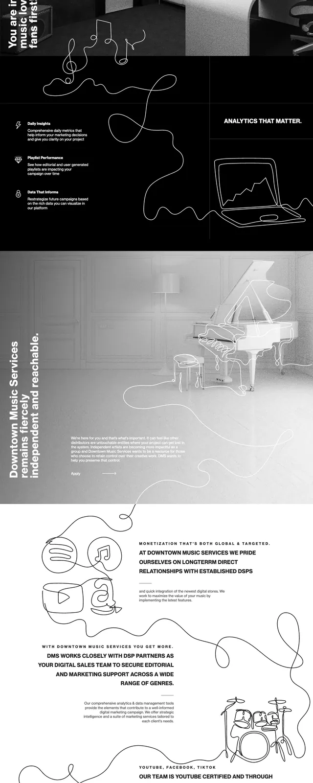
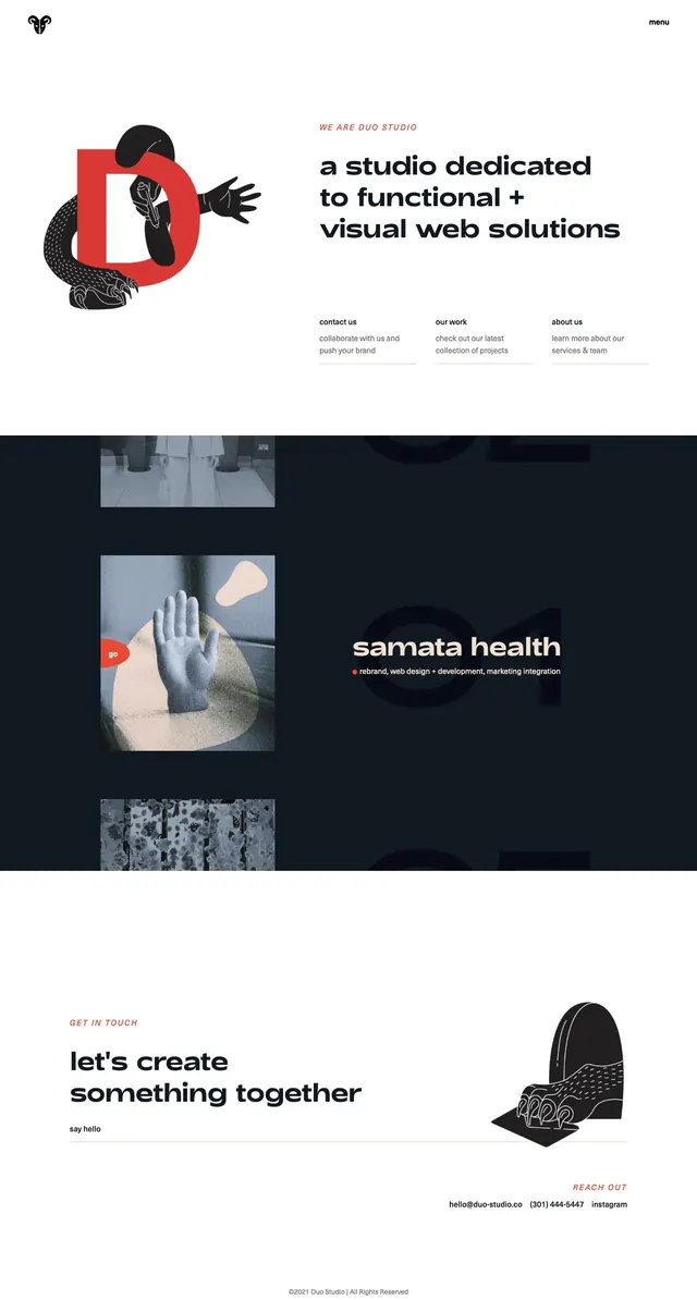
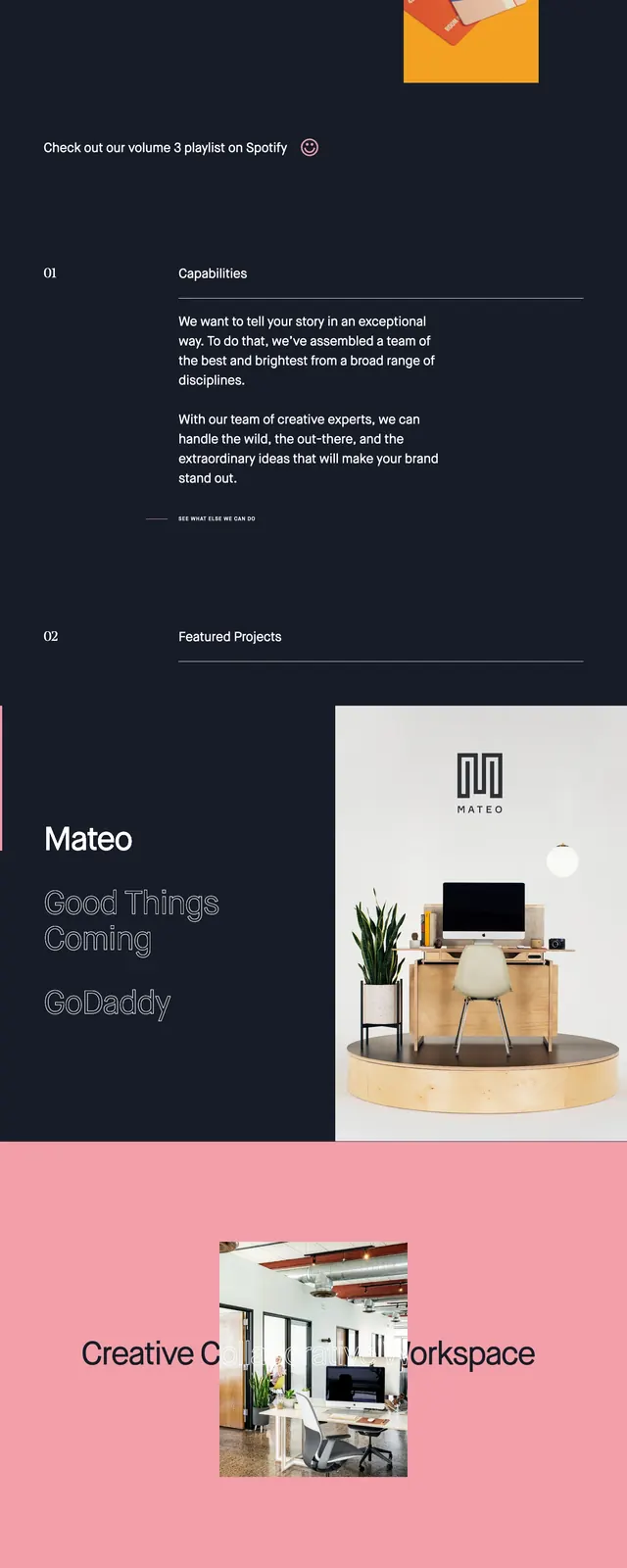
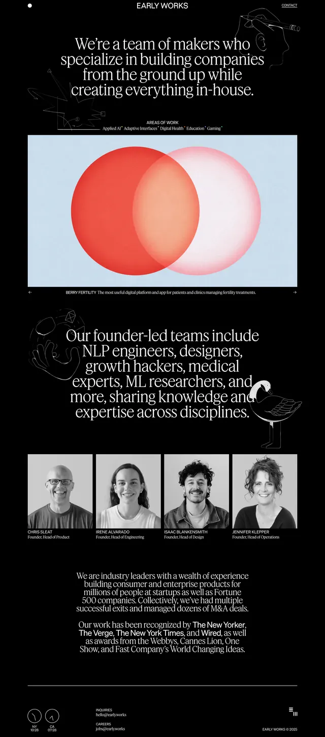
The page opens on a near-black hero with a small logo, compact navigation buttons, and a very large white headline aligned left. Below it sits a wide framed image area with a light grid background and thin line-art shapes, followed by a short supporting line of copy. Further down, the page switches to a centered statement section, a dark case-study preview card, a two-column testimonial quote, and a large muted footer with an outlined BRIGHTSCOUT wordmark.
Key takeaway
The strongest pattern is the contrast between stark dark hero framing and airy, high-contrast editorial sections beneath it. Large typography, minimal navigation, and oversized visual blocks make the brand feel polished and agency-led.
Reuse notes
Use this approach for agency or consultancy homepages that need a premium, modern feel without heavy UI chrome. It works best when the page can alternate between bold type-led messaging and large portfolio or case-study imagery.