Preview image. Unlock full-res
A minimalist agency homepage with a vivid coral hero, oversized serif headlines, and spacious editorial sections.
Summary
A minimalist agency homepage with a vivid coral hero, oversized serif headlines, and spacious editorial sections.
Visual description
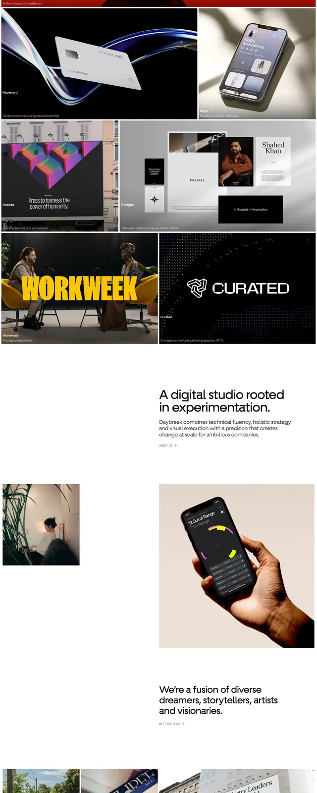
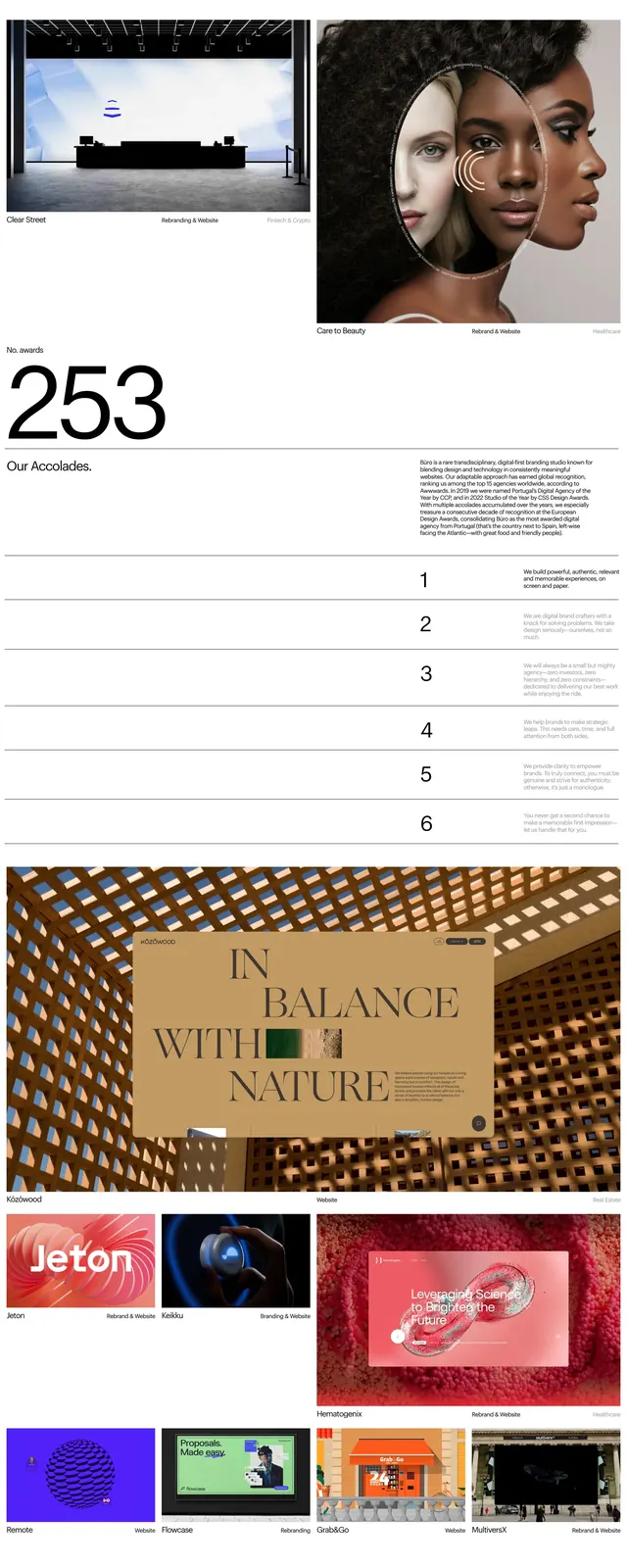
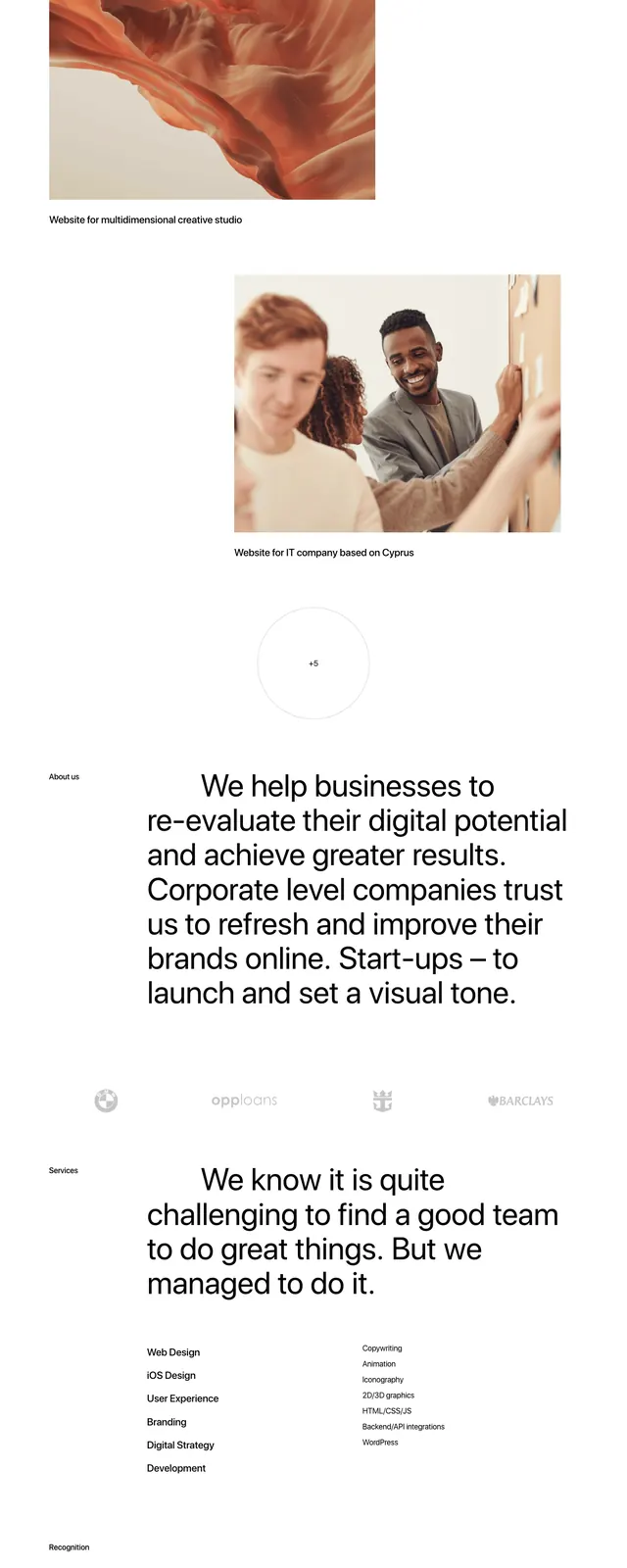
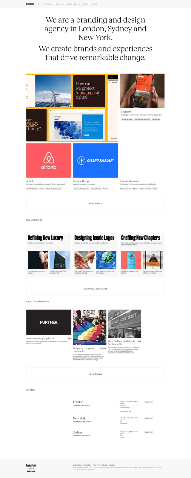
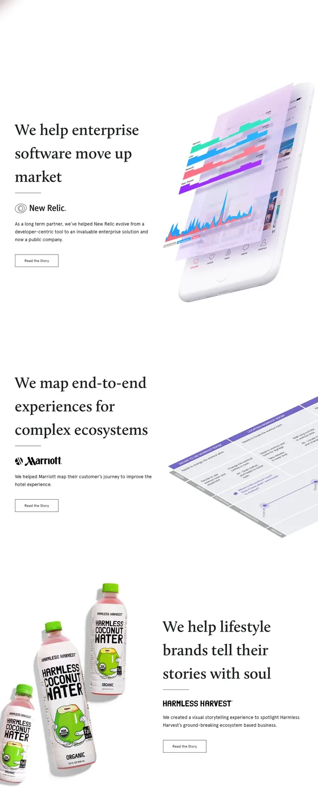
The page opens with a full-width coral-red hero featuring a small top navigation, the Telepathy wordmark, and a centered oversized serif headline with a short supporting sentence and a subtle downward arrow. Below the hero, the page switches to a very white, spacious editorial layout with large case-study statements on the left and angled product or process imagery on the right. Mid-page, two side-by-side blocks present Services and Work over photographic backgrounds, followed by a pale newsletter signup band and a sparse footer with links and social icons.
Key takeaway
The strongest move is the contrast between the bold color-blocked hero and the restrained white editorial sections below. The oversized serif type and generous negative space make the agency positioning feel premium and confident.
Reuse notes
Use this pattern for agency, consultancy, or portfolio sites that need a polished editorial feel with clear storytelling. It works best when paired with strong case-study imagery and short, high-impact copy.