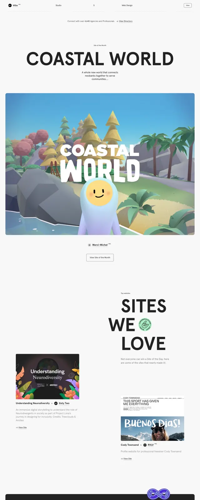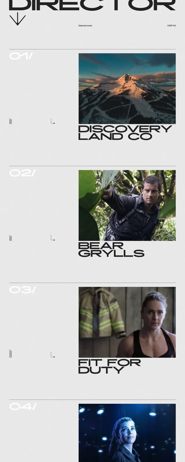
Preview image. Unlock full-res
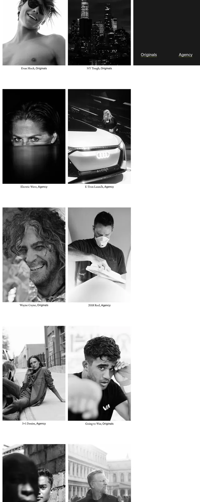
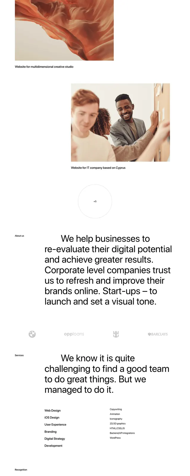
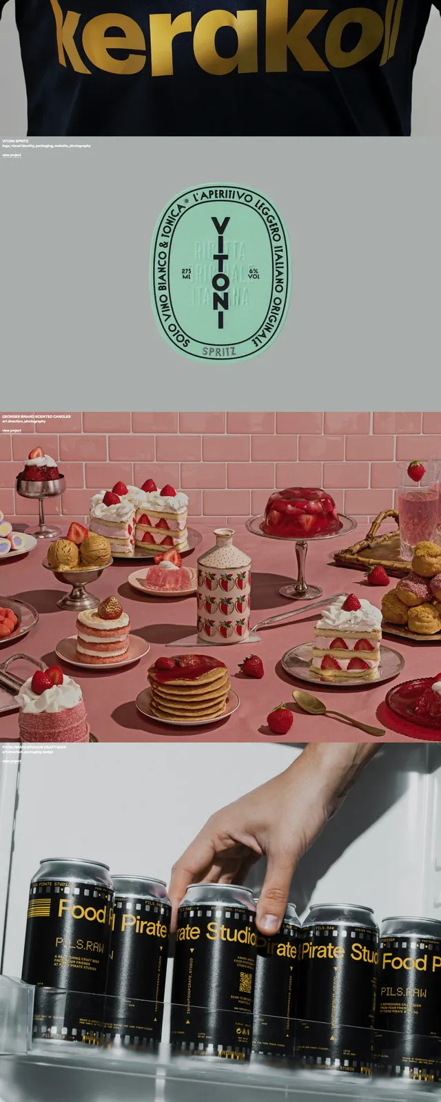
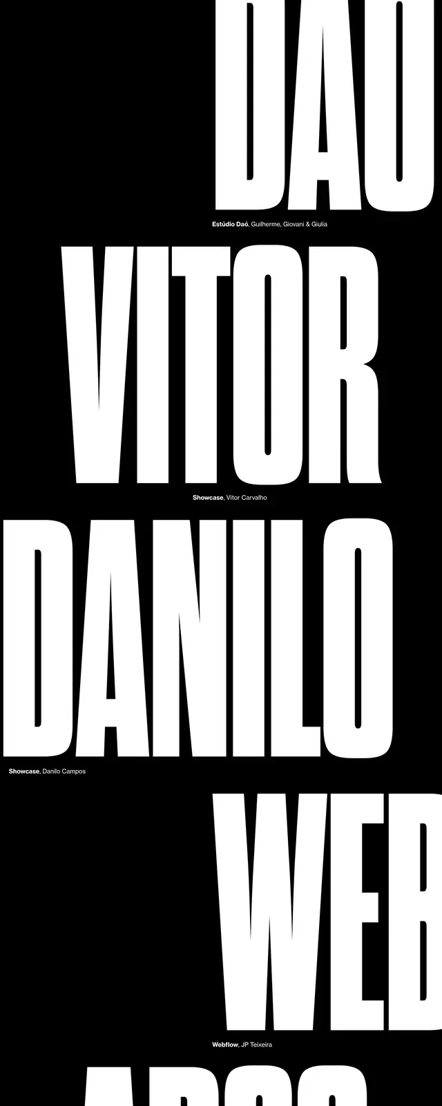
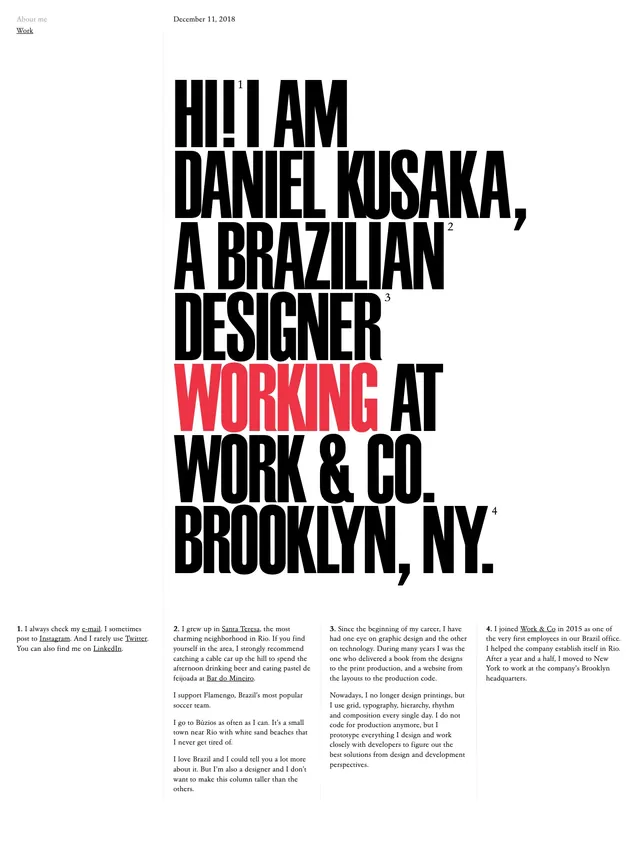
A monochrome portfolio site with oversized condensed typography, thin divider lines, and stacked project previews on a clean light background.
Summary
A monochrome portfolio site with oversized condensed typography, thin divider lines, and stacked project previews on a clean light background.
Visual description
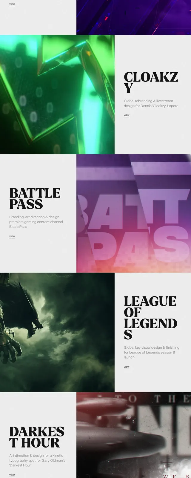
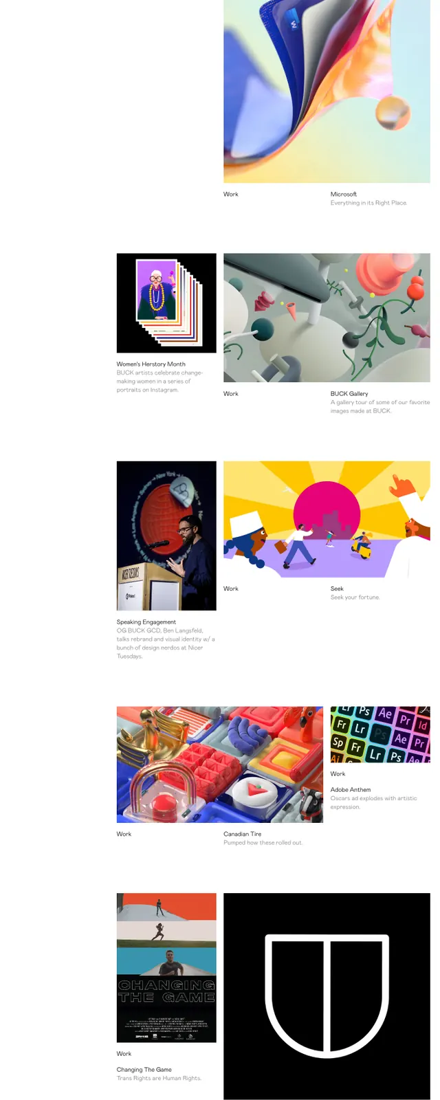
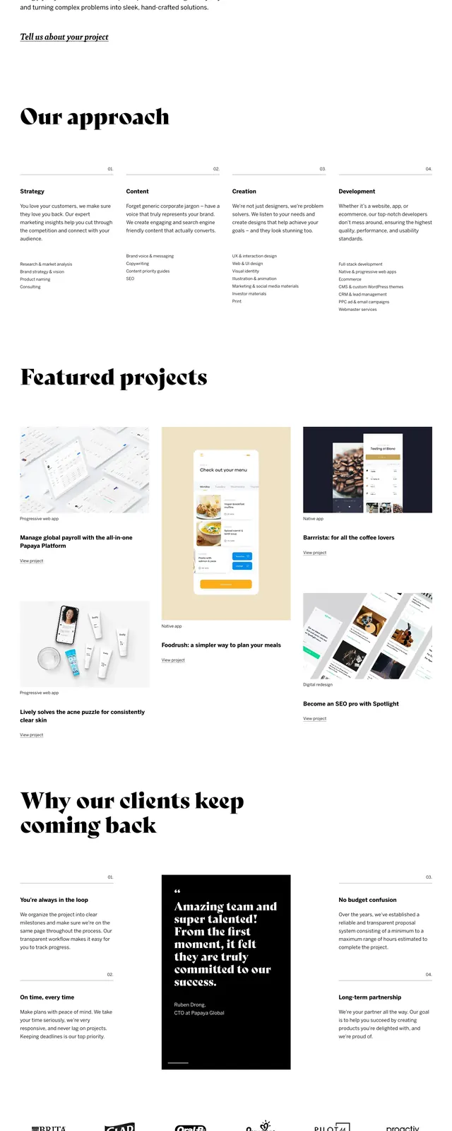
The page opens with a large hero statement set in heavy all-caps type, spanning multiple lines and anchored by a simple top navigation. Below, the layout switches to stacked project slices with large numeric labels, thin horizontal rules, and image-led case study previews. The overall composition uses generous negative space, tight alignment, and strong typographic contrast to keep the page feeling sparse and deliberate.
Key takeaway
The main visual idea is to let typography do the branding work, with imagery and section dividers acting as restrained supporting elements. It is a strong reference for portfolio sites that want to feel editorial and high-end without extra decoration.
Reuse notes
Reuse the oversized condensed headline treatment, thin rule separators, and numbered project list structure for a refined portfolio or case study landing page. The same system works well when paired with restrained monochrome UI and a few carefully cropped images.