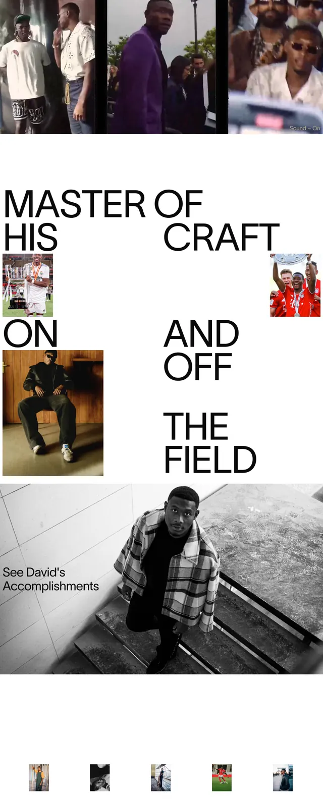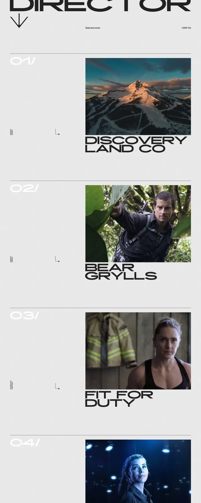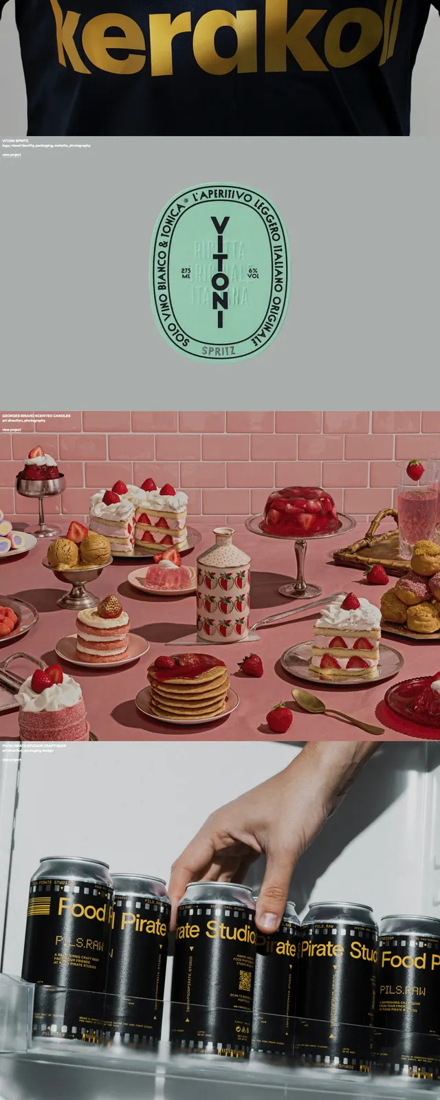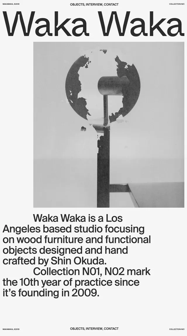
Preview image. Unlock full-res
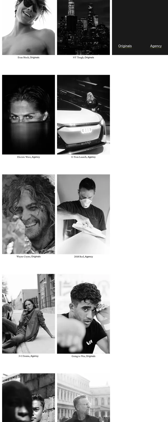
A stark black-and-white editorial homepage with oversized typography, sparse navigation, and a grid of photographic projects.
Summary
A stark black-and-white editorial homepage with oversized typography, sparse navigation, and a grid of photographic projects.
Visual description
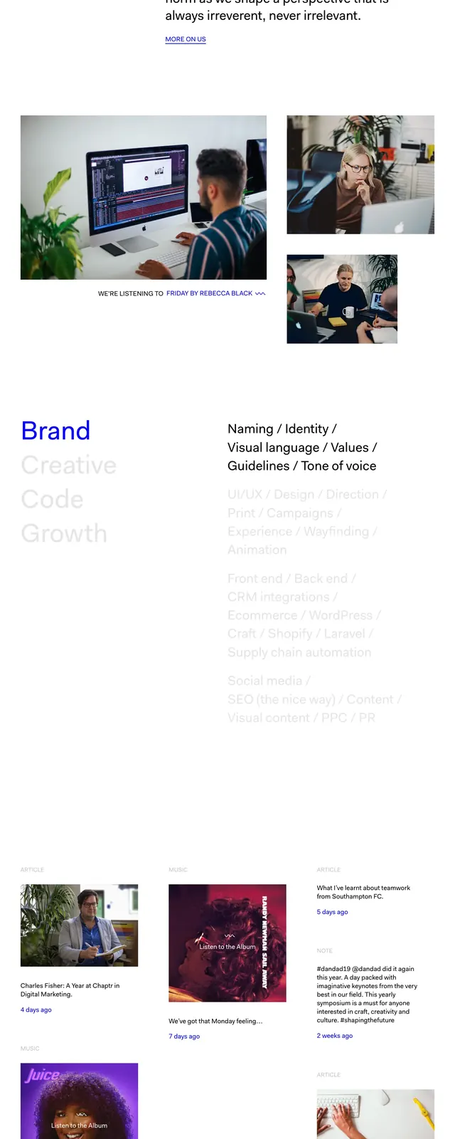
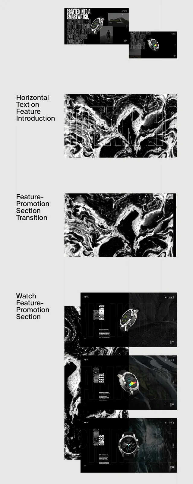
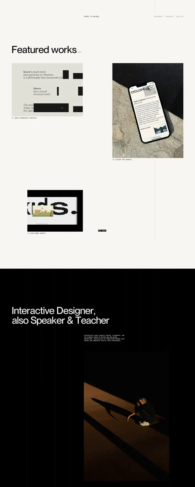
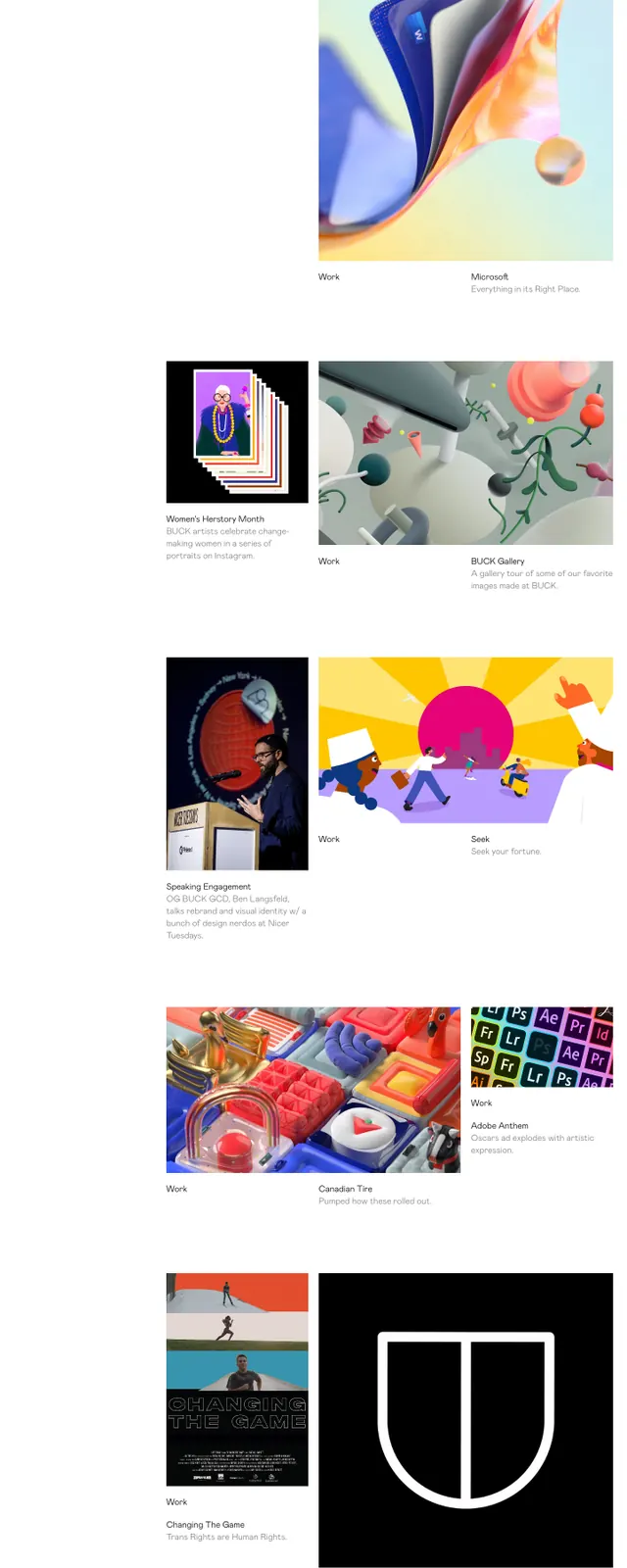
The page opens with a huge black wordmark-like headline spanning nearly the full width of the screen, set on a white background with very small navigation text at the top. Below the hero, large areas of whitespace separate compact editorial copy from a set of grayscale project thumbnails arranged in a loose two-column grid. Further down, a newsletter-style prompt appears beside a thin underline input field, followed by a small landscape image and a minimal footer with city and social links.
Key takeaway
The design relies on extreme typography scale, monochrome imagery, and generous whitespace to create a high-fashion editorial feel. It feels more like a curated magazine spread than a conventional agency site.
Reuse notes
Reuse the oversized hero headline, sparse top navigation, and photographic case-study grid for a portfolio or creative studio landing page. Keep the palette strictly monochrome and preserve the large whitespace to maintain the same editorial tension.