Preview image. Unlock full-res
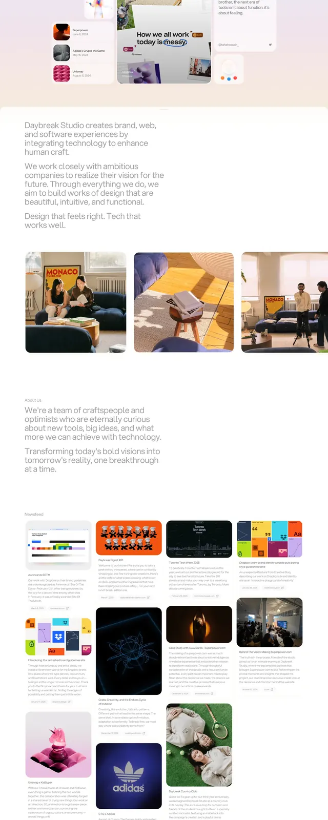
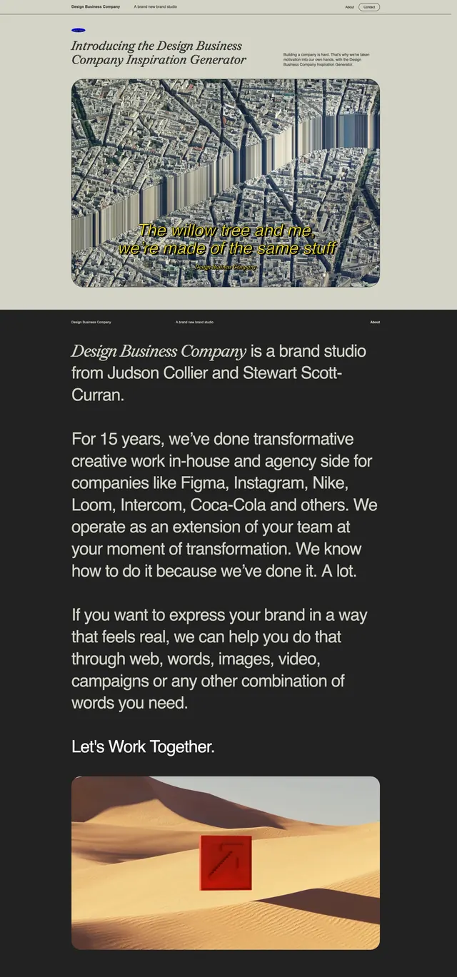
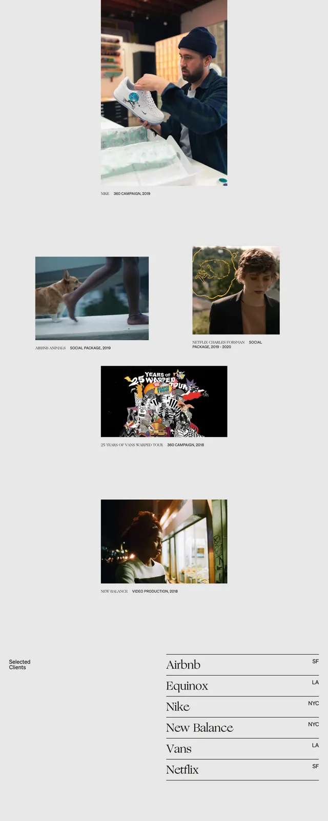
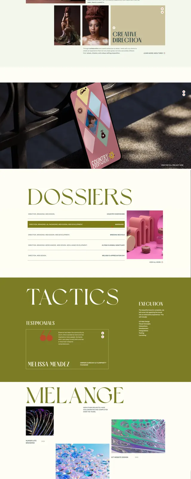
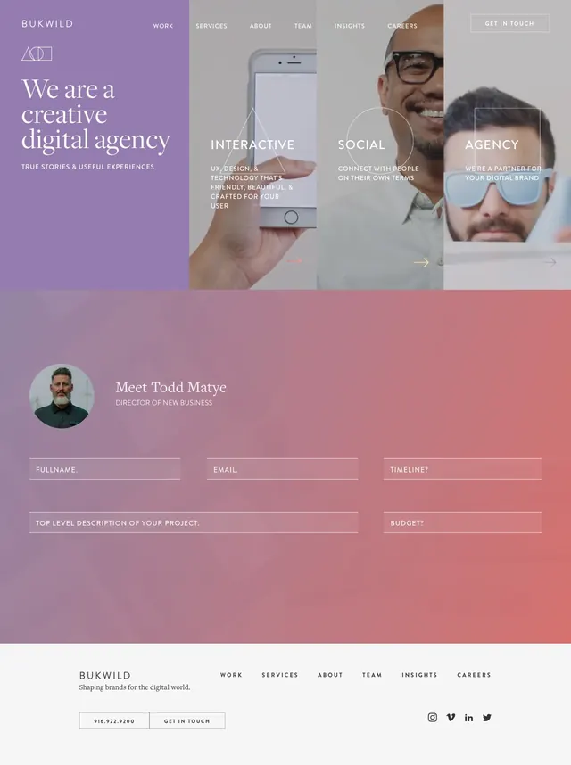
A soft gradient agency landing page with split hero panels, large serif headline, and a contact form section repeated through the page.
Summary
A soft gradient agency landing page with split hero panels, large serif headline, and a contact form section repeated through the page.
Visual description
The page opens with a split hero: a purple left panel with the Bukwild wordmark and large serif headline, and three narrow photographic columns on the right with overlaid service labels. The navigation is thin and understated, with a boxed call-to-action button in the top right. Below, a soft pink-to-coral gradient contact section features an avatar, a staff intro, and thin outlined form fields, then the same contact block appears again further down the page before a simple footer.
Key takeaway
The design combines editorial typography with a restrained photographic grid and washed gradient panels to create a polished agency feel. Repeated contact-form sections and lightweight navigation make the layout feel reusable and conversion-oriented.
Reuse notes
This works well for agency or creative studio sites that want a premium but approachable first impression. Reuse the split hero structure, serif headline contrast, and translucent gradient contact section for a similar brand tone.