Preview image. Unlock full-res
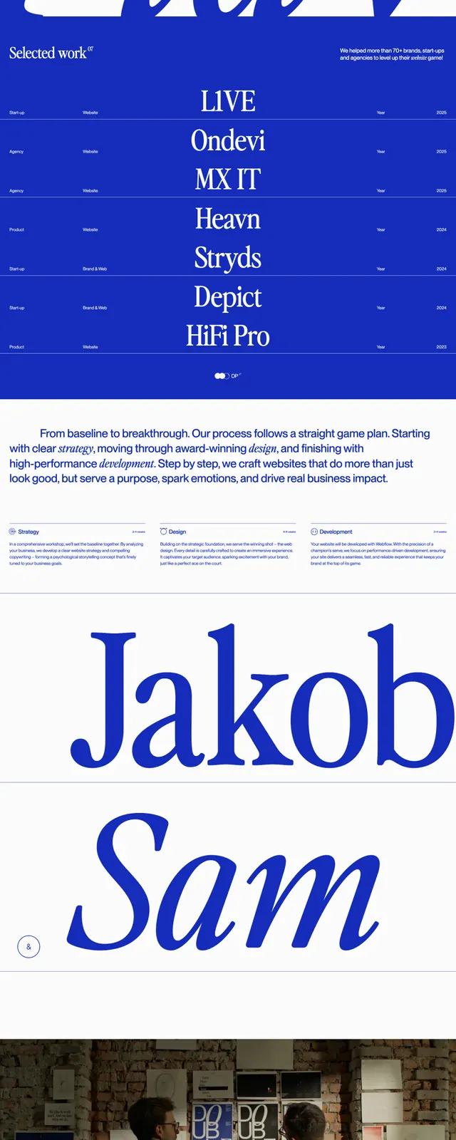
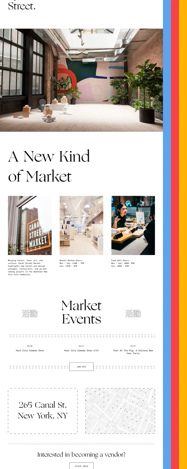
An editorial, high-fashion style market homepage with oversized serif typography, white space, and bright vertical color bars along the right edge.
Summary
An editorial, high-fashion style market homepage with oversized serif typography, white space, and bright vertical color bars along the right edge.
Visual description
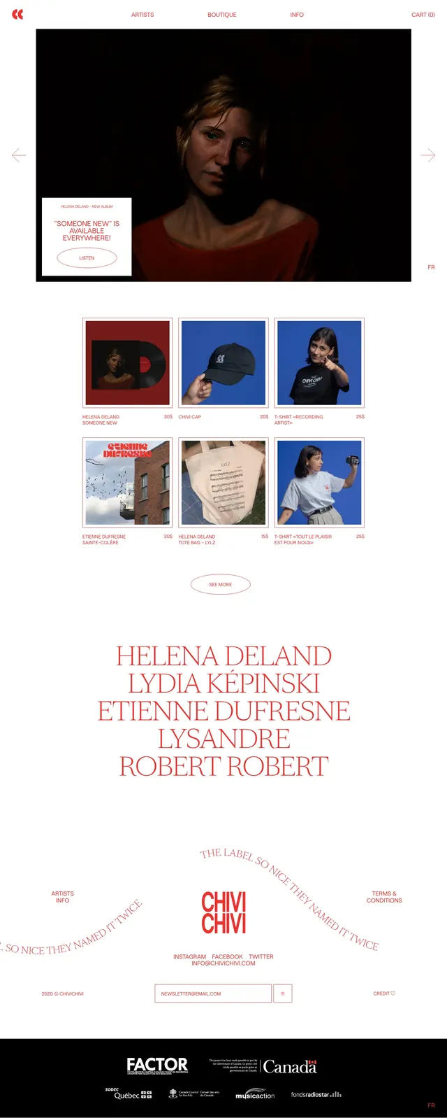
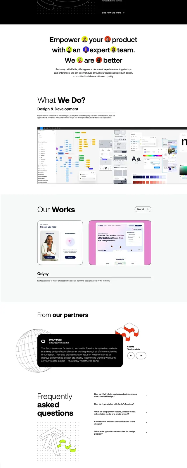
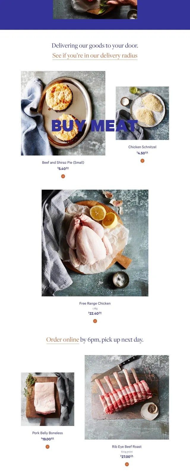
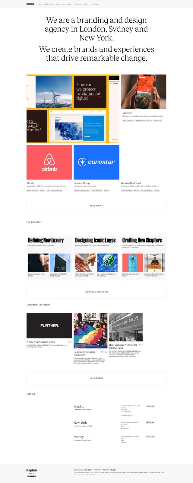
The page uses a large serif headline at the top left on a white background, with narrow vertical rainbow-colored bars fixed along the right edge. A wide interior photo breaks the page into sections, followed by a second oversized serif heading and a three-column grid of image cards with short descriptive text. Lower on the page are a dashed-outline address panel, a map panel, a vendor call-to-action button, contact tiles, and a newsletter signup field in a sparse, magazine-like layout.
Key takeaway
The strongest reusable move is the combination of editorial serif typography with clean white space and hard-edge color accents. The page feels structured but expressive because the layout alternates between text blocks, photography, and thin outlined utility panels.
Reuse notes
Use this pattern for cultural retail, hospitality, or experience-driven brands that need to feel curated and design-forward. It works best when you have strong photography, a simple CTA flow, and a brand palette that can support vivid accent bars without overwhelming the content.