Preview image. Unlock full-res
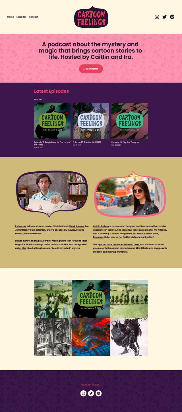
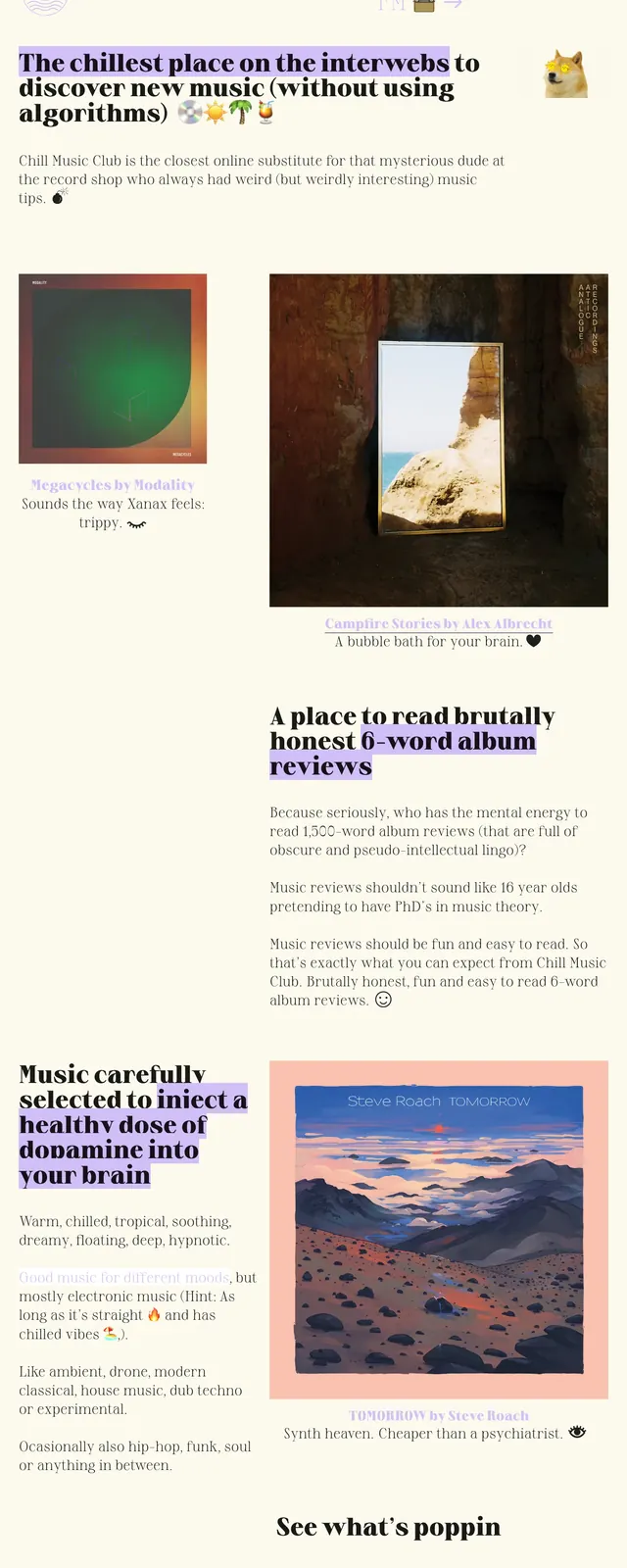
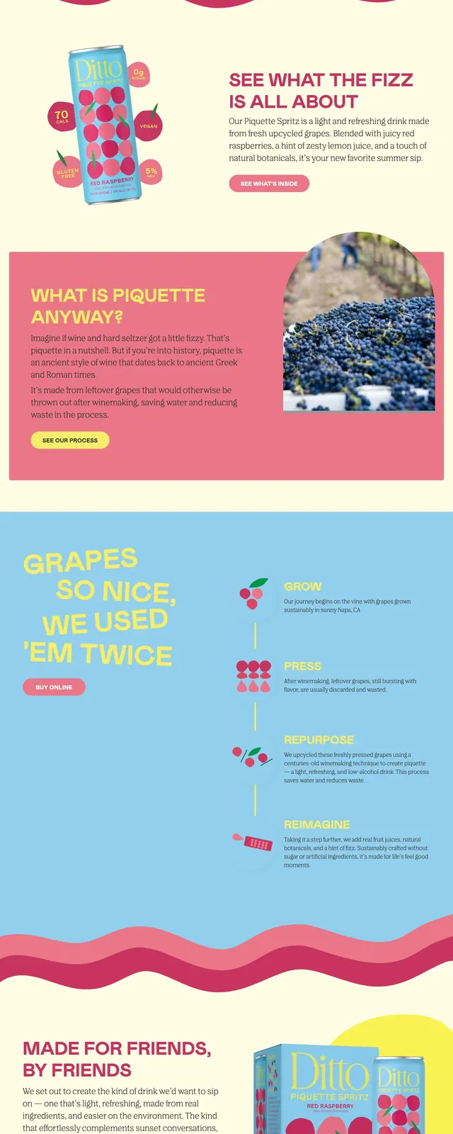
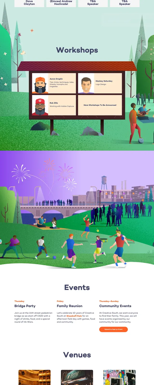
A playful editorial landing page for a personalized reading app, combining soft cream backgrounds, bold branding, and colorful section breaks with product-focused storytelling.
Summary
A playful editorial landing page for a personalized reading app, combining soft cream backgrounds, bold branding, and colorful section breaks with product-focused storytelling.
Visual description
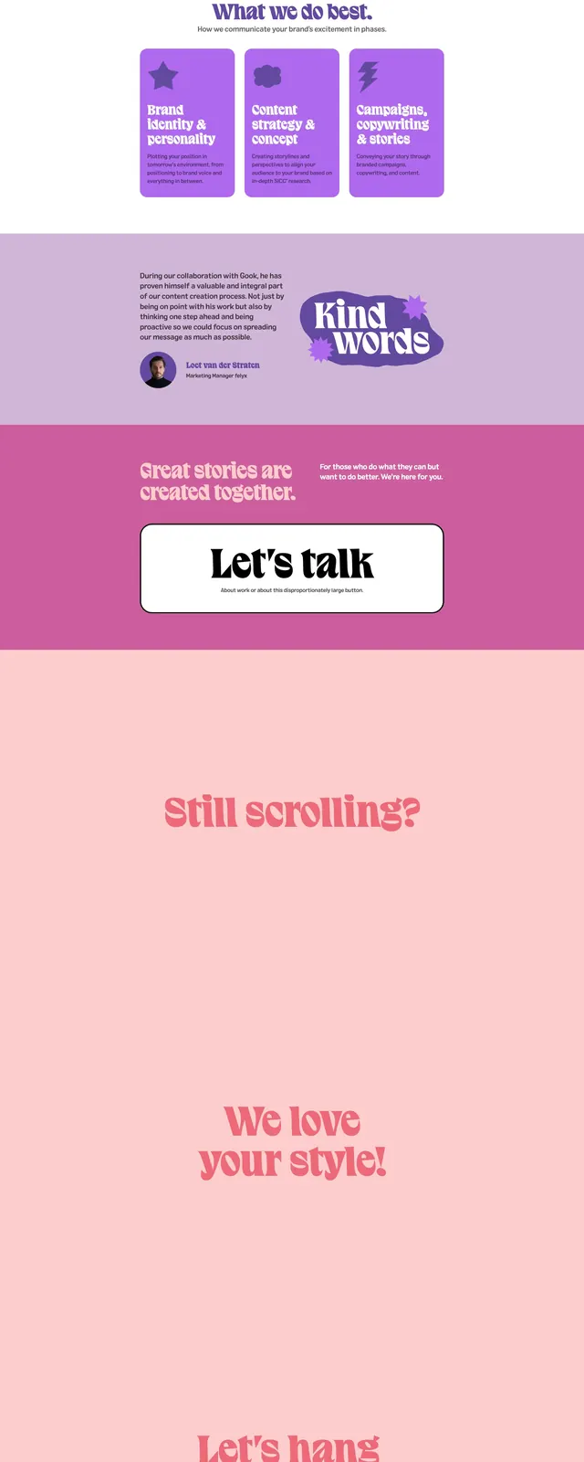
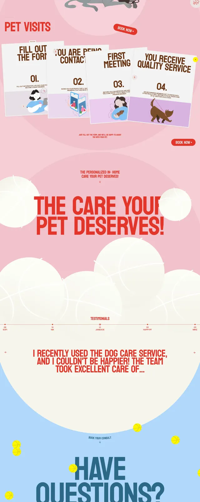
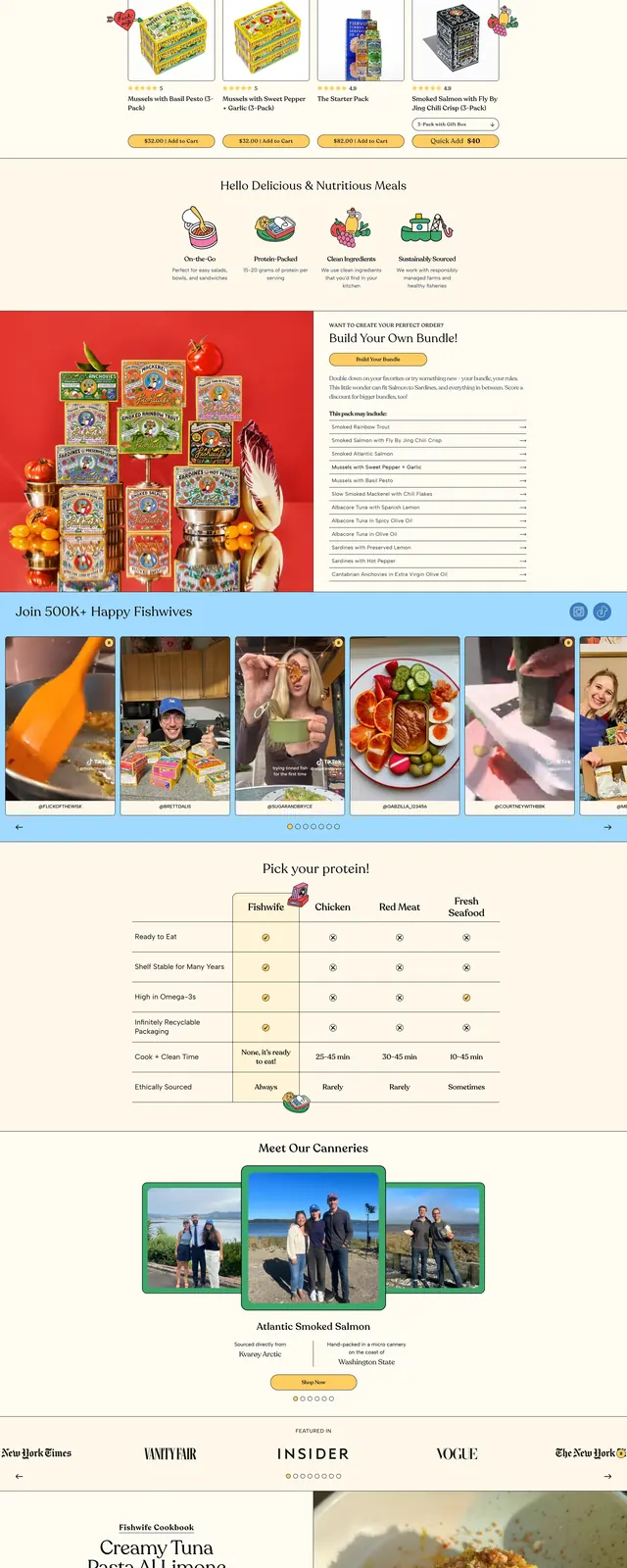
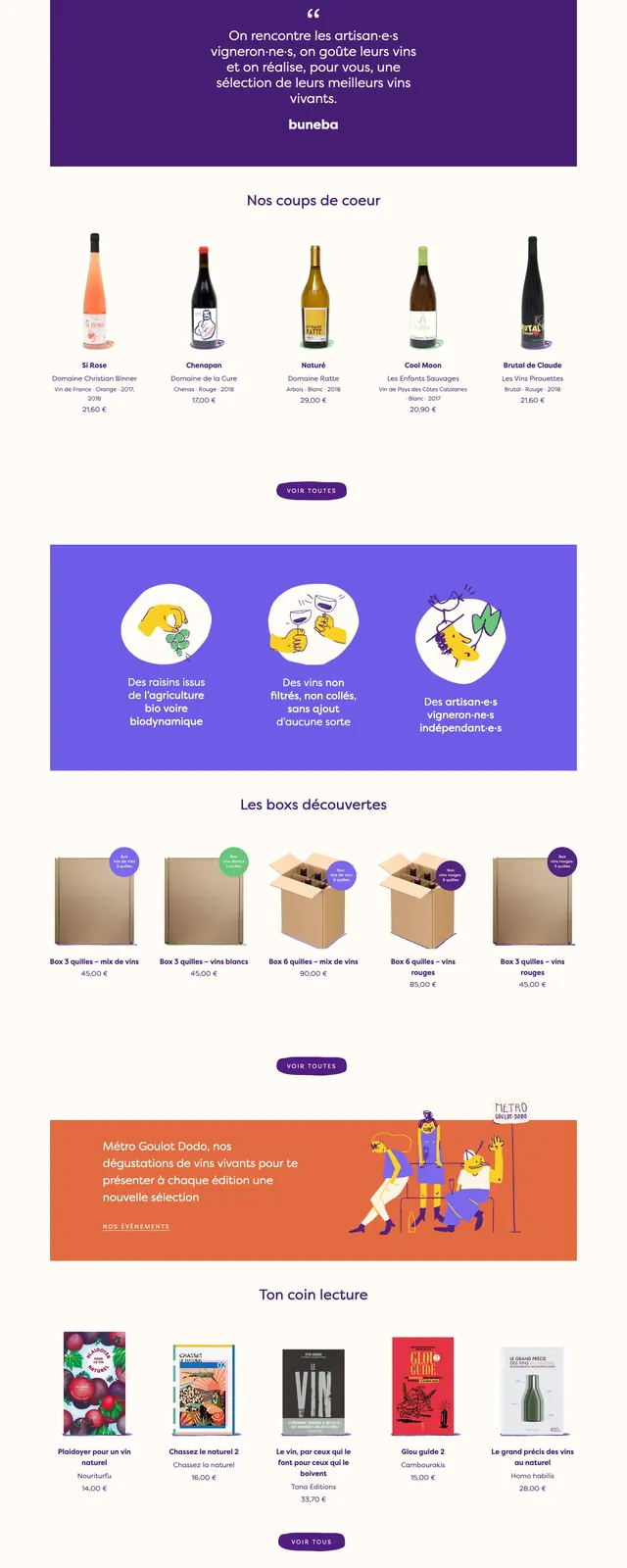
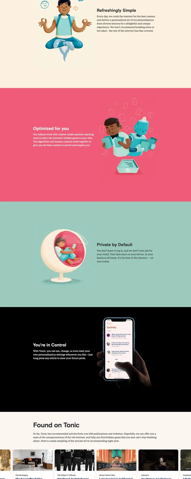
The page opens with a centered top navigation, a large branded wordmark, and a split hero layout featuring a phone mockup on the right and a bold app message on the left. The design uses cream backgrounds, rounded coral and navy accents, and whimsical illustrated separators between sections. Lower on the page are colorful feature bands, a testimonial-style content strip, an FAQ accordion, and a dark footer with newsletter signup. The overall composition feels airy, friendly, and highly art-directed.
Key takeaway
The strongest pattern is a brand-led hero paired with playful editorial sectioning and strong color blocking. It is well suited for consumer apps that want to feel polished, human, and slightly whimsical.
Reuse notes
Reuse the split hero, oversized brand title, and single clear CTA for a strong first impression. The section-divider waves and illustrated feature panels are useful for turning a standard product page into a more memorable narrative experience.