Preview image. Unlock full-res
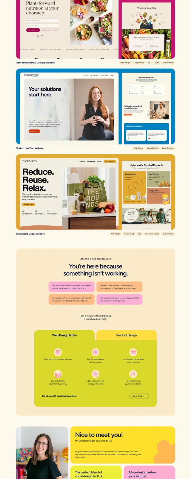
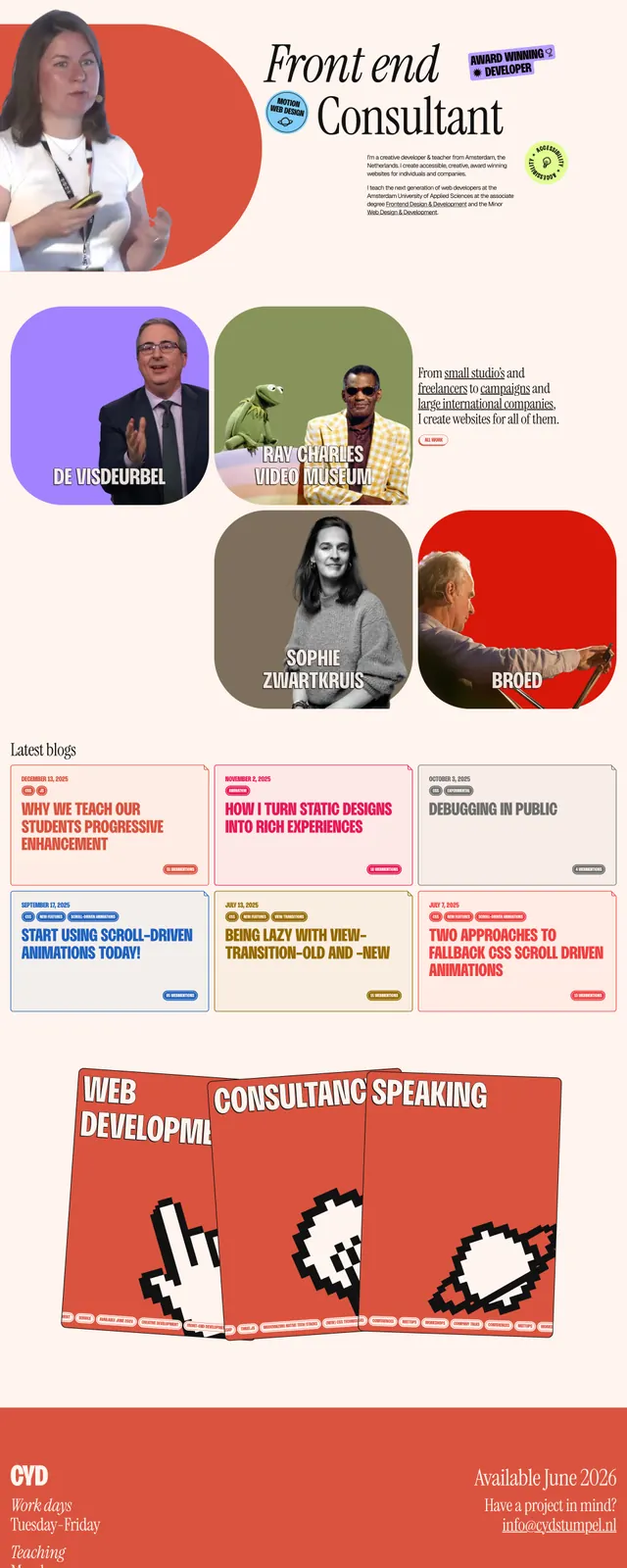
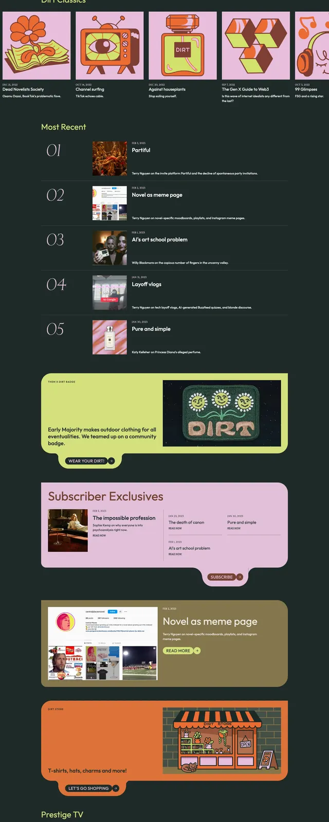
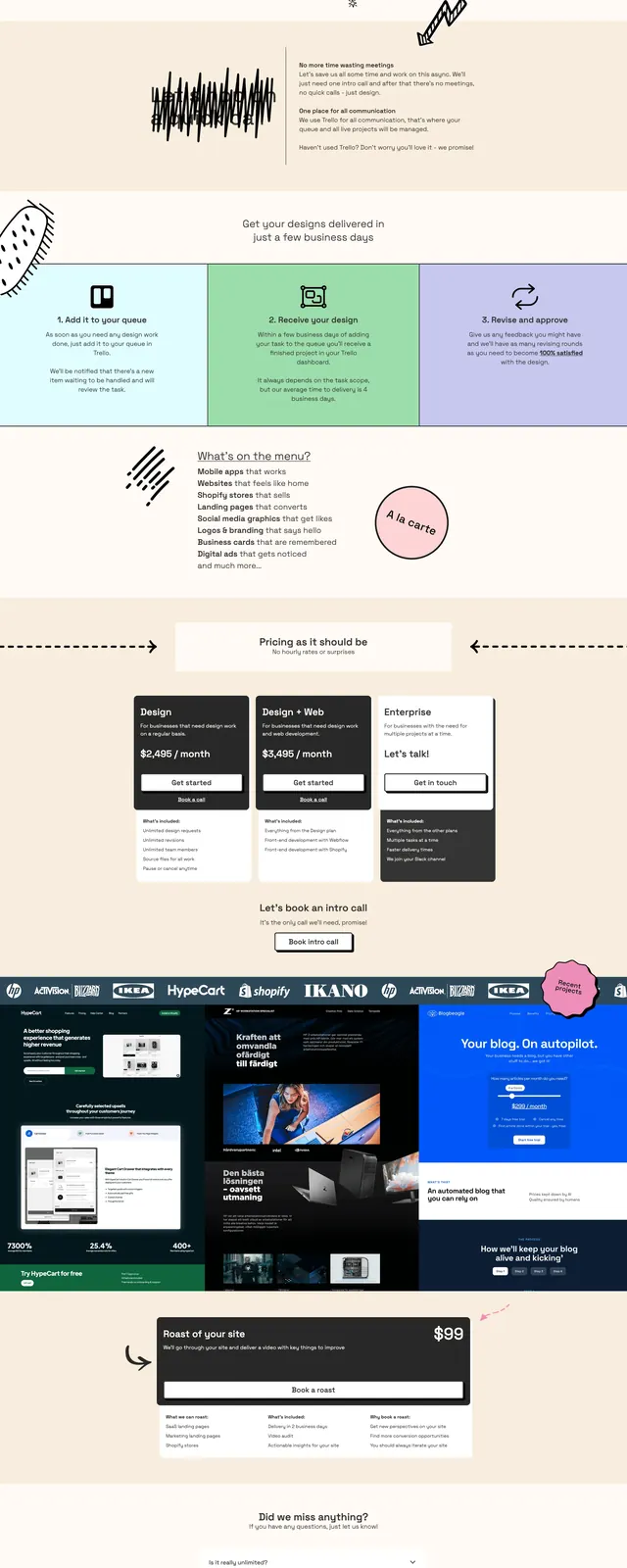
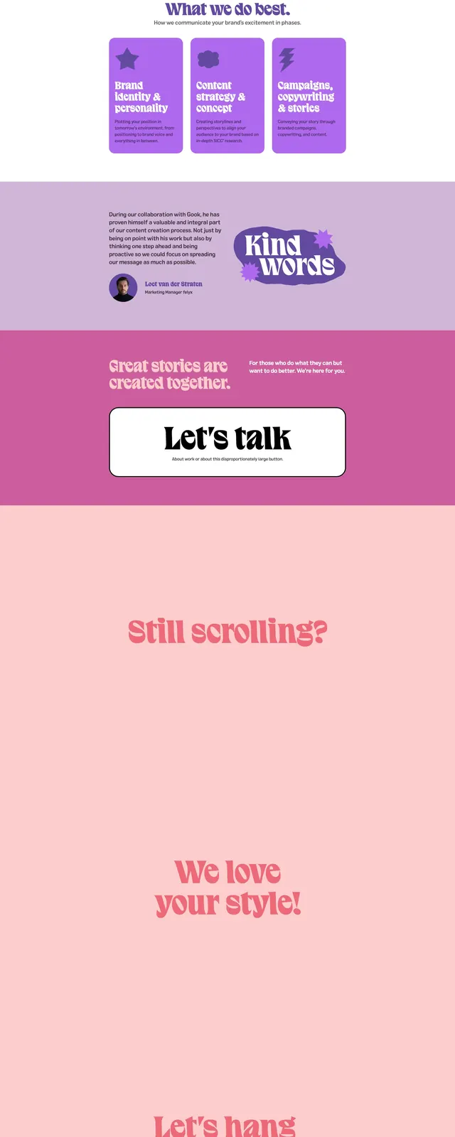
A playful agency landing page with oversized retro typography, pastel color blocking, and bold call-to-action sections.
Summary
A playful agency landing page with oversized retro typography, pastel color blocking, and bold call-to-action sections.
Visual description
The page uses a large centered hero with a hot pink logo-style headline on a pale pink background. Below it are alternating full-width sections with lots of white space, a split about block, a purple image strip, and a prominent rounded white CTA card. The page ends with another oversized brand lockup and a simple footer on a deep purple background.
Key takeaway
The design leans on exaggerated serif display type, soft pink and purple blocks, and minimal navigation to create a distinct personality. It feels like a creative studio or branding site built to emphasize attitude and memorability over density.
Reuse notes
Reuse the oversized wordmark hero, the high-contrast pastel palette, and the centered CTA card as the main pattern. The alternating full-bleed color bands and sparse content blocks make the layout easy to adapt for agency or portfolio sites.