Preview image. Unlock full-res
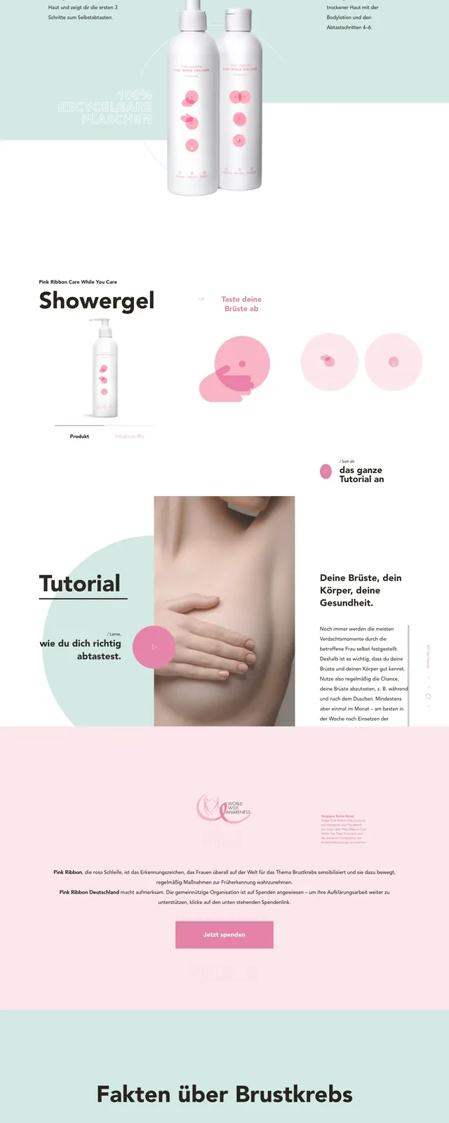
A soft, editorial health-awareness landing page for Carewhileyoucare with a split hero, pink product imagery, and large informational sections below.
Summary
A soft, editorial health-awareness landing page for Carewhileyoucare with a split hero, pink product imagery, and large informational sections below.
Visual description
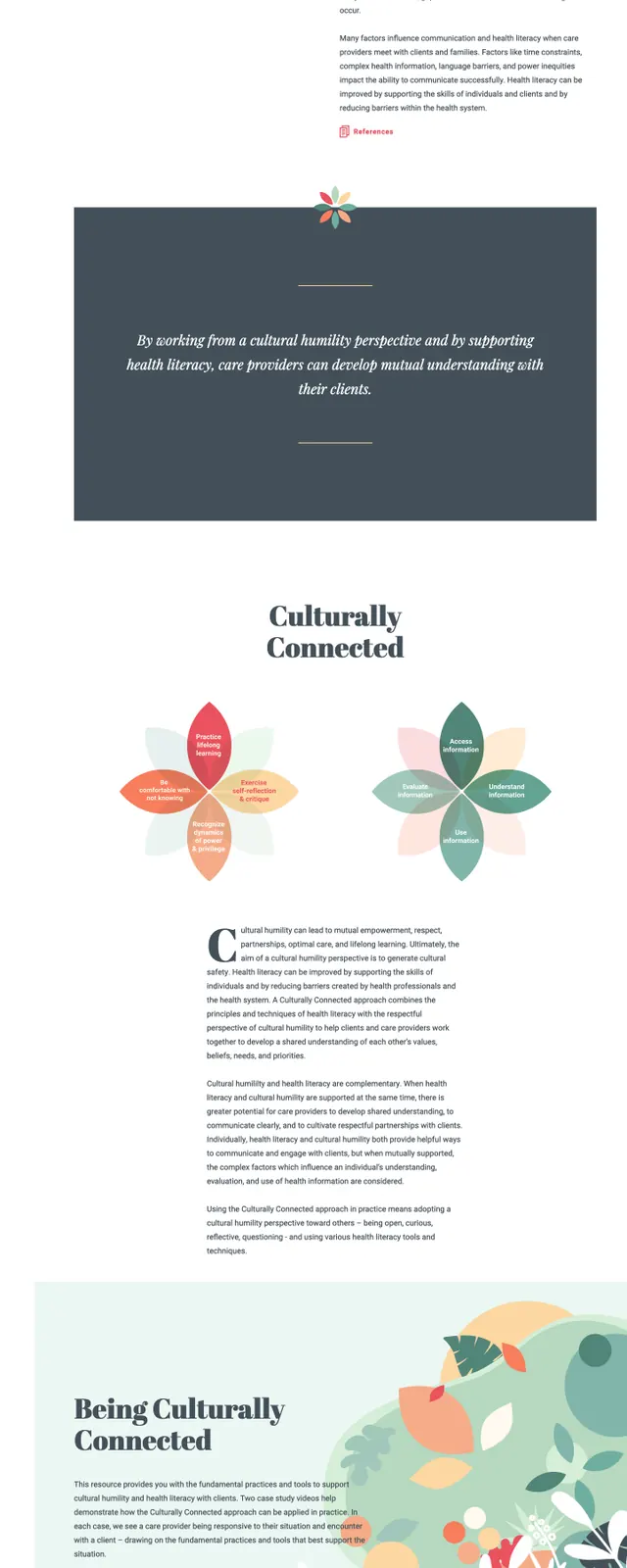
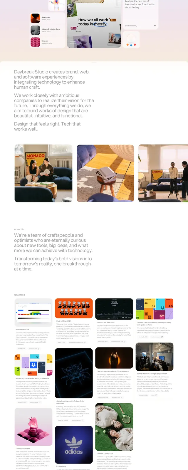
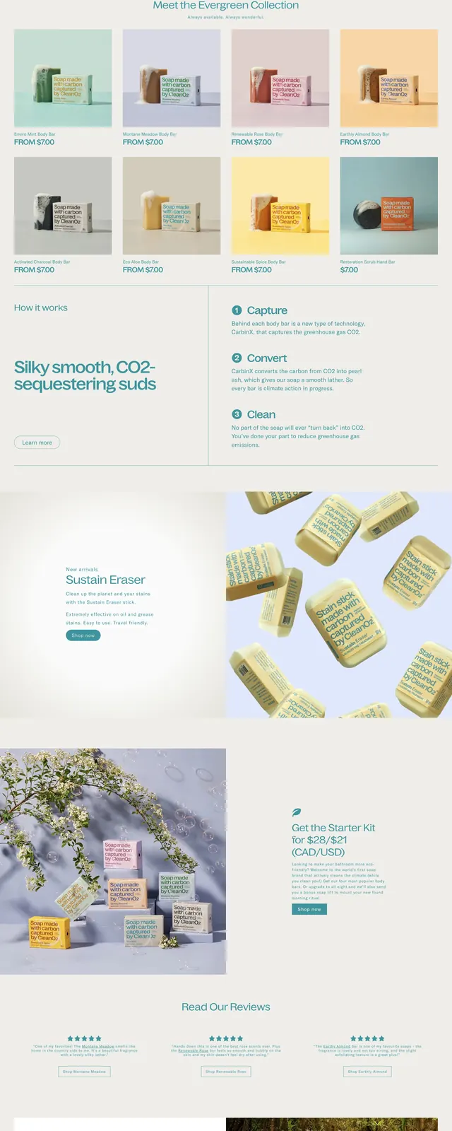
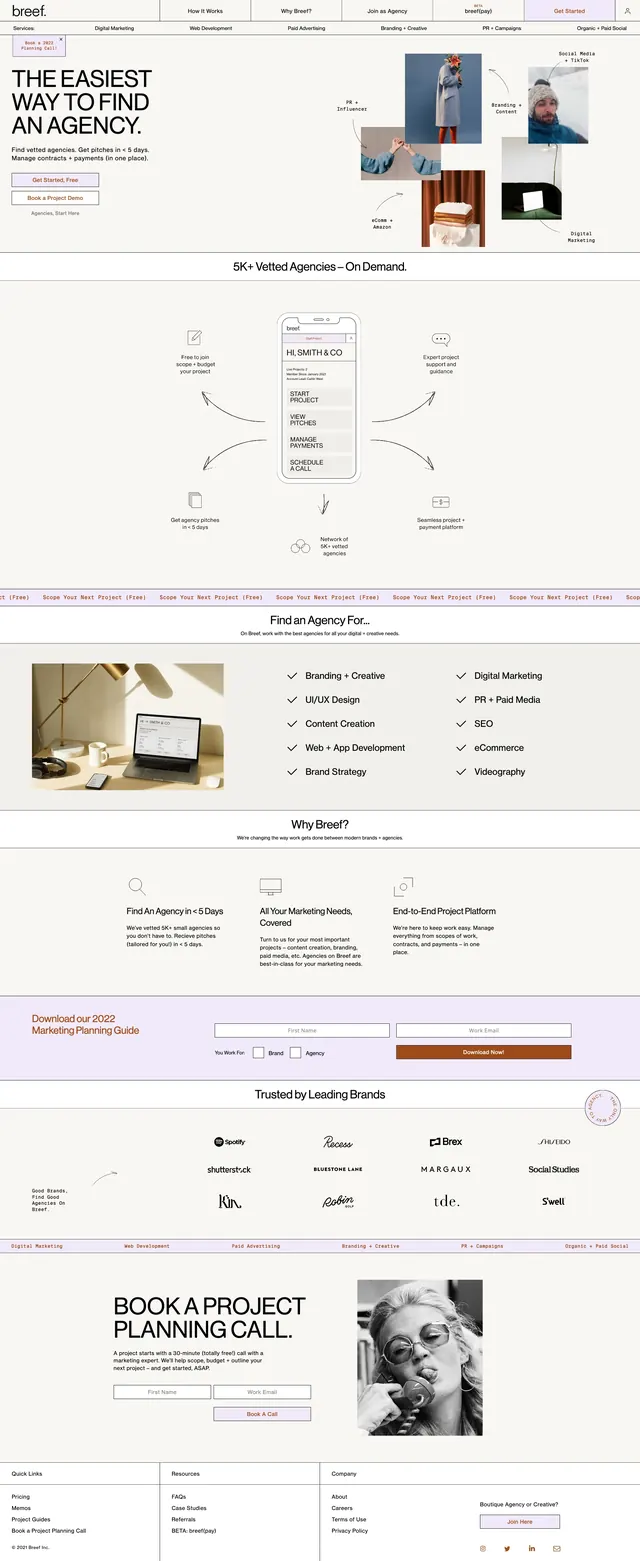
The page opens with a wide split hero: a bold German headline and supporting copy on the left, a portrait photo in the center, and a product promo panel on the right with pink circular accents and bottle imagery. The color palette is very light, dominated by white and pale mint with soft pink highlights. Below the hero are stacked content blocks, including a tutorial section with a breast self-exam image, a three-column statistics/info band, and a dark footer with social icons and campaign text.
Key takeaway
Use a soft editorial layout to make a health-awareness message feel approachable without losing seriousness. The strongest pattern is the mix of oversized type, pale negative space, and product/lifestyle imagery.
Reuse notes
This works well for nonprofit or healthcare landing pages that need to combine education, product awareness, and emotional appeal. The layout depends on strong photography and careful spacing, so it is less effective with dense copy or busy visuals.