Preview image. Unlock full-res
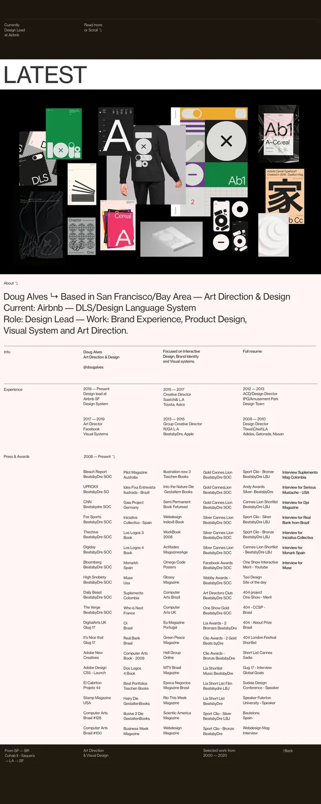
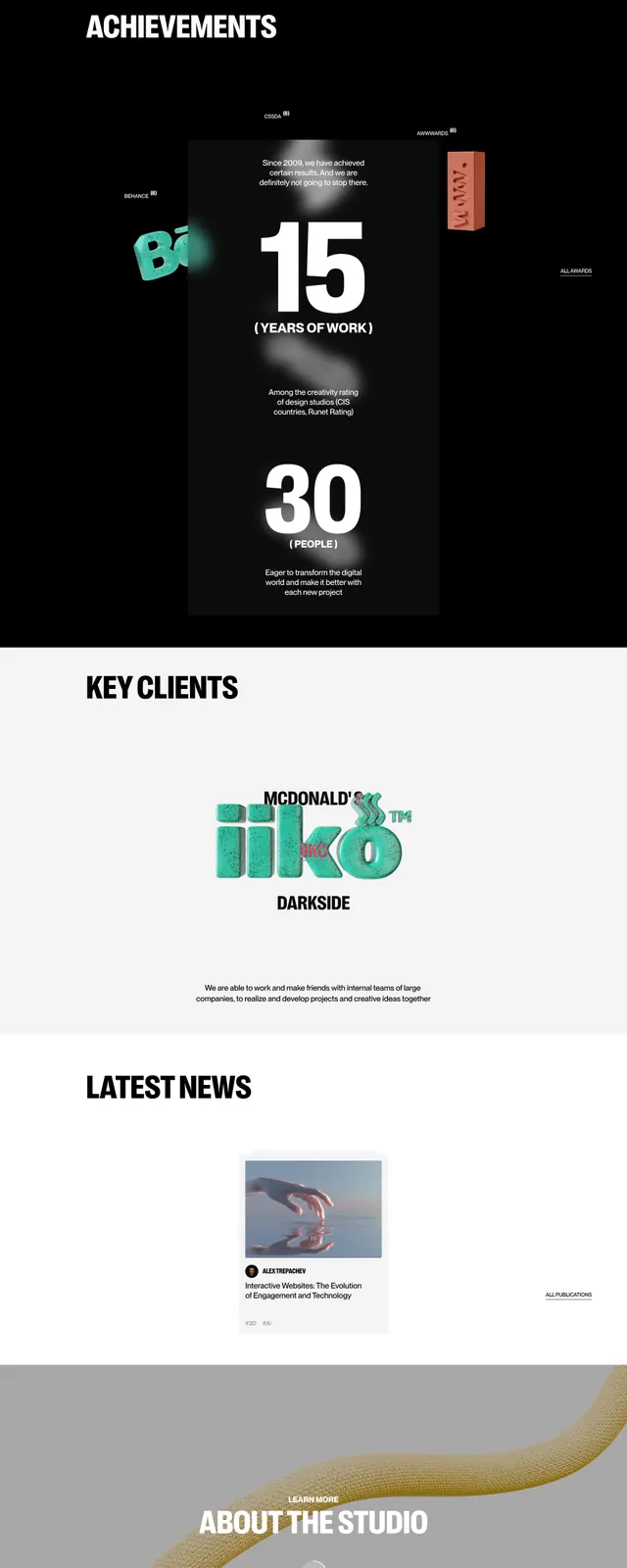
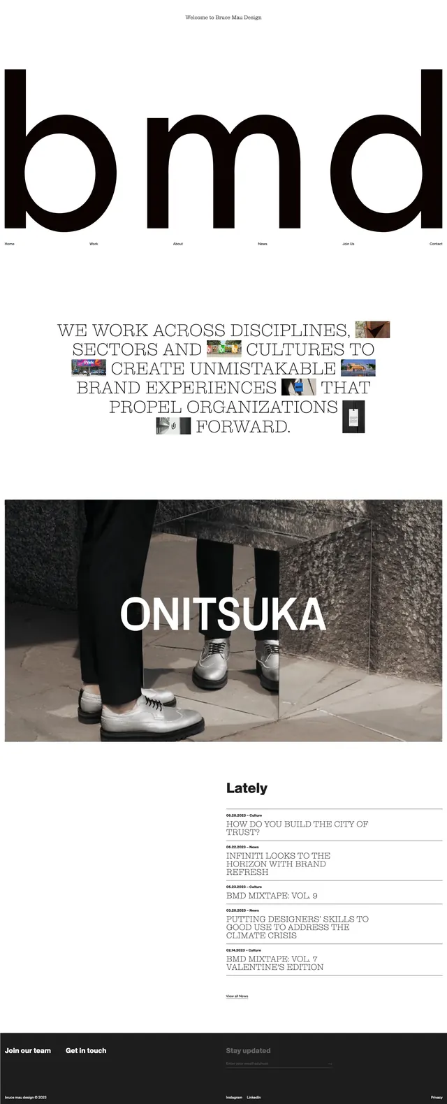
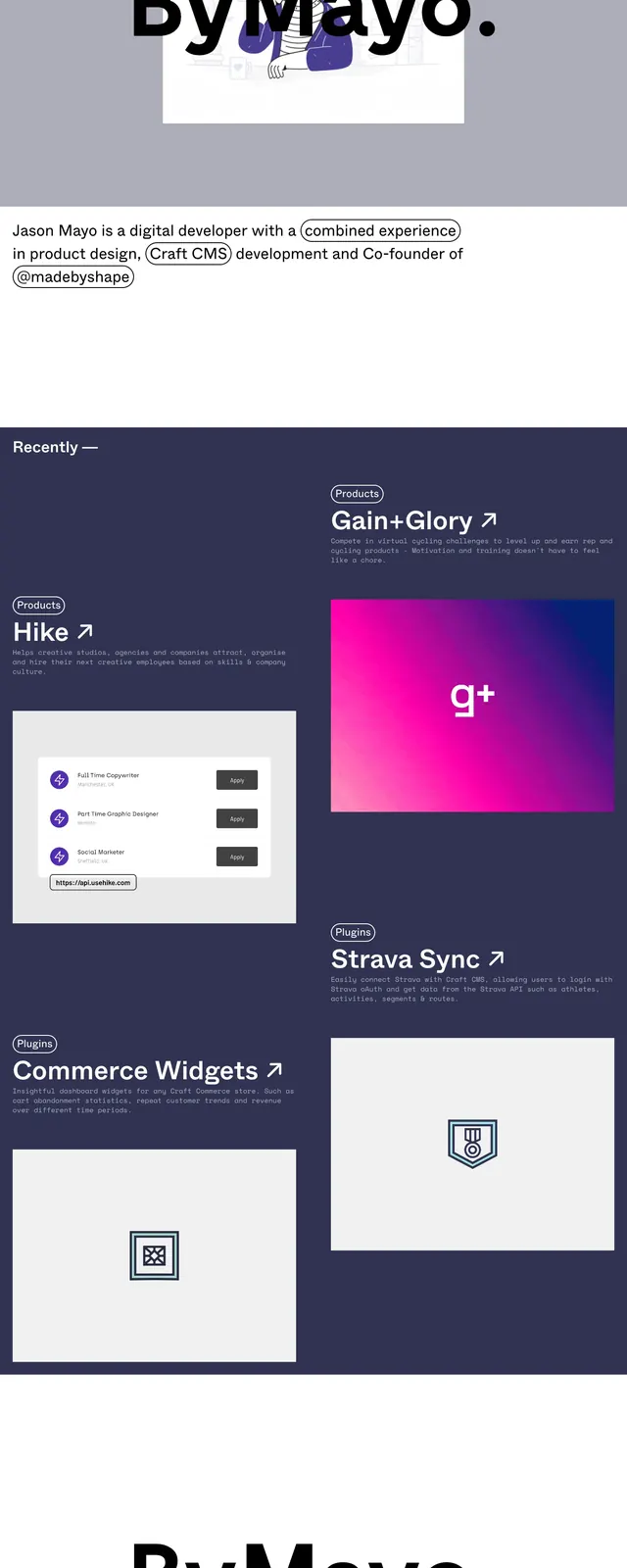
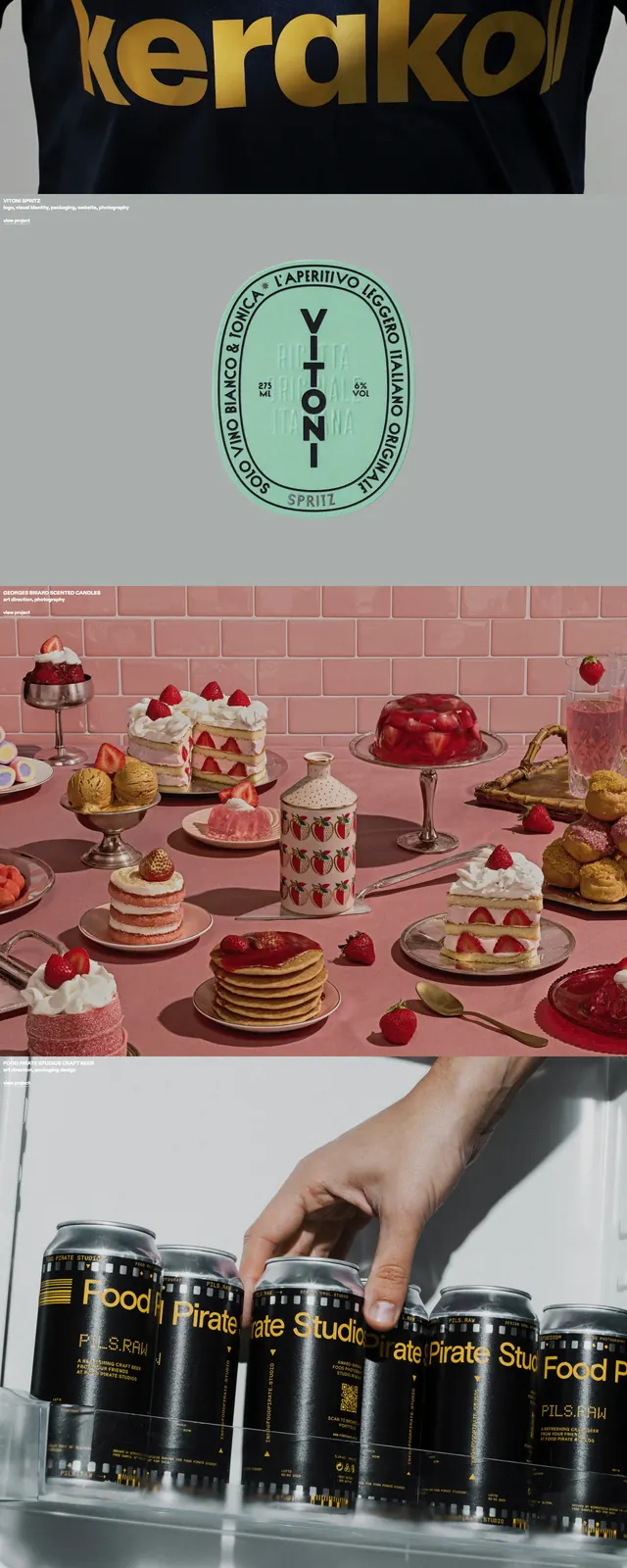
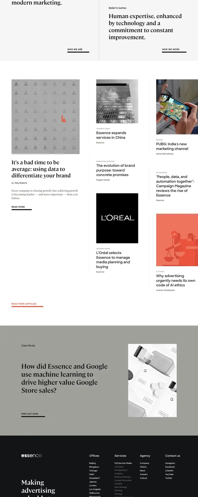
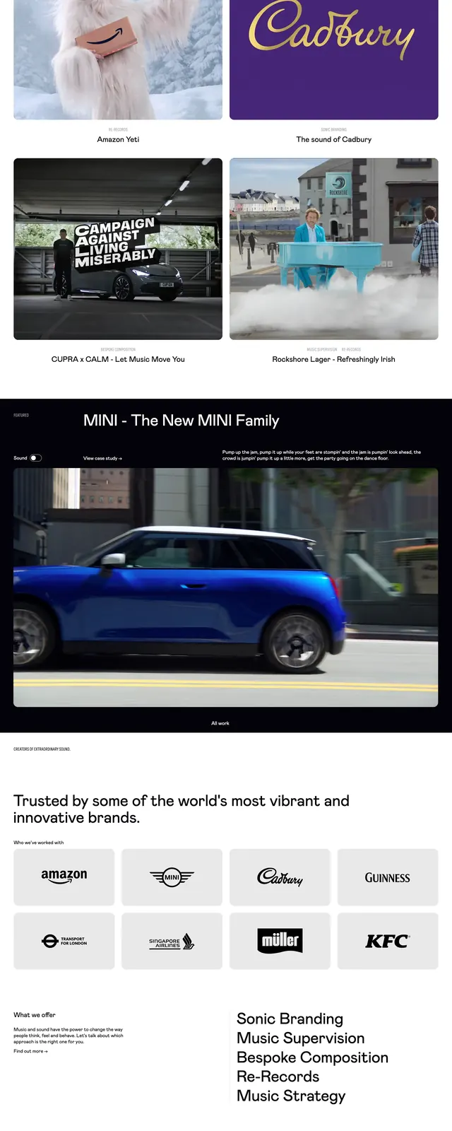
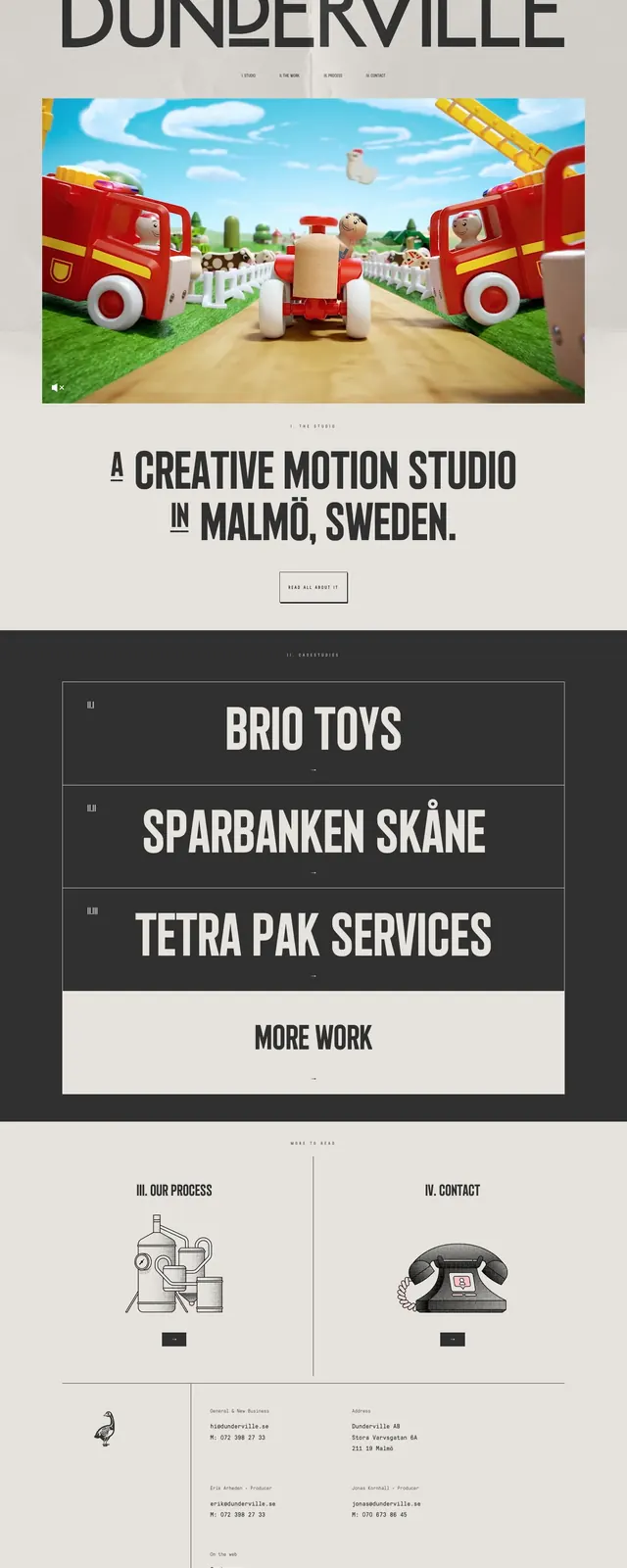
A minimalist, editorial-style agency homepage with oversized typography, centered imagery, and a stark black-and-cream section rhythm.
Summary
A minimalist, editorial-style agency homepage with oversized typography, centered imagery, and a stark black-and-cream section rhythm.
Visual description
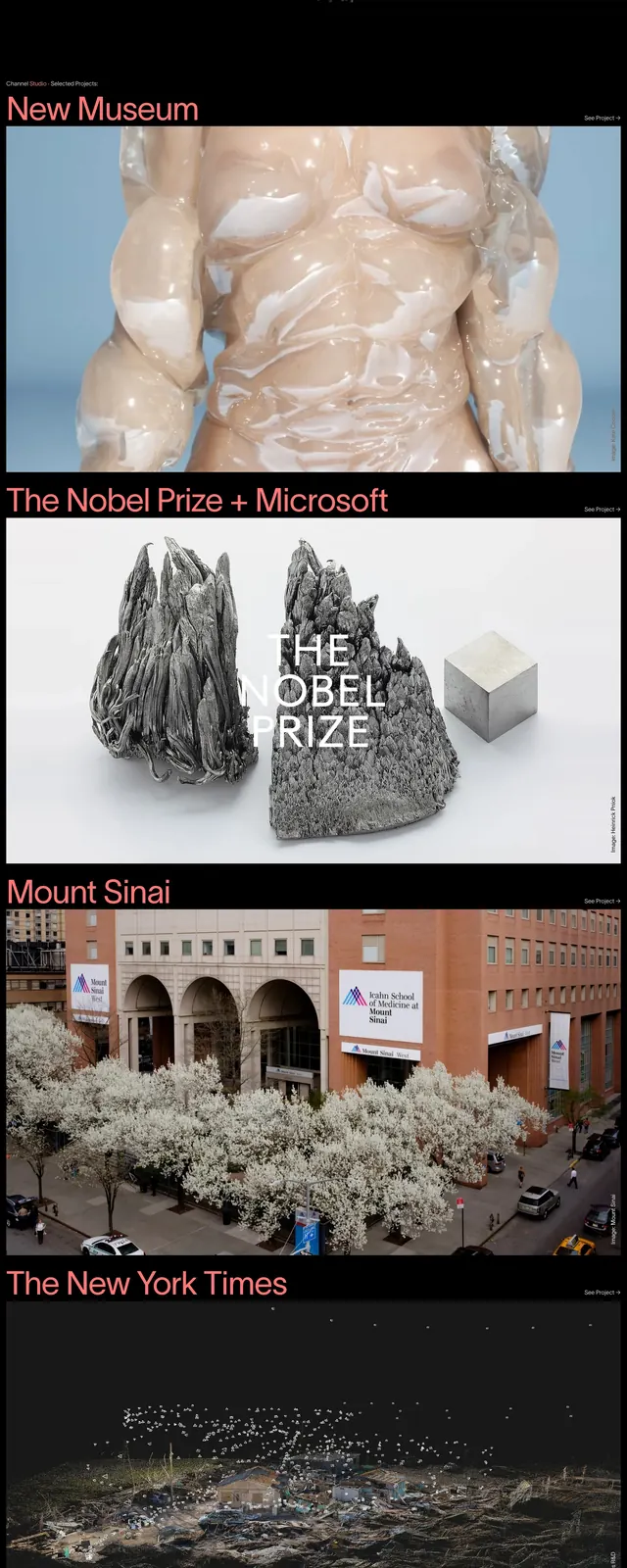
The page opens with a huge all-caps wordmark at the top, followed by a centered hero image framed by generous margins. Beneath it sits a bold statement headline and a small outlined call-to-action button. Lower sections switch to a dark work-list panel with large project names, then return to a light contact/process area with small illustrated icons and compact footer details.
Key takeaway
The design relies on strong typographic hierarchy, restrained color, and clear section contrast to make the portfolio feel premium and editorial. Reusable patterns here include the oversized hero title, centered media block, and stacked project showcase.
Reuse notes
Reuse the layout for agency or studio sites that need a simple but high-impact first screen. The contrast between light hero and dark portfolio list is especially effective for showcasing selected work without visual clutter.