Preview image. Unlock full-res
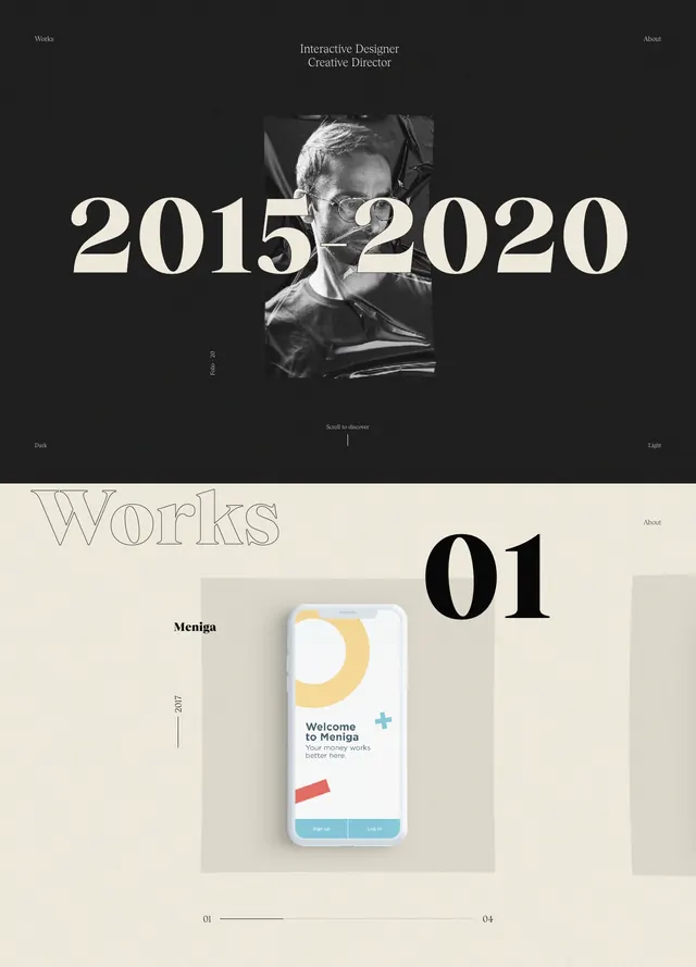
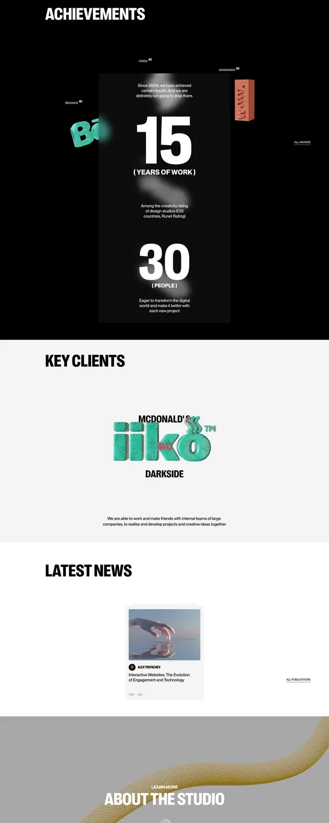
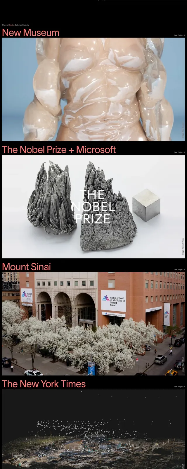
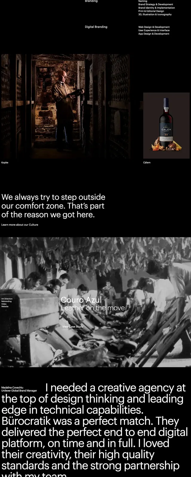
A minimalist editorial agency homepage built around oversized typography, spacious white space, and bold project imagery.
Summary
A minimalist editorial agency homepage built around oversized typography, spacious white space, and bold project imagery.
Visual description
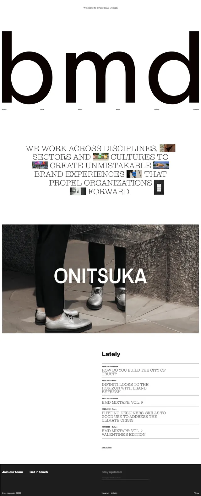
The page opens with a stark white hero dominated by oversized black letterforms spelling out the brand identity. A thin top welcome line and small horizontal navigation sit around the typography, creating a restrained editorial frame. Below, a centered manifesto-style statement uses serif type and small embedded image thumbnails as accents. The lower portion shifts into large full-width project imagery, a compact news list, and a dark footer with links and newsletter-style signup fields.
Key takeaway
The design relies on scale contrast: massive typography, generous negative space, and selective image interruptions. It feels like a high-end creative studio site with strong editorial discipline.
Reuse notes
Reuse the oversized wordmark hero and the serif manifesto block for brands that want a confident, gallery-like first impression. The compact news list and minimal footer work well as reusable agency homepage modules.