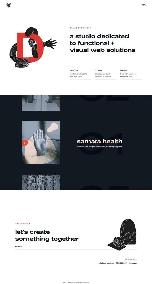
Preview image. Unlock full-res
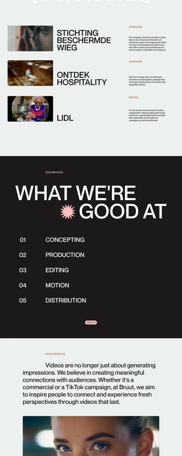
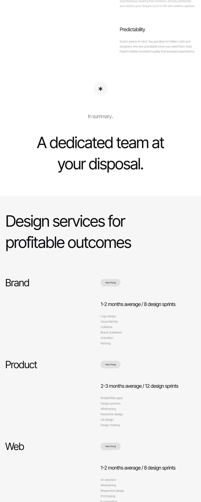
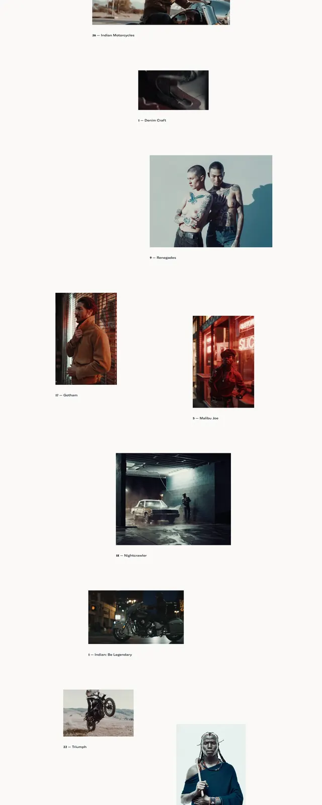
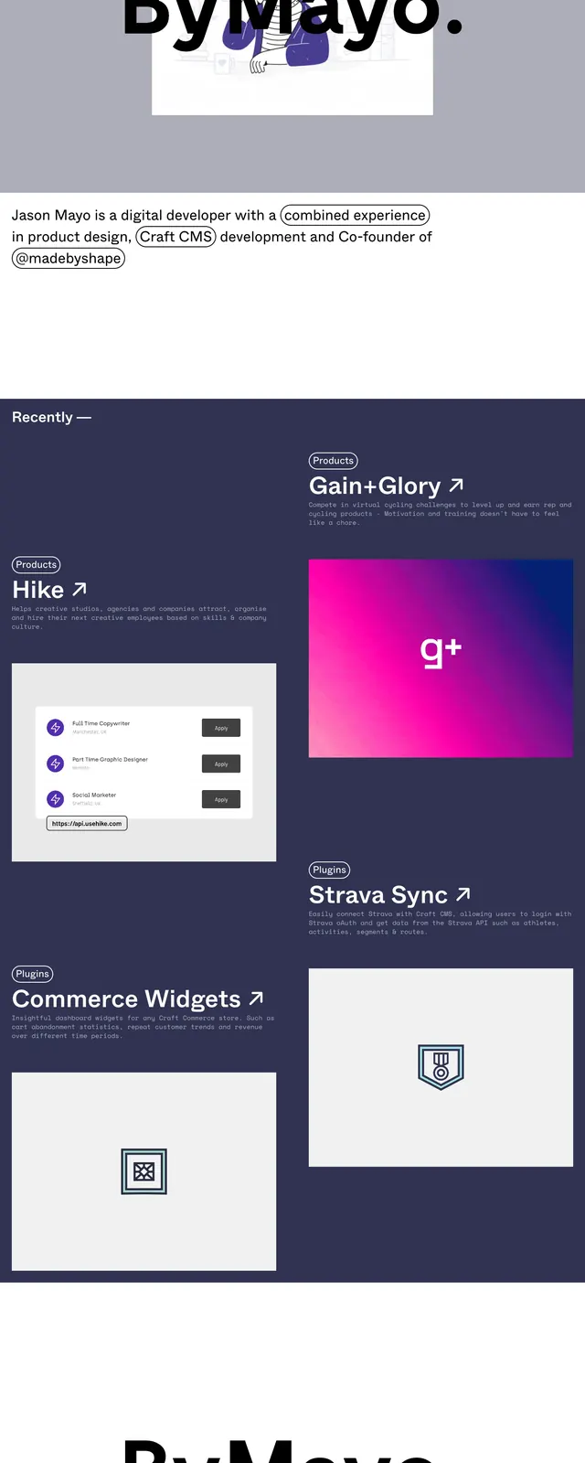
A minimal editorial landing page for Concrete Club with oversized typography, generous whitespace, and a dark closing CTA section.
Summary
A minimal editorial landing page for Concrete Club with oversized typography, generous whitespace, and a dark closing CTA section.
Visual description
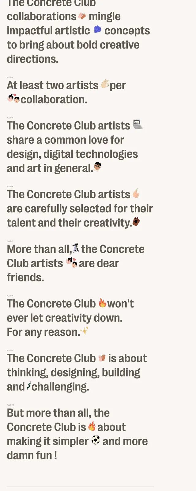
The page opens with a sparse top navigation bar and very large bold text set on a soft warm background. Multiple stacked text blocks read like manifesto statements, with small emoji accents and minimal UI chrome. Lower on the page, the design shifts into a dark contact/CTA section with similarly oversized copy and a thin framed layout. The overall composition stays typographically driven, with little to no imagery beyond text and icons.
Key takeaway
This design relies on strong editorial hierarchy and extreme whitespace to make a simple brand statement feel distinctive. The dark final section provides a clear contrast point and reusable CTA pattern.
Reuse notes
Reuse the formula of a restrained nav, oversized manifesto copy, and subtle accent icons for studio or agency landing pages. The two-tone light-to-dark page structure works well for brands that want a refined but memorable scroll experience.