Preview image. Unlock full-res
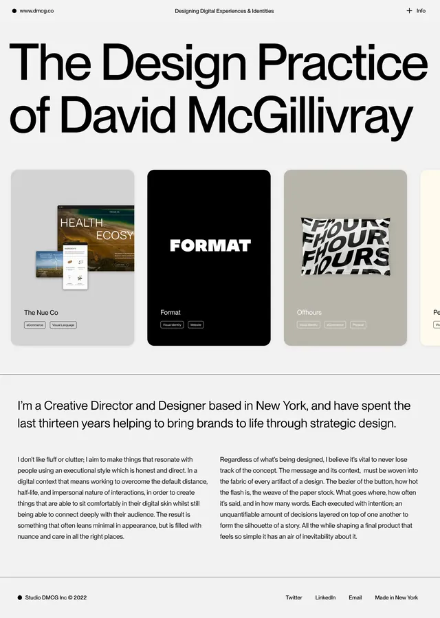
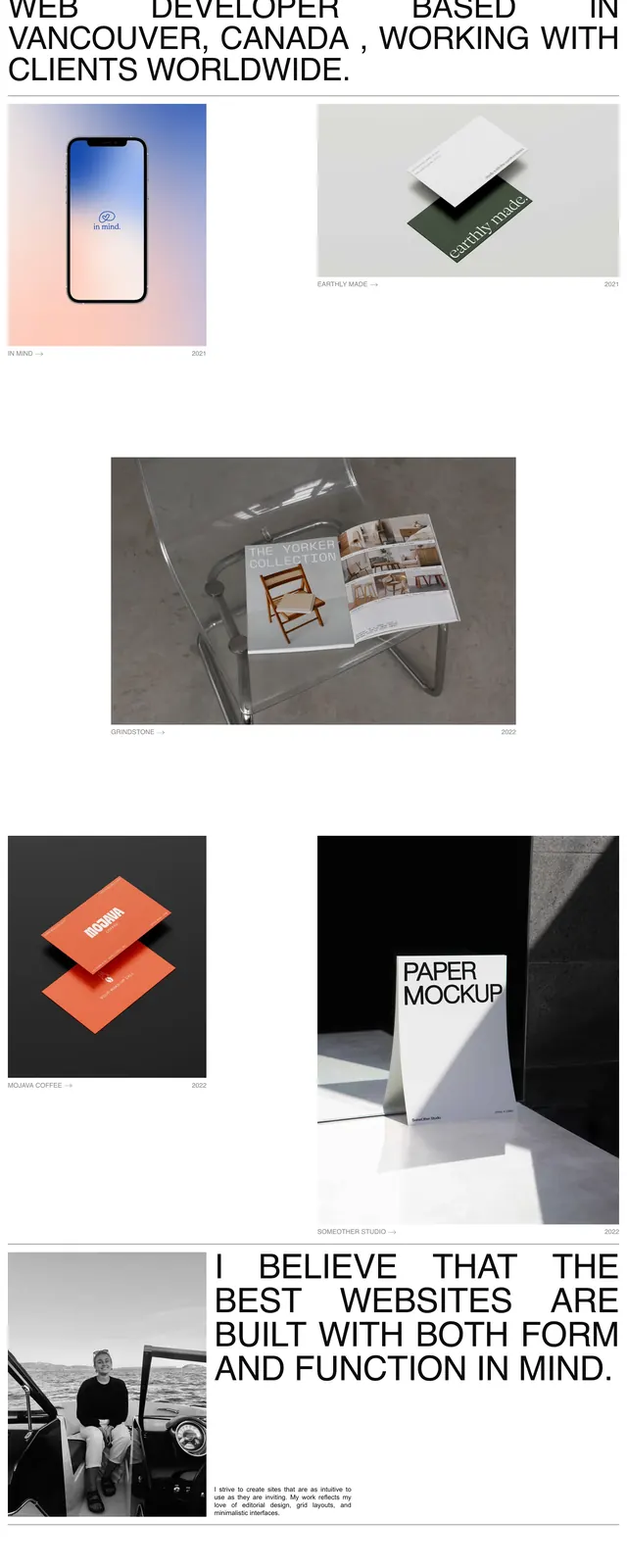
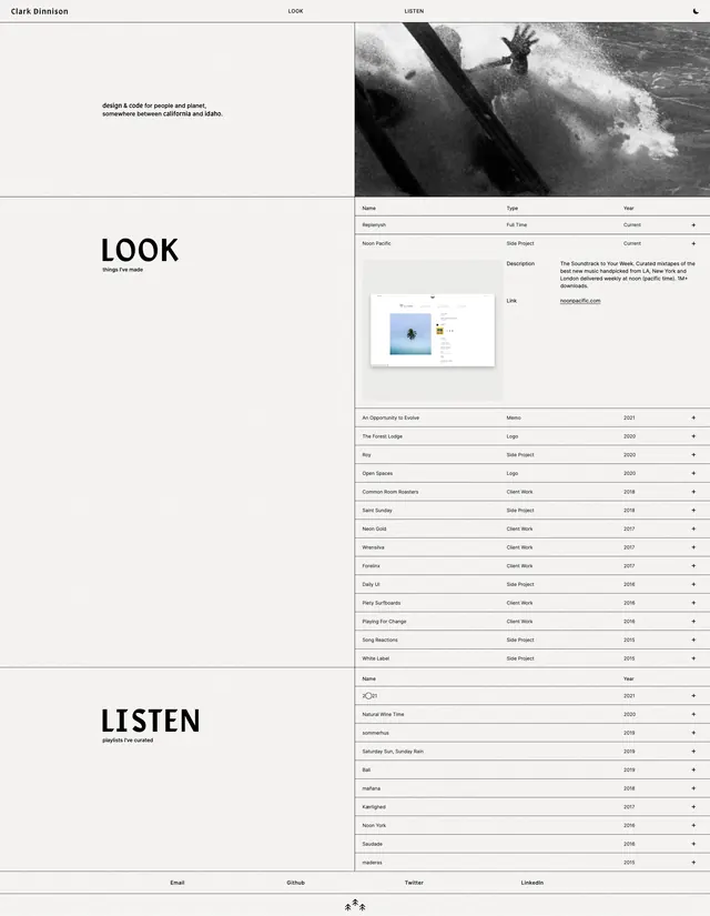
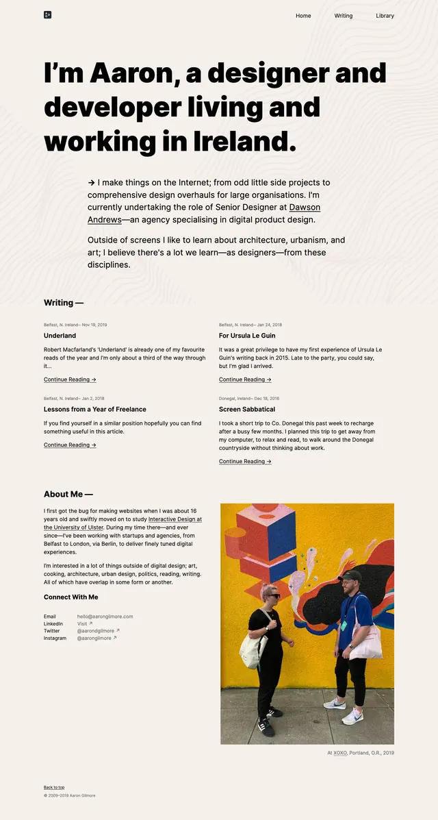
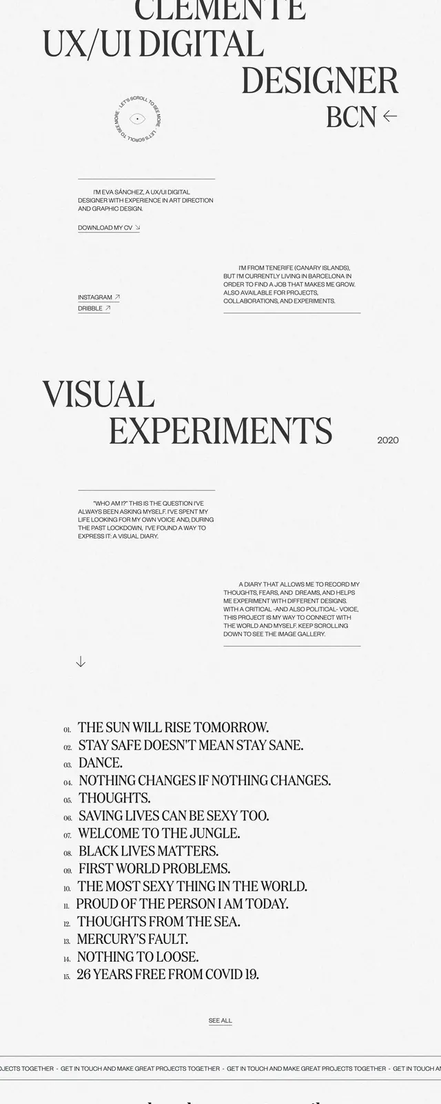
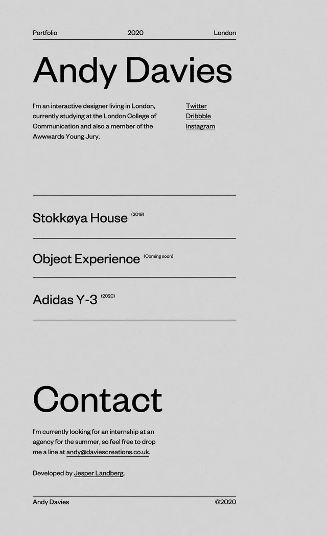
A sparse monochrome portfolio page with oversized name text, thin dividers, and a clean project list.
Summary
A sparse monochrome portfolio page with oversized name text, thin dividers, and a clean project list.
Visual description
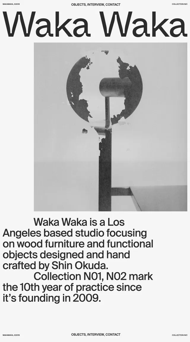
The page uses a light gray background with a very minimal black-on-gray palette. A slim top row shows small labels aligned left, center, and right, followed by a large centered-left name set in oversized sans-serif type. Below, a short bio sits on the left with three underlined social links on the right, then a list of projects separated by thin horizontal rules and small year/status labels. The lower portion ends with a large contact heading, a short paragraph, and a simple footer line with the name and copyright.
Key takeaway
The main idea is extreme typographic hierarchy with generous whitespace and hairline dividers. It feels editorial and refined without relying on imagery or heavy UI chrome.
Reuse notes
Useful for portfolio intros, personal sites, and minimalist agency landing pages where the work list is the product. It works best when the content is short and the spacing can stay open; it would feel thin on content-heavy pages.