Preview image. Unlock full-res
A dark, high-contrast investment firm homepage built around oversized editorial typography, black-and-white photography, and a dense footer CTA.
Summary
A dark, high-contrast investment firm homepage built around oversized editorial typography, black-and-white photography, and a dense footer CTA.
Visual description
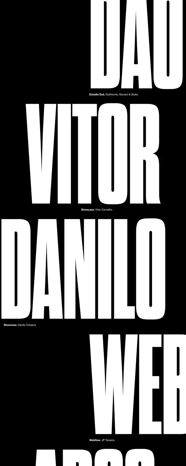
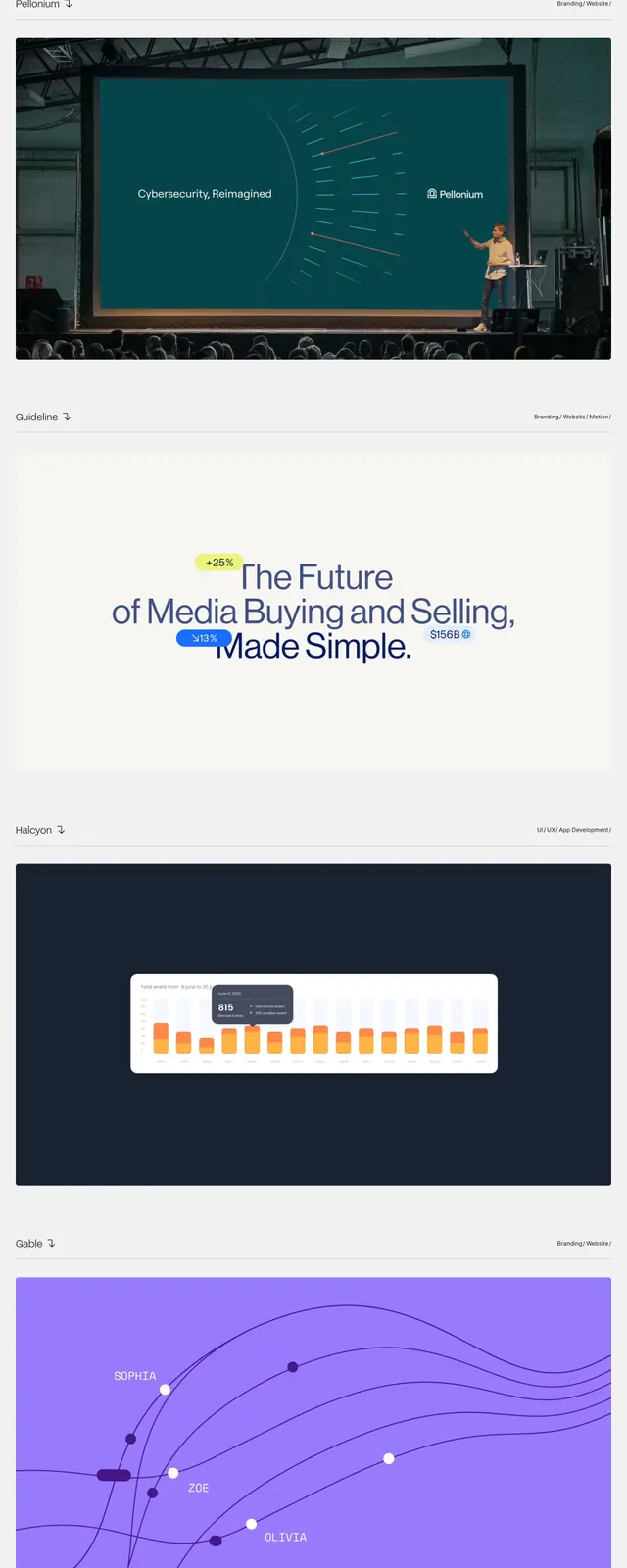
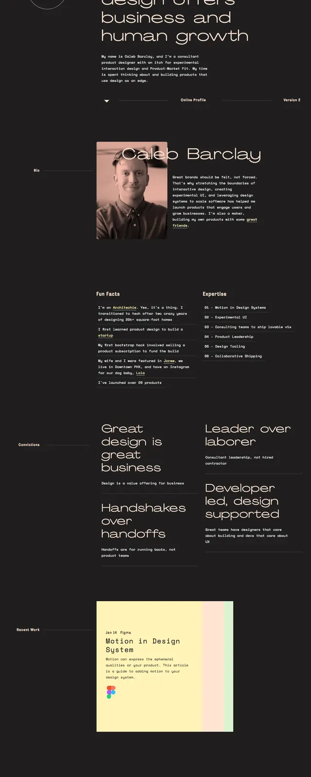
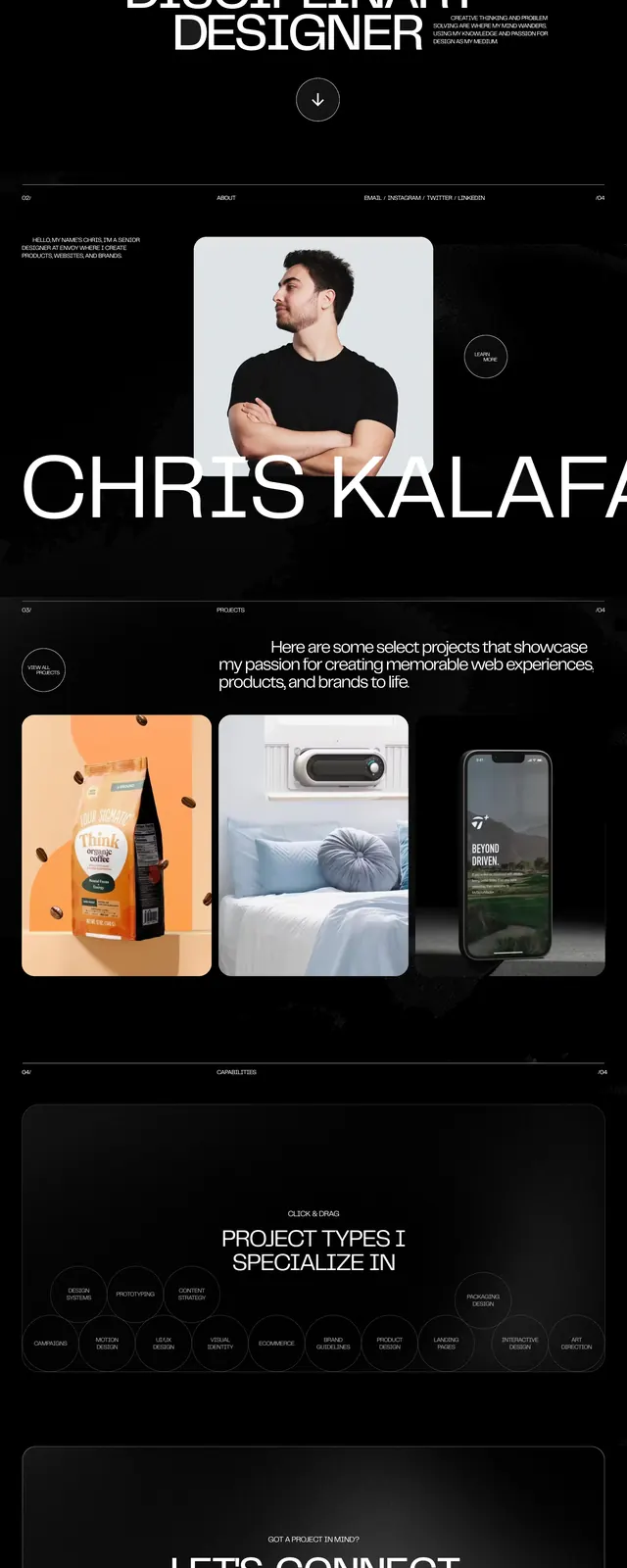
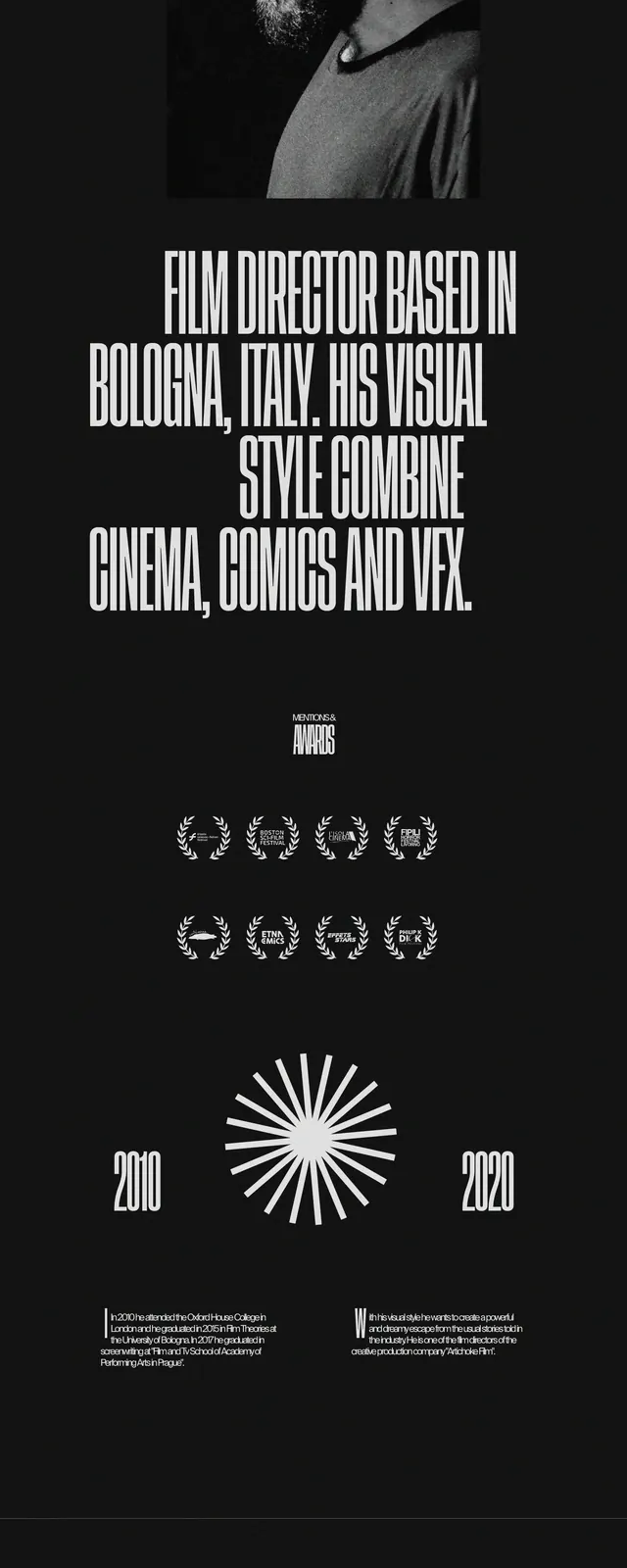
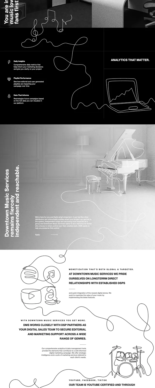
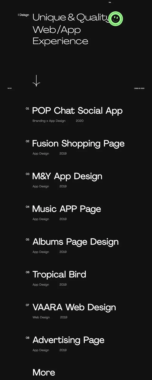
The page uses a stark black background with white typography and grayscale imagery throughout. The first screen combines a small logo and menu icon, a large all-caps headline, and an oversized wordmark-like hero graphic filled with a city photo. Lower sections stack narrow photo strips, a centered statement block, a wide image grid, and a footer area with a newsletter email field, utility links, and a line-art map graphic.
Key takeaway
The strongest move is the oversized typographic hero paired with photographic fills, which makes a finance site feel editorial and local. The black-and-white treatment keeps the layout cohesive even as the page mixes headline blocks, image galleries, and a CTA footer.
Reuse notes
Use this pattern for venture capital, investment, or consultancy sites that want a confident, high-end tone without decorative color. It works best when the brand has strong photography and can support very large condensed type.