Preview image. Unlock full-res
A bright, editorial-style restaurant homepage with oversized food photography, bold promotional panels, and a playful brand-forward layout.
Summary
A bright, editorial-style restaurant homepage with oversized food photography, bold promotional panels, and a playful brand-forward layout.
Visual description
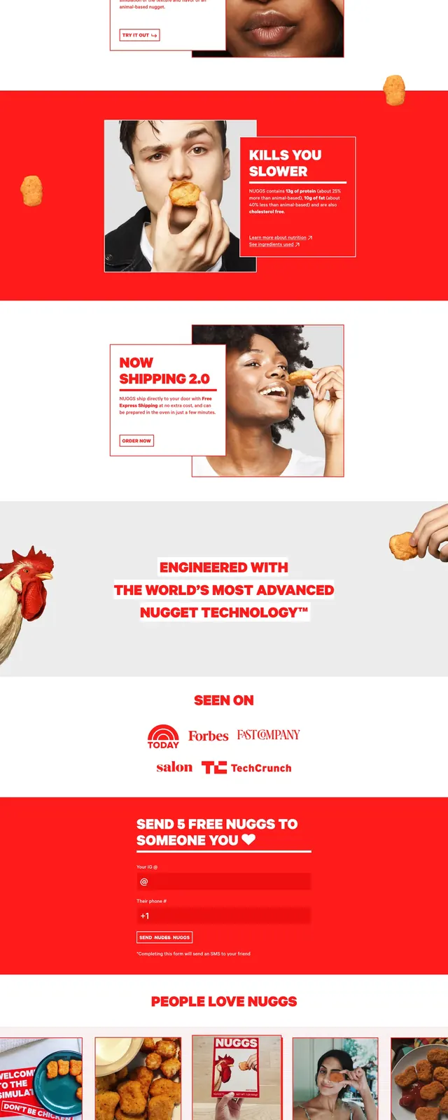
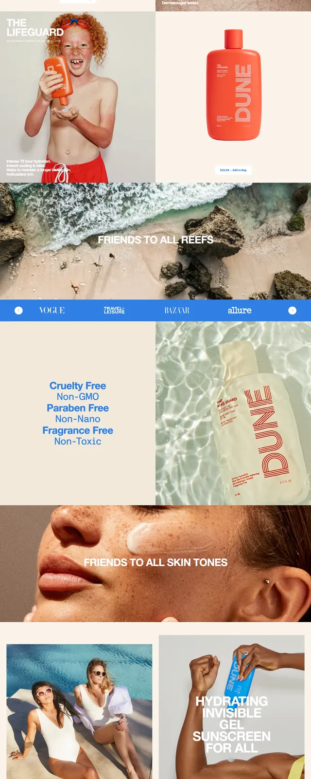
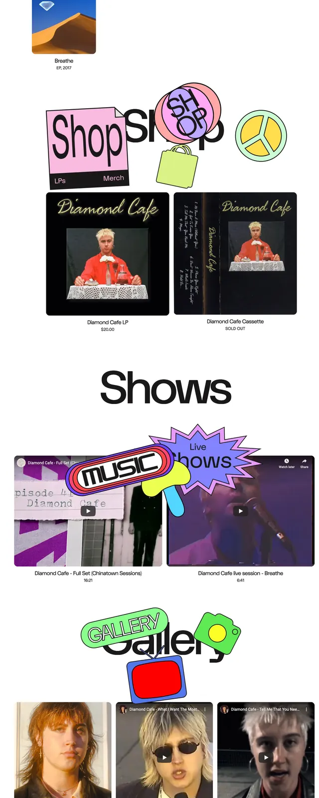
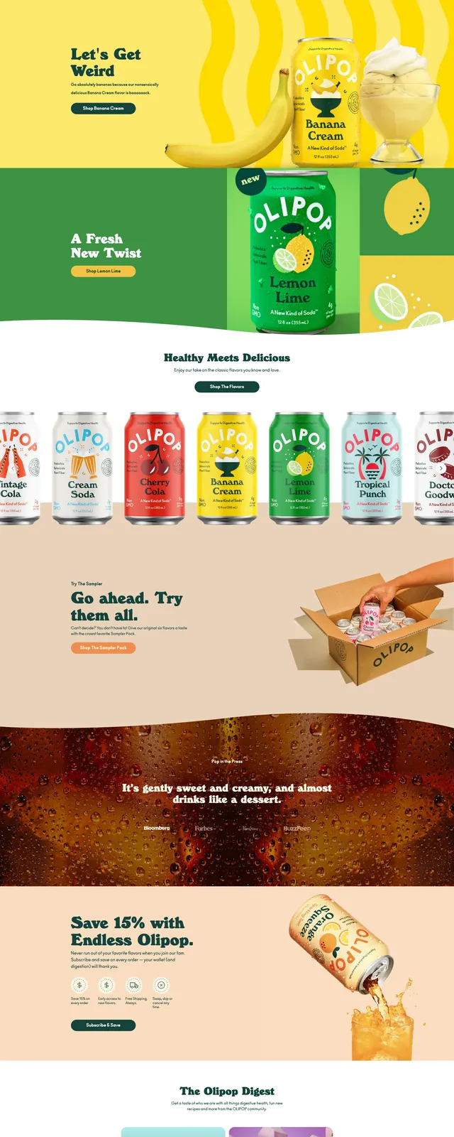
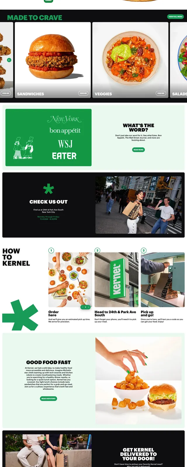
The page opens with a slim top navigation and a wide hero made of tall vertical image panels showing people eating burgers and sandwiches, with bold white promotional text over the photos. Below that are stacked homepage sections including a newsletter signup bar, a new menu drop feature with a burger image, a dark callout block with store info beside a street photo, and a three-step ordering section with numbered cards and large imagery. The lower sections continue with benefit blocks, illustrated character drawings, a download-app CTA, and a large branded footer area dominated by the Kernel wordmark. The overall composition uses strong contrast, large cutout-style photos, and generous spacing between distinct promotional modules.
Key takeaway
The main reusable move is a brand-led restaurant homepage built from oversized photography, punchy headlines, and modular promo sections. It feels more like a lifestyle campaign than a standard menu site.
Reuse notes
Useful for food brands, delivery concepts, or consumer-facing hospitality sites that want to feel energetic and distinctive. The structure works best when there is strong photography and a clear brand color that can carry through multiple sections.