Preview image. Unlock full-res
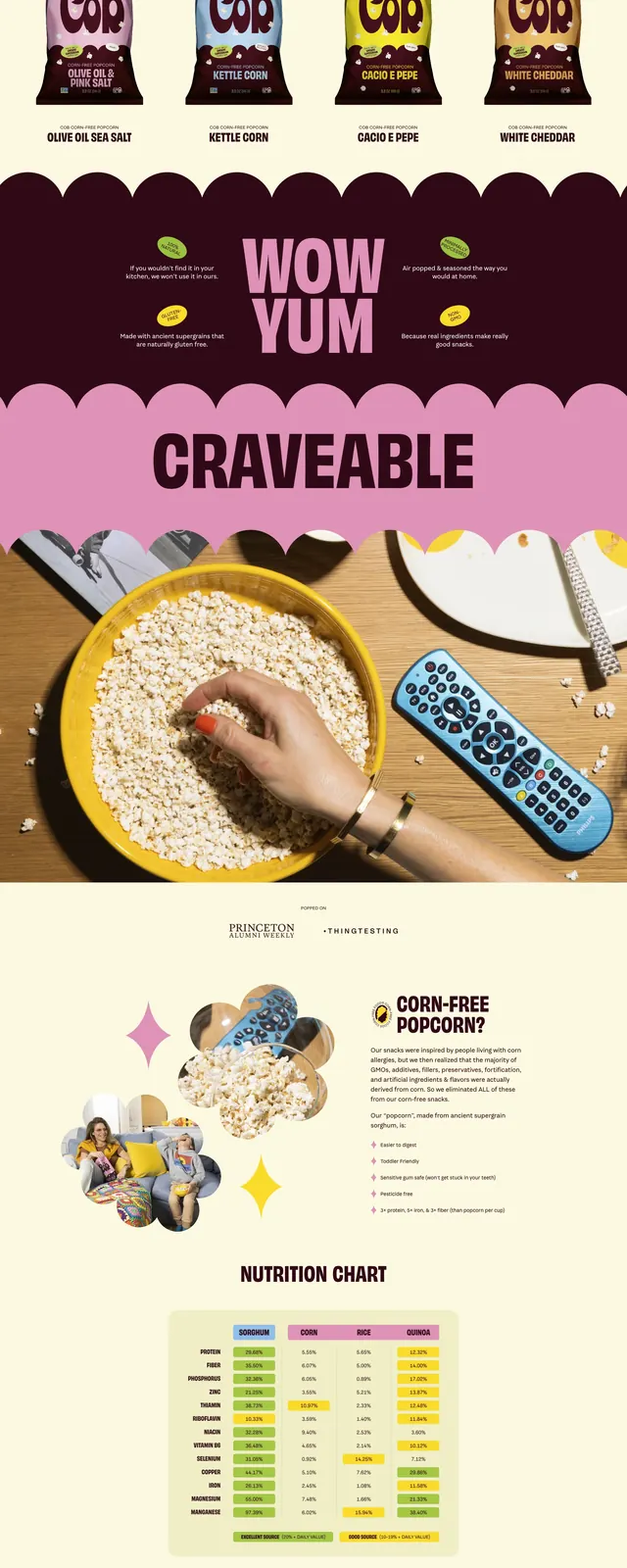
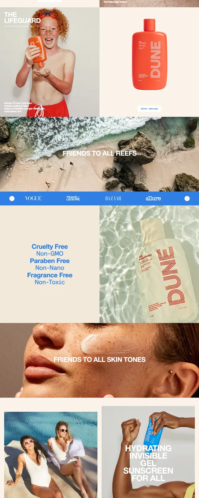
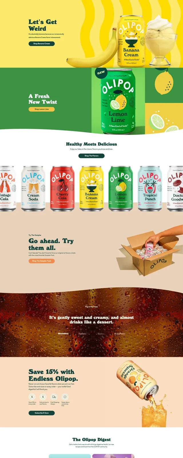
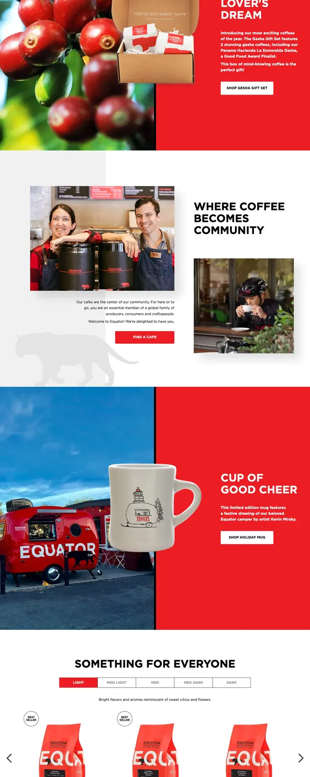
A bold food brand landing page with oversized product photography, bright color-blocked sections, and clean uppercase messaging.
Summary
A bold food brand landing page with oversized product photography, bright color-blocked sections, and clean uppercase messaging.
Visual description
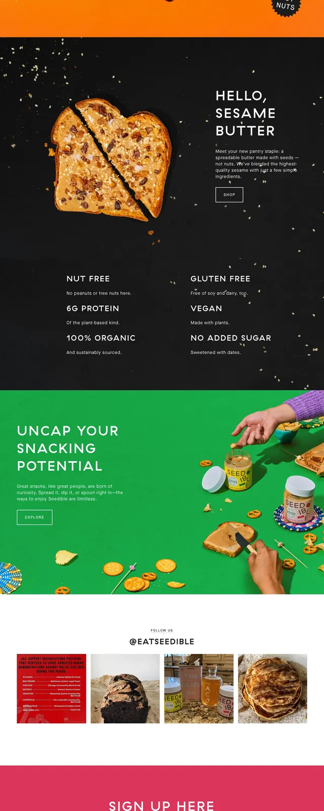
The page opens with a full-bleed hero featuring Seedible product jars, snack ingredients, and hands in motion against a saturated orange background. Below it, dark feature sections use floating seed-like specks and simple benefit copy to emphasize product claims such as nut free, vegan, and no added sugar. A bright green promotional panel follows with left-aligned text and a right-side product still life, then a small image strip and a large pink newsletter signup block before a minimal footer.
Key takeaway
The design leans on high-impact color contrasts and playful product staging to make a snack brand feel energetic and memorable. Reusable sections are simple, spacious, and highly scannable, with strong emphasis on photography and short benefit statements.
Reuse notes
Reuse this approach when a consumer brand needs a vivid, cheerful landing page with clear product storytelling. The strongest pattern to borrow is the alternating color-panel rhythm paired with large typography and isolated hero objects.