Preview image. Unlock full-res
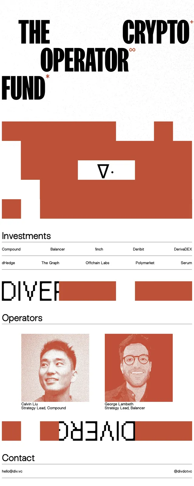
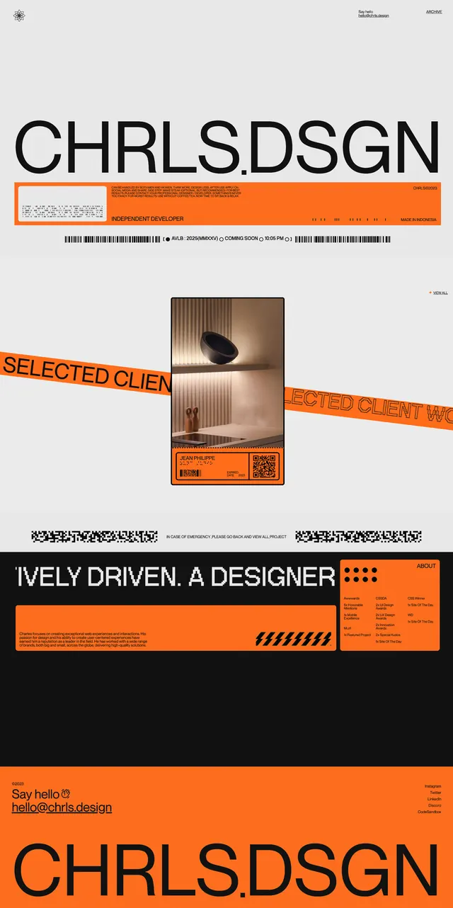
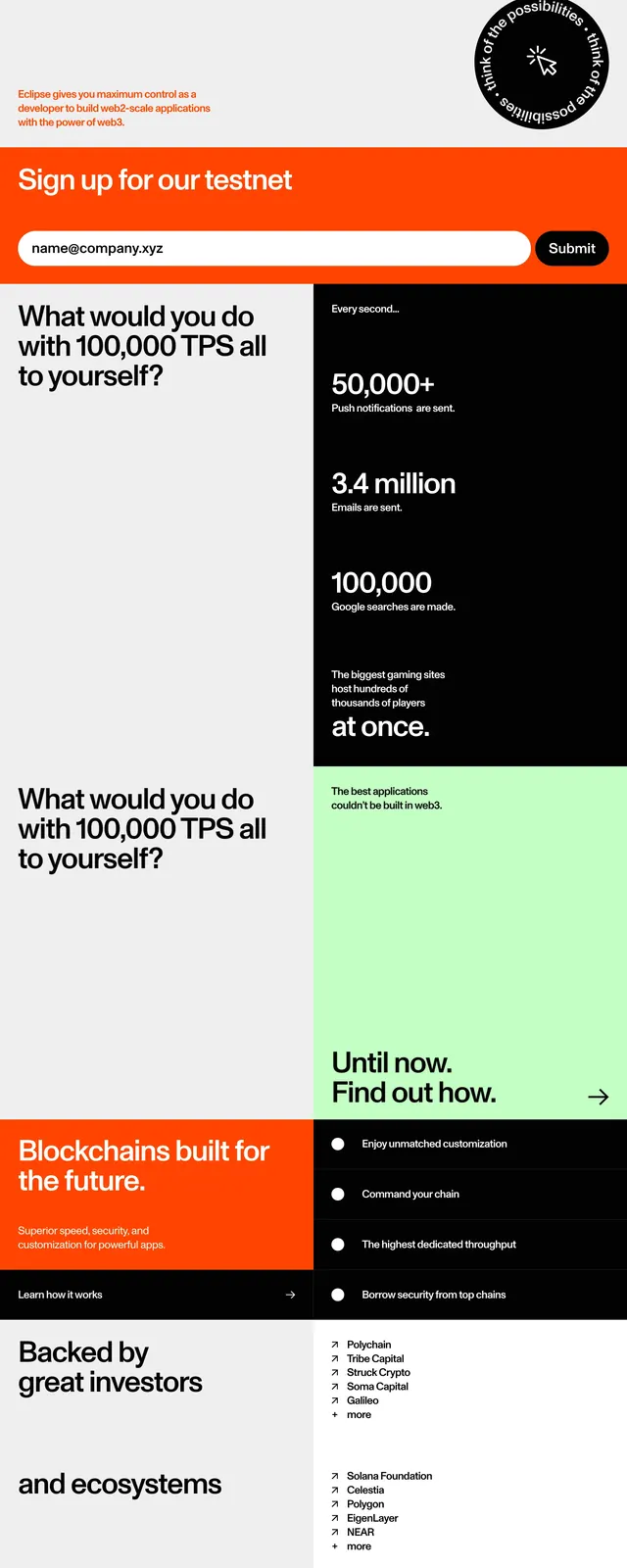
A high-contrast landing page for Eclipse that uses oversized typography, bright orange blocks, and stark black-and-white sections to present a technical crypto message with strong visual hierarchy.
Summary
A high-contrast landing page for Eclipse that uses oversized typography, bright orange blocks, and stark black-and-white sections to present a technical crypto message with strong visual hierarchy.
Visual description
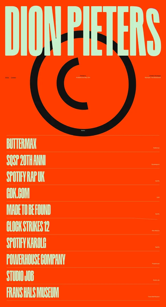
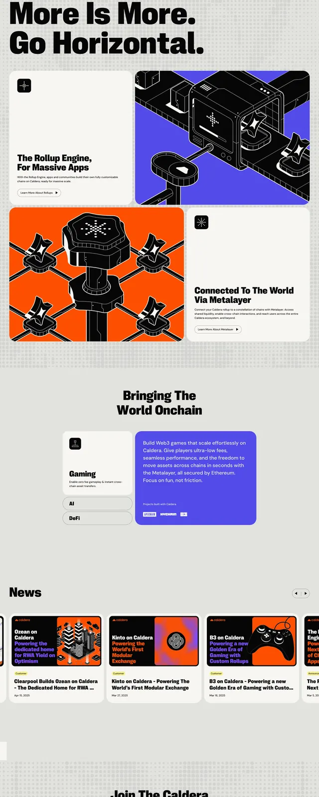
The page opens with a full-width orange hero featuring a tiny circular logo mark, a compact top navigation, and an enormous black wordmark spanning the screen. Below it, large editorial copy highlights customizable rollups and the Solana virtual machine in alternating black and orange text on a white background. Mid-page sections switch into a bento-like grid with large text blocks, a black statistic card, and a mint green panel, followed by dark resource and careers tiles and a bright orange newsletter signup bar. The page ends with another oversized orange brand wordmark and small social links.
Key takeaway
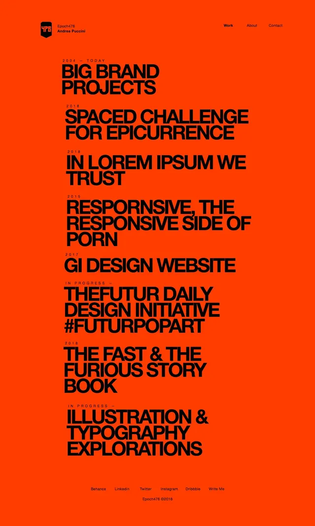
The design relies on extreme scale contrast, a strict color system, and sparse navigation to make the brand feel loud, technical, and memorable. The reusable pattern is a bold hero plus stacked content blocks that alternate between utility, stats, and CTA sections.
Reuse notes
Reuse the oversized typography, tight black/orange palette, and bento section rhythm for crypto or developer-focused landing pages. The signup strip and stat card treatment are especially adaptable for conversion-focused sections.