Preview image. Unlock full-res
A stark, typographic crypto venture landing page built around oversized black headlines, raw pixel-style branding, and terracotta block shapes on a white background.
Summary
A stark, typographic crypto venture landing page built around oversized black headlines, raw pixel-style branding, and terracotta block shapes on a white background.
Visual description
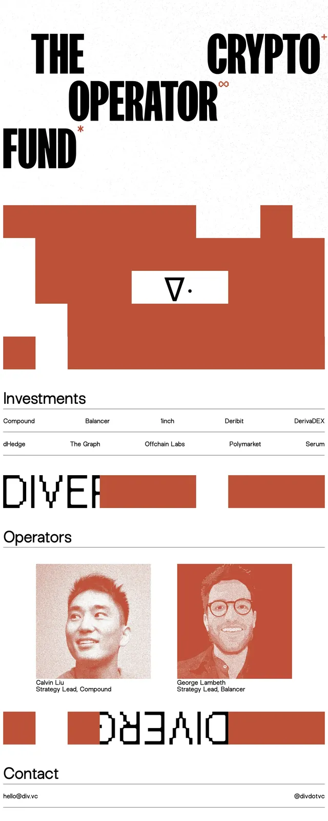
The page uses a white canvas with heavy black typography, starting with a pixelated wordmark and small top navigation links. Large cropped headlines like “THE OPERATOR FUND” and “CRYPTO” dominate the upper half, with terracotta rectangular blocks breaking up the space as graphic dividers. Lower sections include a simple investments list laid out in columns, a team area with two portrait cards, and a contact strip with email and social handle. The footer repeats the large Divergence Ventures wordmark.
Key takeaway
The strongest move is the combination of aggressive oversized type with sparse, blocky color interruptions. It feels editorial and experimental while still reading as a serious venture brand.
Reuse notes
Use this approach for crypto, venture, or other high-conviction brands that want a raw, anti-corporate look. It works best when the content is minimal and the typography can carry the page without heavy UI chrome.