Preview image. Unlock full-res
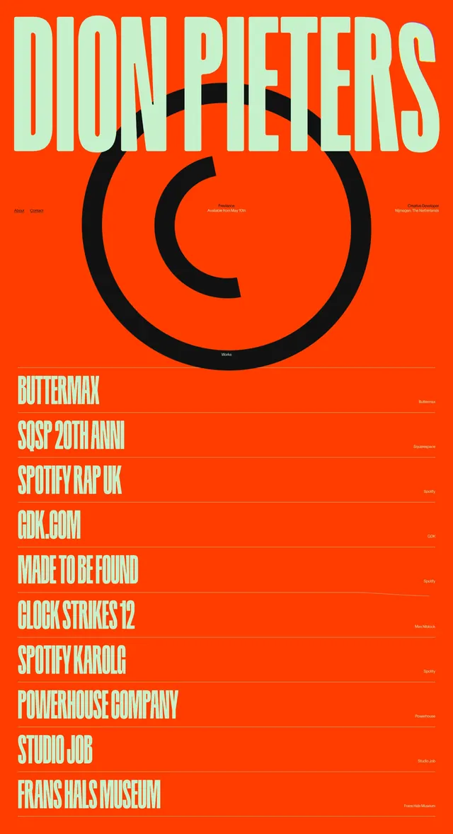
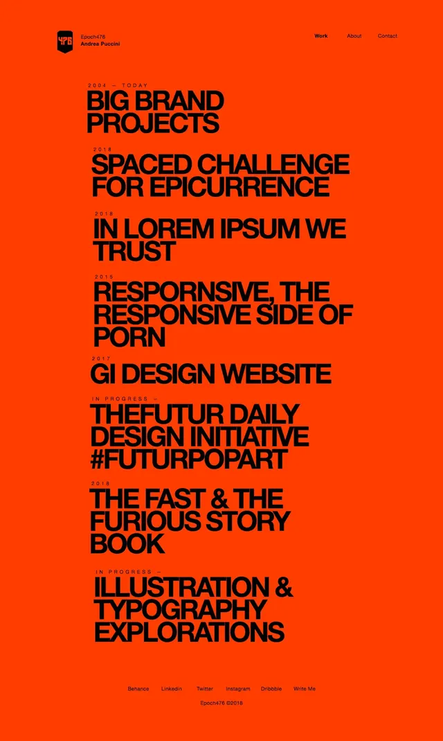
A high-contrast portfolio homepage with a vivid orange background and oversized black typography listing projects in a stacked editorial layout.
Summary
A high-contrast portfolio homepage with a vivid orange background and oversized black typography listing projects in a stacked editorial layout.
Visual description
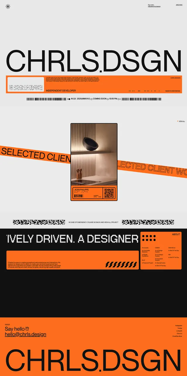
The page uses a full-bleed bright orange background with black text and a small top navigation. Large uppercase project titles are stacked vertically with tiny date labels above each entry, creating a strong editorial rhythm. A thin white horizontal band breaks the list near the middle, and a small footer row of social links sits at the bottom.
Key takeaway
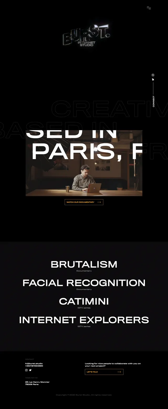
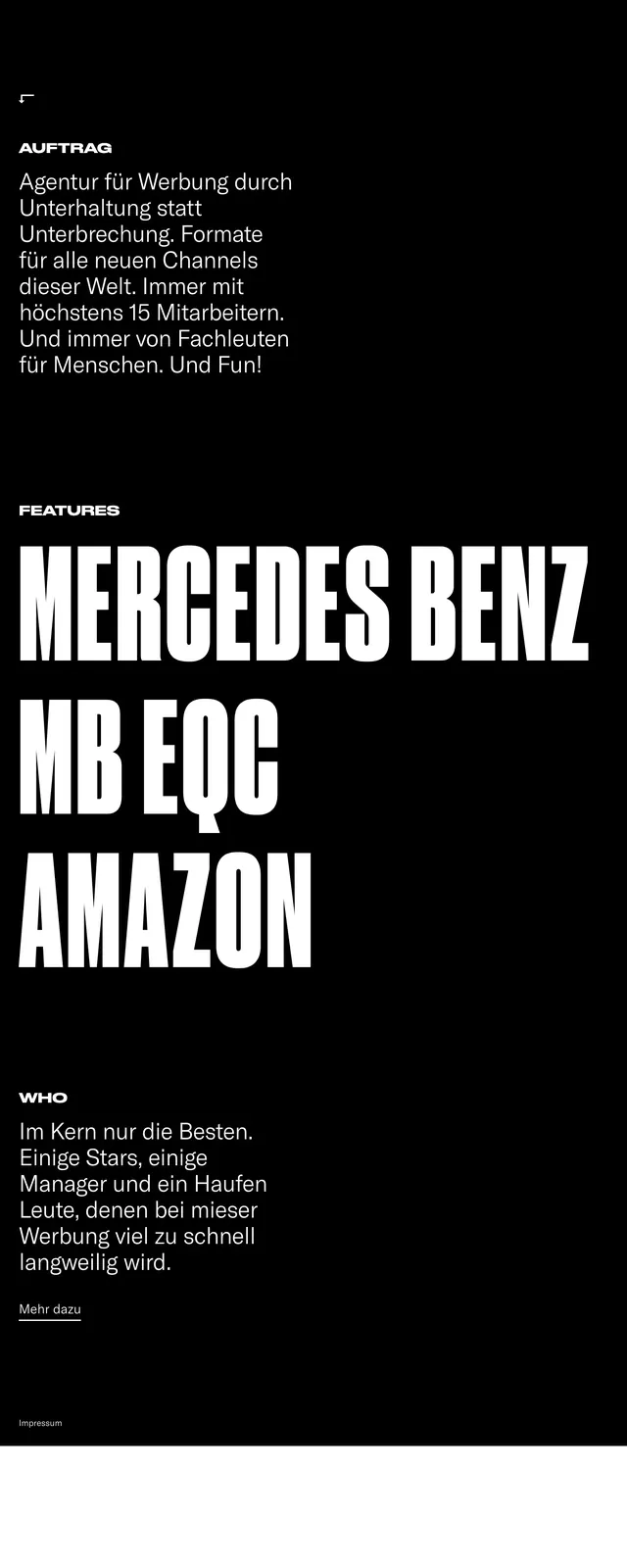
The design is driven by typography rather than imagery, using scale, spacing, and contrast to make the portfolio feel assertive and memorable. It is an effective pattern for showcasing work histories or project lists on a personal or agency site.
Reuse notes
Reuse the stacked project-list structure for portfolios, case-study indexes, or manifesto-style landing pages. Keep the palette extremely limited and let oversized type and spacing do the visual work.