Preview image. Unlock full-res
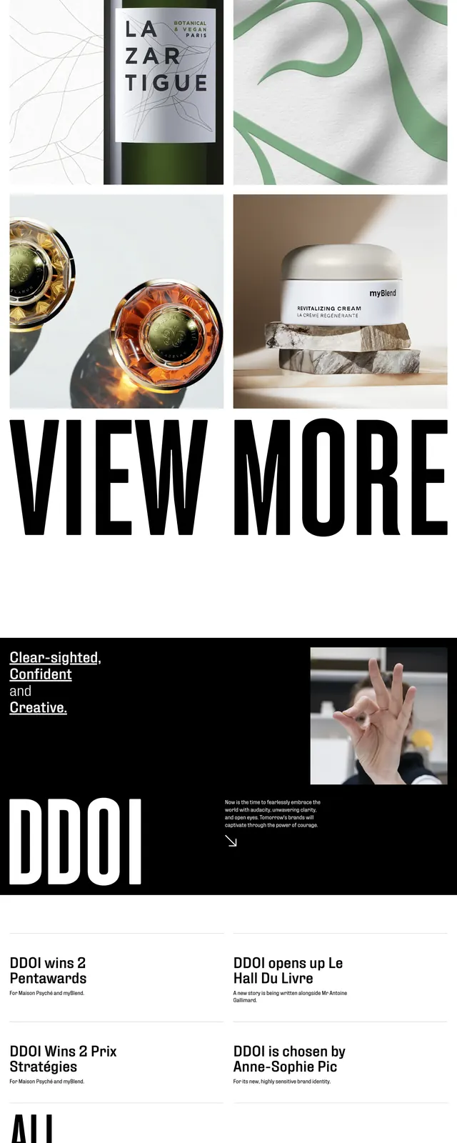
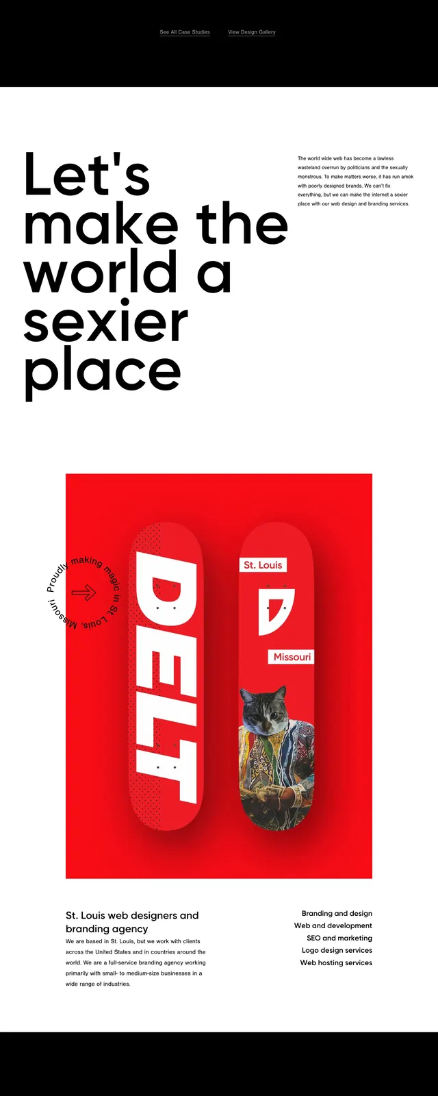
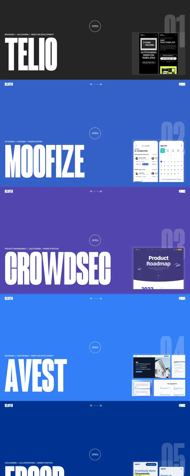
A bold portfolio landing page built around oversized condensed typography, stark spacing, and alternating color blocks with minimal interface chrome.
Summary
A bold portfolio landing page built around oversized condensed typography, stark spacing, and alternating color blocks with minimal interface chrome.
Visual description
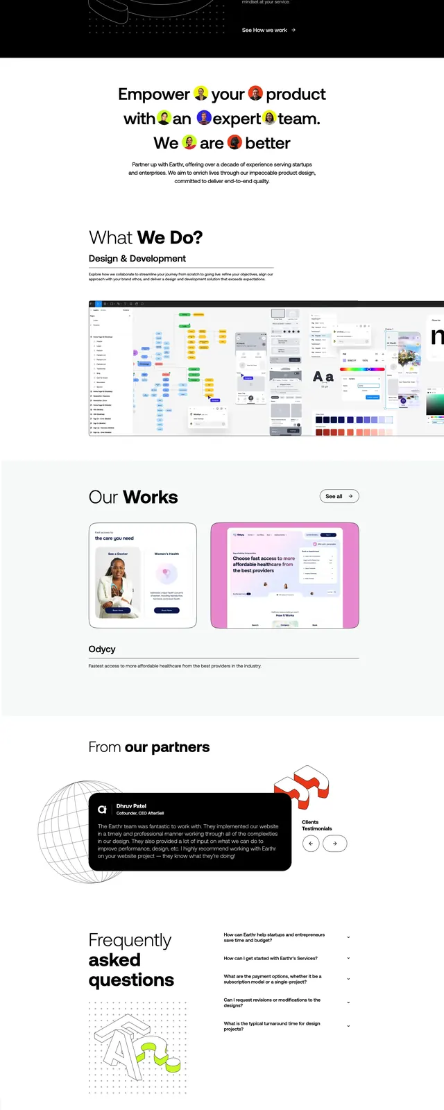
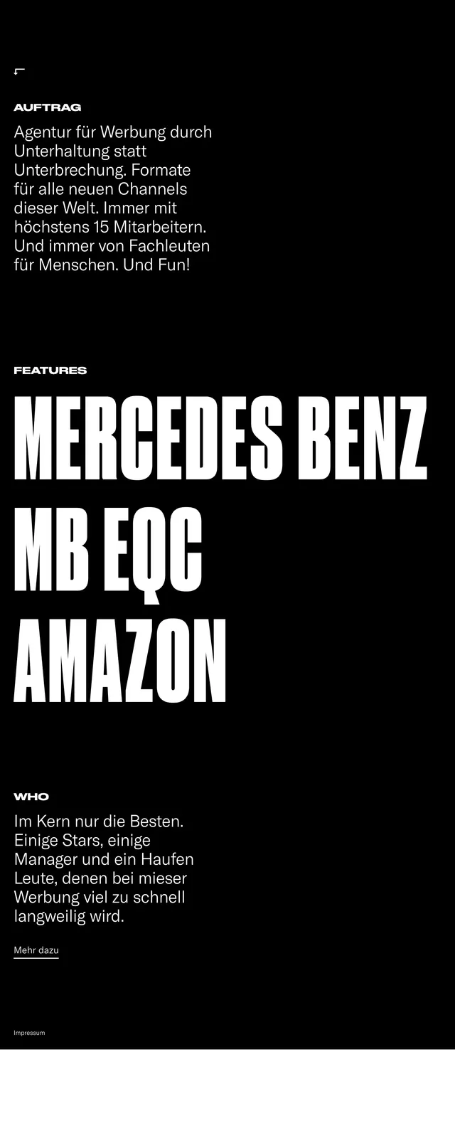
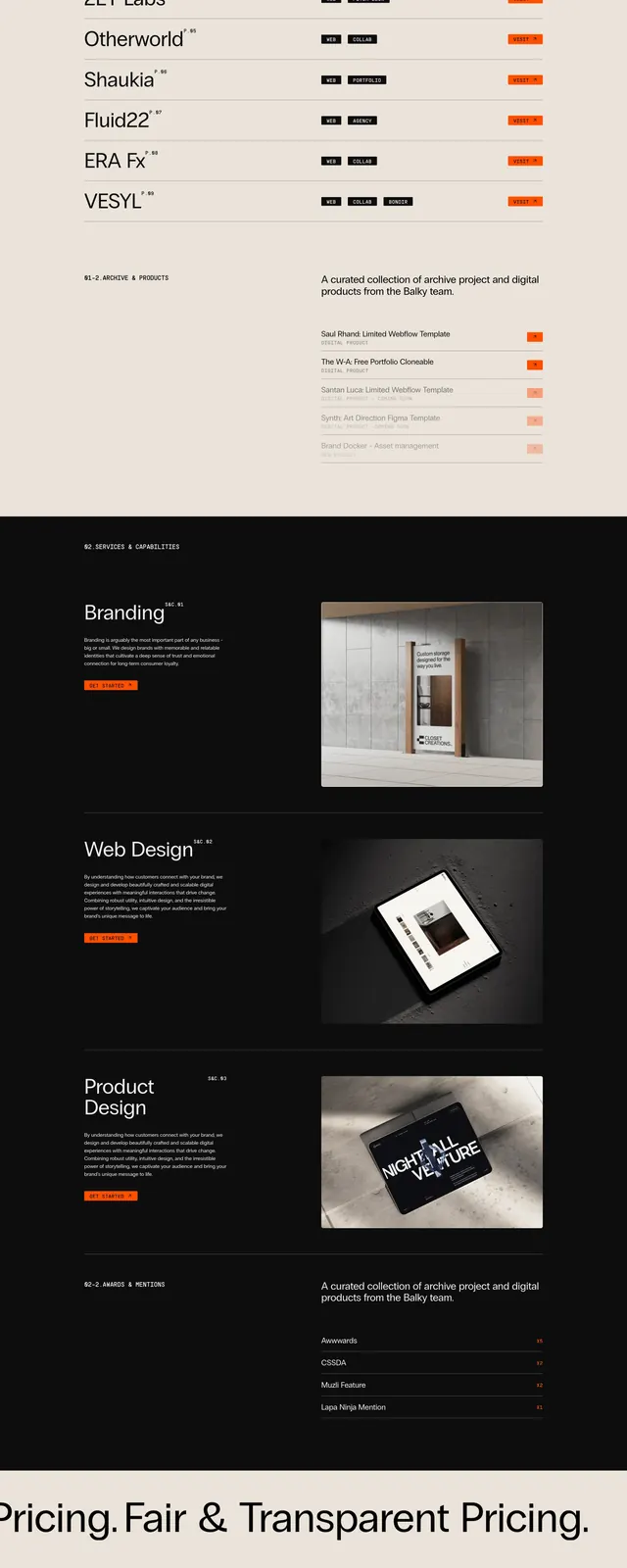
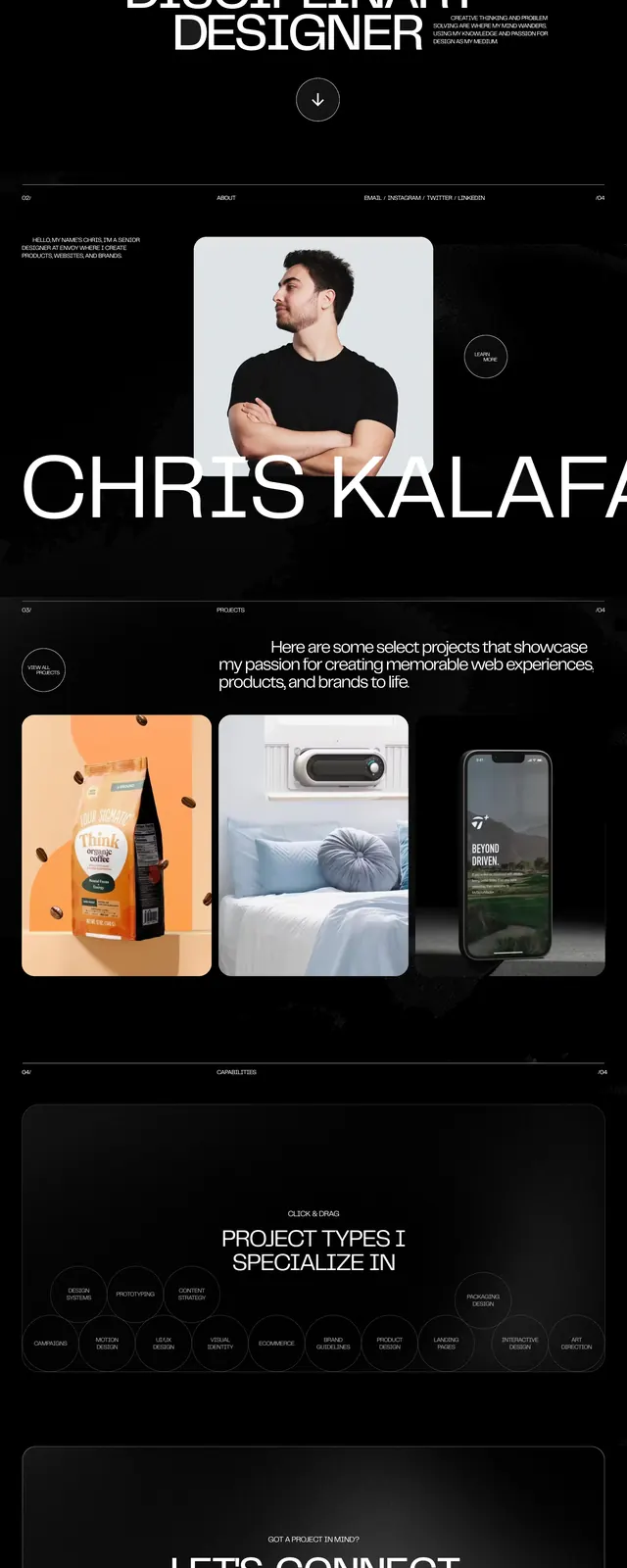
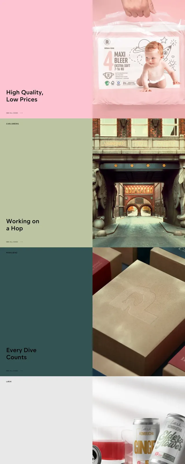
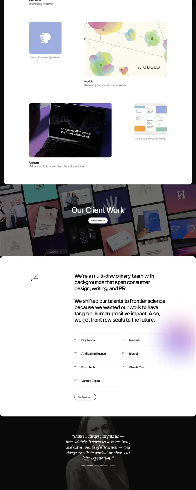
The page opens with an oversized all-caps hero headline in dark condensed type on a white background, paired with small right-aligned intro copy and a minimal menu icon. Below, stacked portfolio slices alternate strong blue and purple full-width bands with giant project titles, small preview images, and sparse labels. The lower portion switches to a dark footer-like area with multiple link columns and a repeated oversized name treatment in white.
Key takeaway
The design relies on scale, contrast, and disciplined whitespace to make a portfolio feel editorial and memorable. Large typography does most of the work, while small supporting elements keep the layout functional and clean.
Reuse notes
Reuse the giant headline treatment for strong first-impression portfolio or agency heroes. The alternating block sections also work well for project showcase pages that need rhythm without heavy UI complexity.