Preview image. Unlock full-res
A playful honey brand landing page built around oversized serif headlines, bold color blocking, and large product and farm imagery.
Summary
A playful honey brand landing page built around oversized serif headlines, bold color blocking, and large product and farm imagery.
Visual description
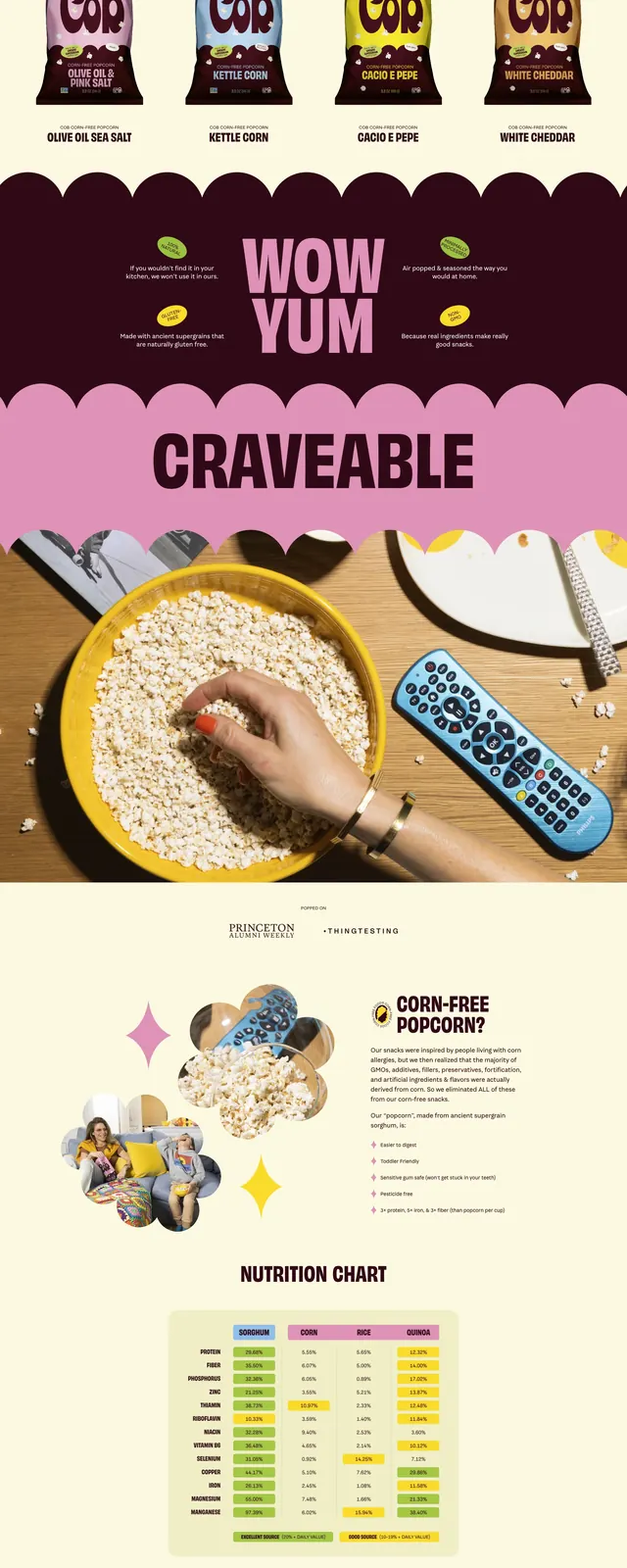
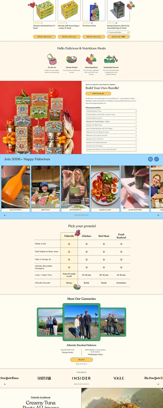
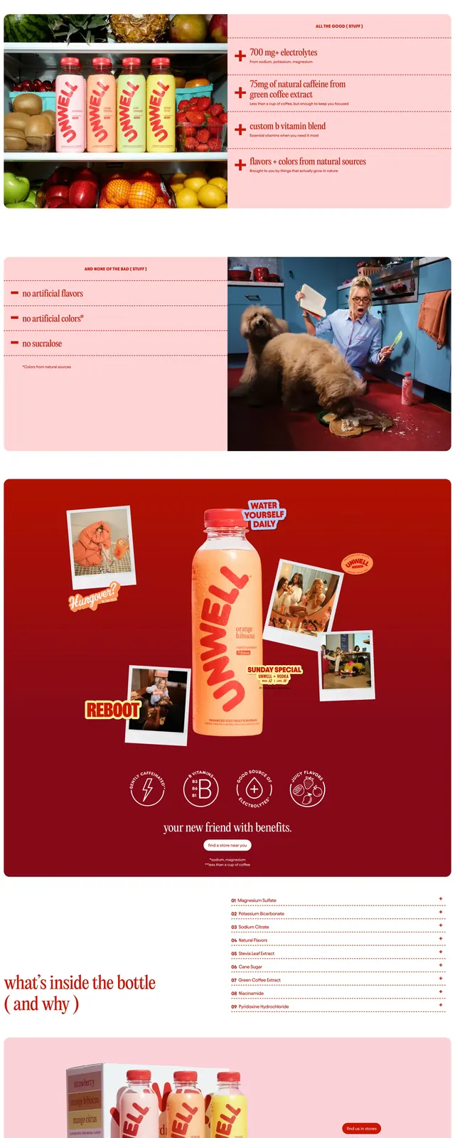
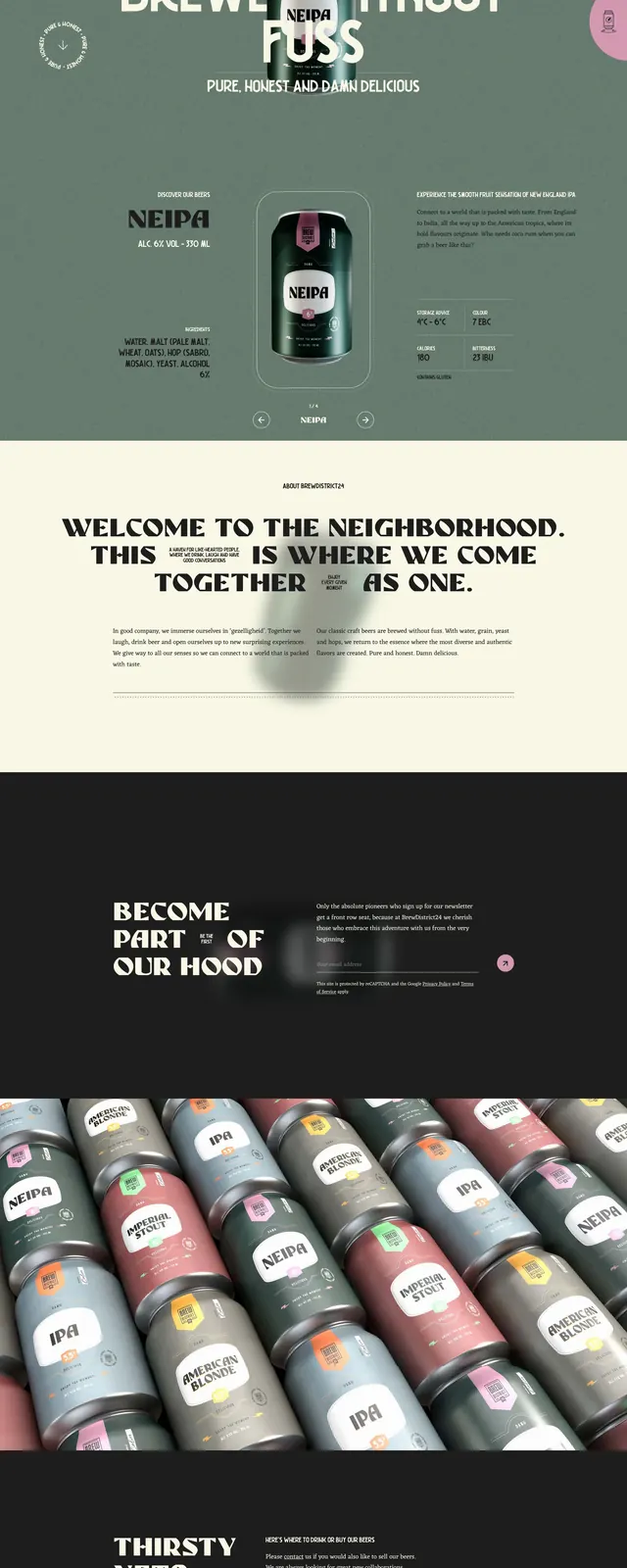
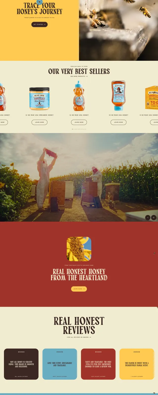
The page opens with a dark brown hero featuring a giant cream serif headline reading 'KNOW YOUR HONEY' and a centered honey bear bottle cutout. Small navigation links sit in the top corners, with tiny supporting labels around the hero for a handcrafted editorial feel. Below, the page stacks a blue ticker-style band, split image/text sections, a wide honey-farm photograph, a red feature panel with a rounded image tile, and a large blue CTA block before ending on a bright yellow footer-like section with oversized 'BUSY BEE HONEY' type. The overall composition uses bold horizontal bands, lots of whitespace between sections, and a mix of product photography and farm scenes.
Key takeaway
The strongest move is the oversized vintage serif typography paired with a simple centered product shot and saturated color blocks. The scrolling structure turns a brand landing page into a sequence of poster-like scenes.
Reuse notes
Use this pattern for food or consumer brands that want a friendly, handcrafted, story-led identity. It works best when you have strong product photography and a limited palette with one or two dominant accent colors.