Preview image. Unlock full-res
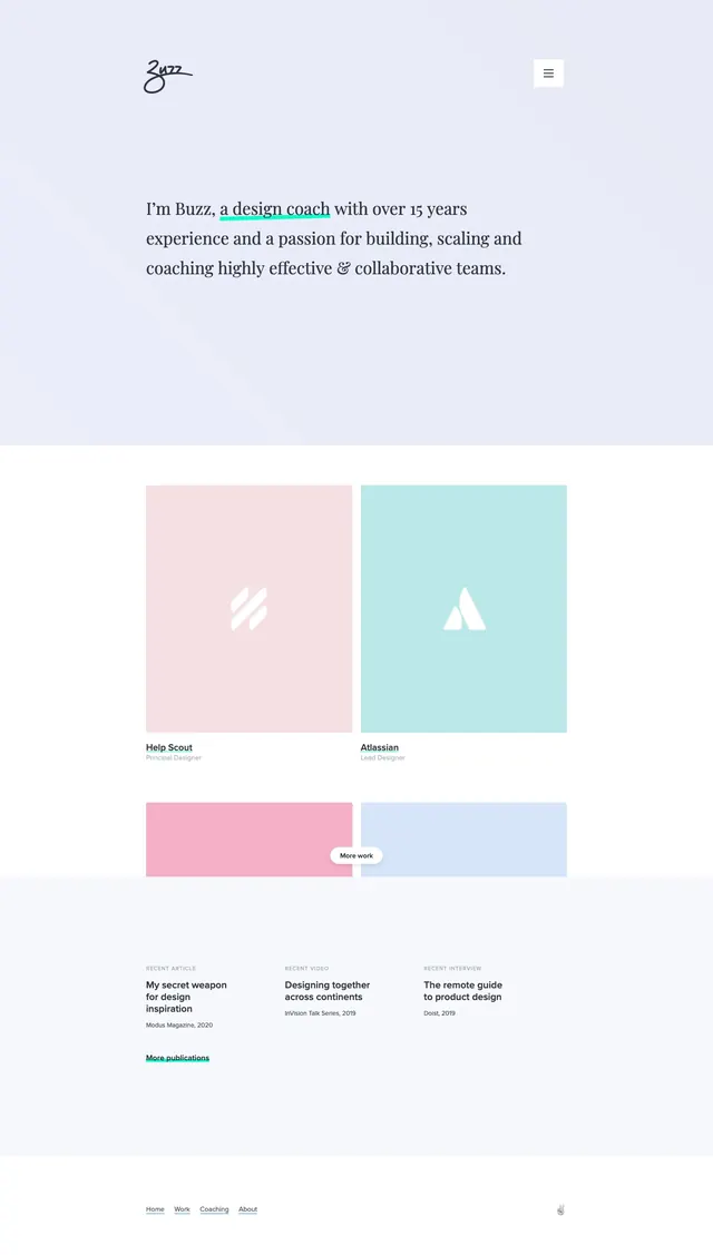
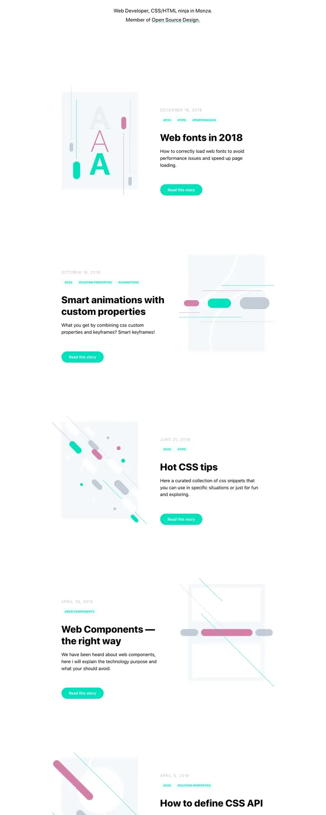
A clean personal portfolio homepage with a centered hero and a vertical list of blog posts using airy whitespace and soft accent colors.
Summary
A clean personal portfolio homepage with a centered hero and a vertical list of blog posts using airy whitespace and soft accent colors.
Visual description
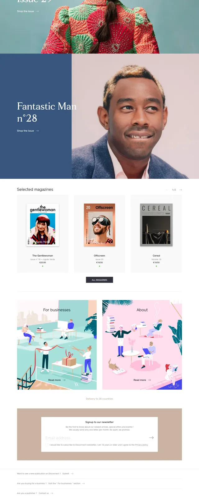
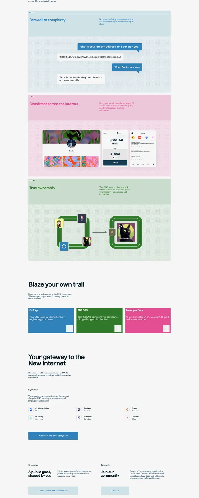
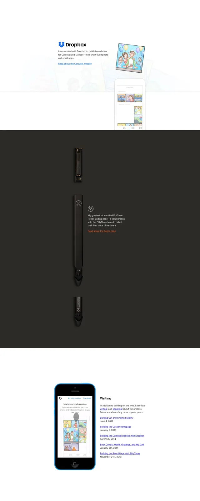
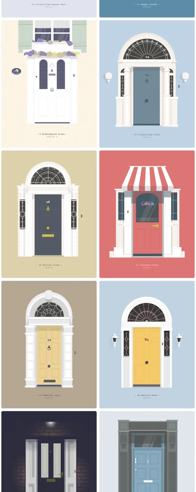
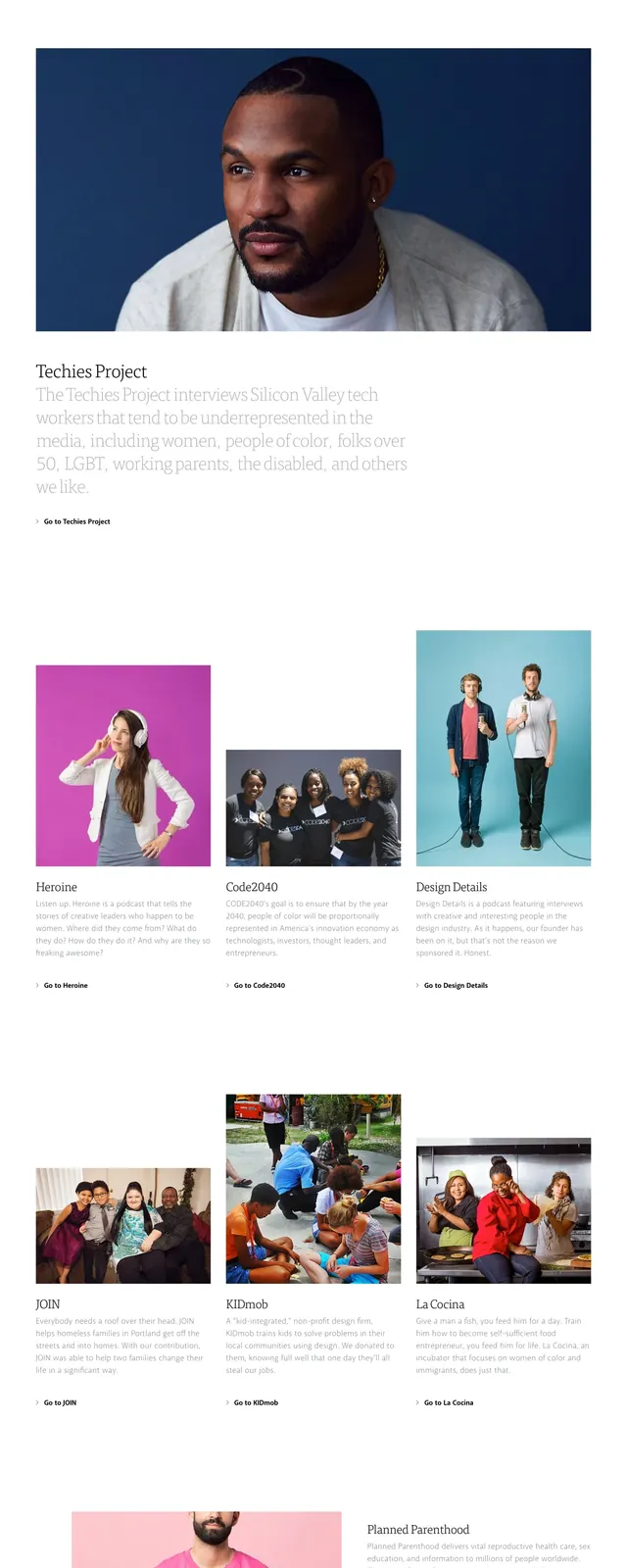
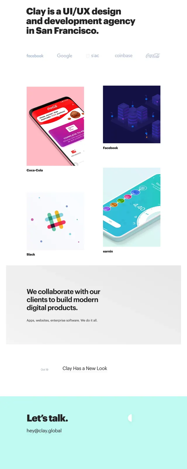
The page opens with a sparse top navigation and a centered intro featuring a large bold name, short role description, and subtle link text. Below, the layout alternates between blog post cards with small pastel illustrations and compact text blocks, creating a rhythmic editorial flow. The overall page uses generous whitespace, thin dividers, and soft teal, pink, and gray accents on a white background. Small social icons and a light footer sit at the bottom with the same restrained styling.
Key takeaway
This design shows how to make a personal site feel polished without visual clutter: strong typography, lots of breathing room, and restrained accent color. The blog feed is the main reusable pattern, mixing image-led and text-led entries in a clean editorial system.
Reuse notes
Reuse the centered hero for portfolio or author pages where the identity needs to be immediate and minimal. The alternating blog card layout works well for content-heavy landing pages that still need a refined, lightweight feel.