Preview image. Unlock full-res
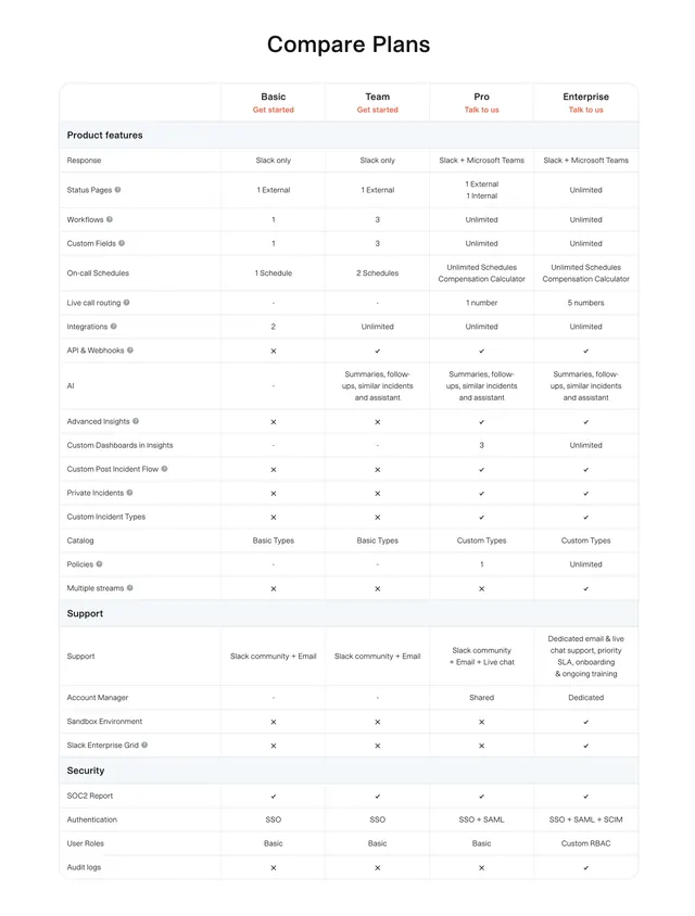
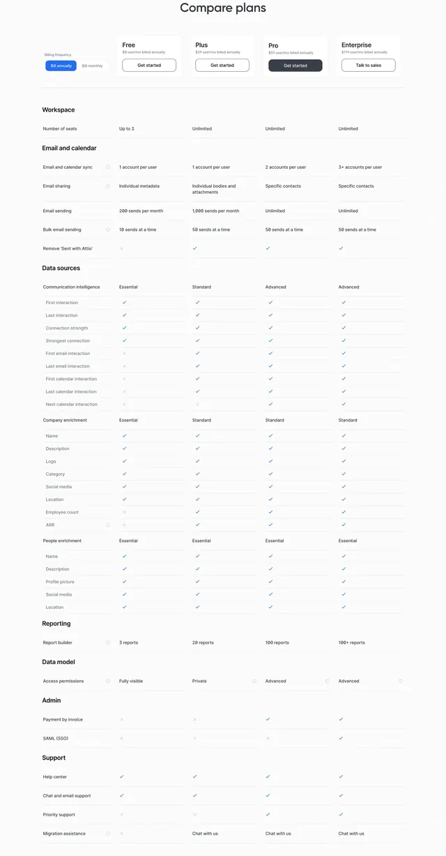
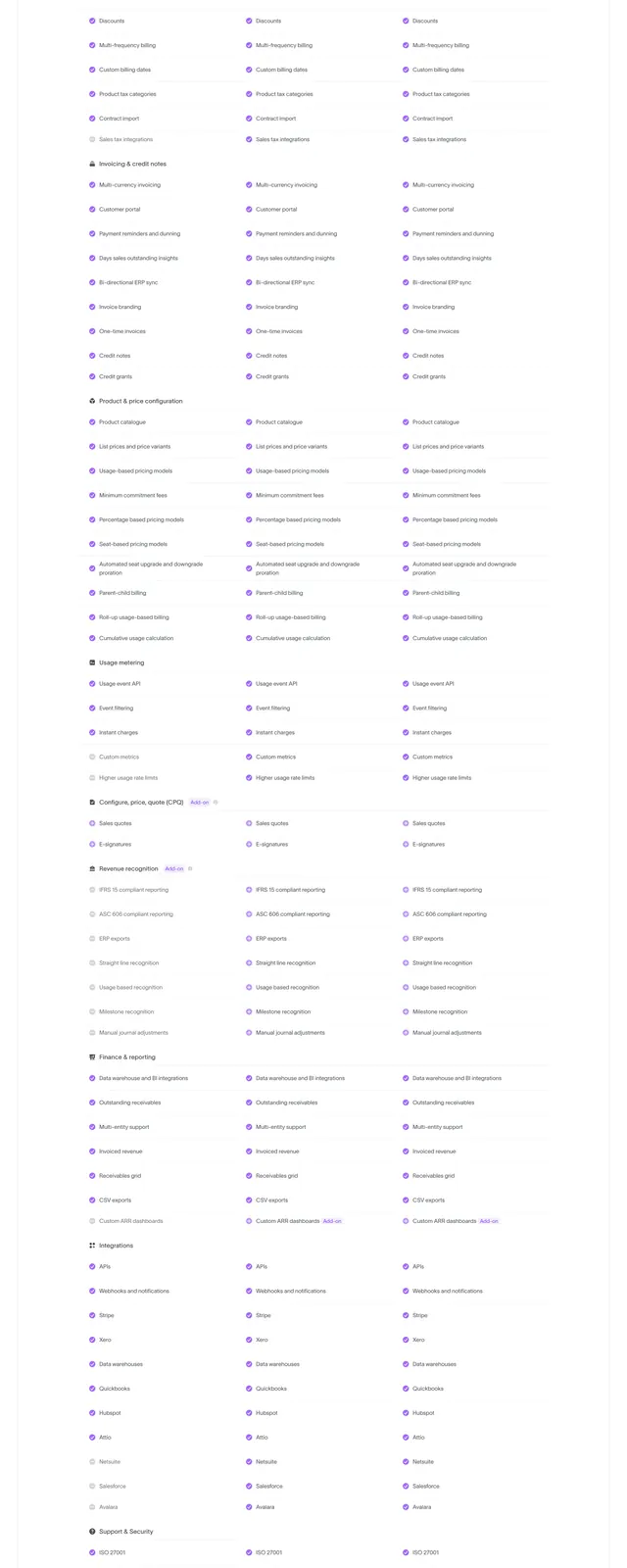
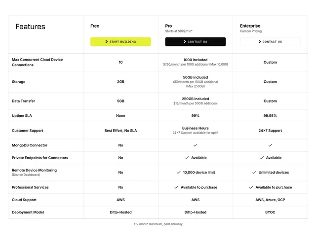
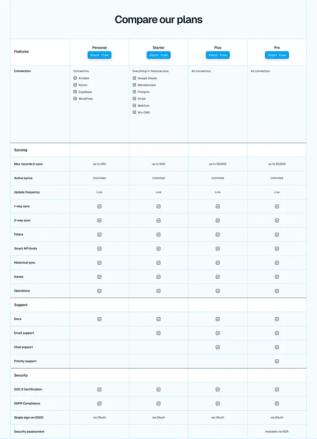
Light four-column feature comparison table grouping rows into Product features, Support, and Security with shaded section headers.
Summary
A clean, light feature-comparison table laying four plan tiers (Basic, Team, Pro, Enterprise) side by side, with the row list segmented into labeled groups so a long matrix stays scannable.
Visual description
A centered "Compare Plans" headline in bold black sits above a bordered table. The header row names four tiers, each with a small orange call-to-action label ("Get started" or "Talk to us"). Rows are divided into shaded full-width group bands ("Product features", "Support", "Security") that break up the long list. Cells hold short text values, checkmarks for included items, and a cross or dash for excluded ones. Several row labels carry small info tooltip icons. Everything is near-monochrome on white, with orange used only for the per-column CTAs.
Key takeaway
The shaded full-width group-header bands that chunk a 30-plus-row comparison into digestible sections without adding clutter. Pairing each column header with its own small CTA so the buy action travels with the plan name.
Reuse notes
Strong default for a SaaS pricing or plan-comparison page with many features across tiers. Best when you have genuinely long feature lists that need grouping; for three or fewer short tiers a card layout reads better. The restrained single accent color keeps a dense table calm.
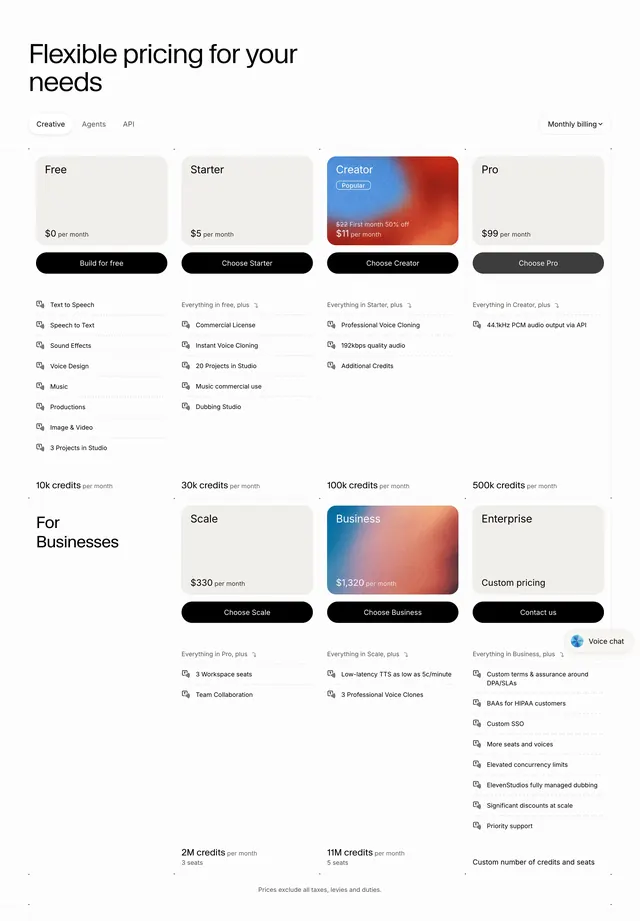
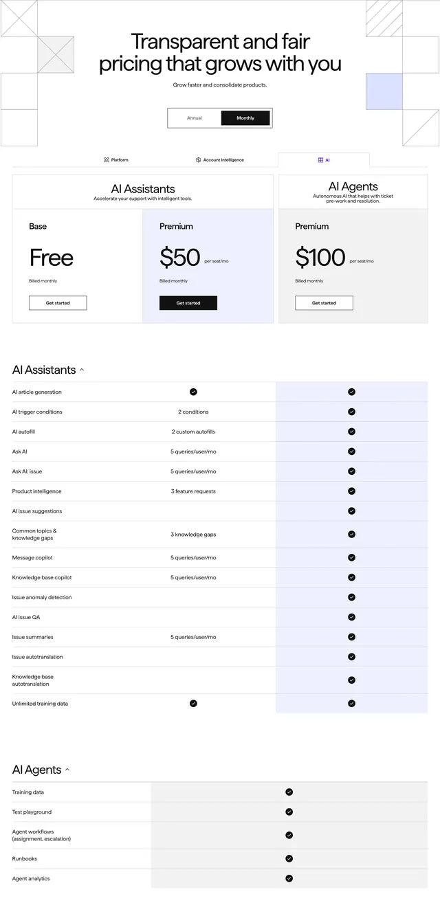
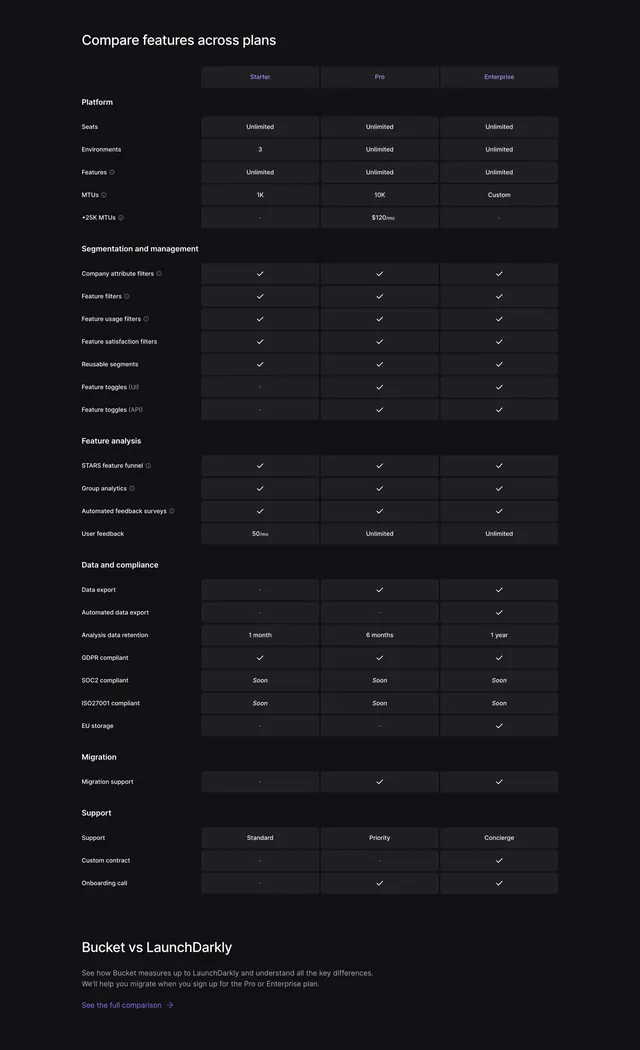
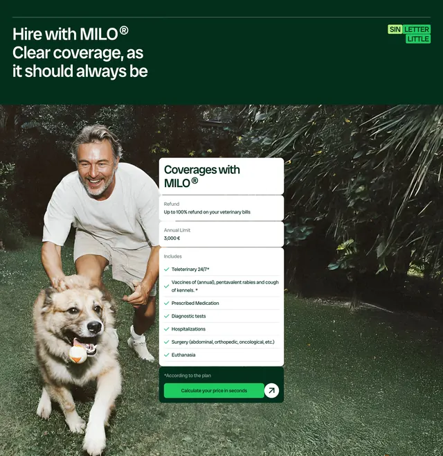
More pricing table sections
See all

More like this

Keep what you find
A free account saves references to boards and can send you a weekly email of picks based on what you save.
To see every result, go Pro.