Preview image. Unlock full-res
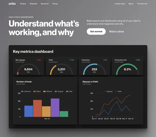
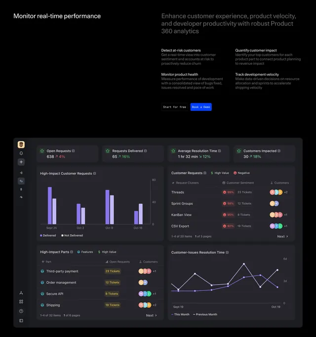
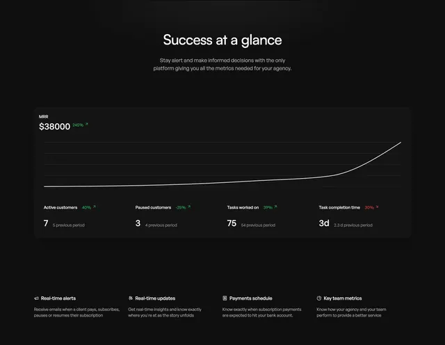
A value-prop section that argues with a product dashboard: a dark MRR card with a trend line and KPI row, backed by a four-item feature strip.
Summary
A value proposition delivered through a product dashboard: a centered pitch over a dark metrics card (MRR, trend line, four KPIs), with a four-item feature strip restating the benefits underneath.
Visual description
Black background, centered white heading ("Success at a glance") and a two-line subhead. A large dark rounded dashboard card dominates: top-left an MRR figure with a green positive-change pill, a clean upward line chart sweeping across the card, and a row of four KPIs below (active customers, paused customers, tasks worked on, task completion time), each with a value, a colored delta, and a previous-period note. Beneath the card, a four-column strip pairs small icons with labels and captions (real-time alerts, real-time updates, payments schedule, key team metrics).
Key takeaway
Letting a realistic dashboard be the value proposition: the metrics card shows the product and the payoff at once, then the feature strip translates each metric into a plain-language benefit. The single green trend line gives an optimistic read without color clutter.
Reuse notes
Good for analytics, agency, or ops tools where the dashboard is the product. The numbers must feel plausible and on-brand; oversized fake metrics undercut trust. Dark mode makes the green deltas pop, but verify the muted KPI captions stay legible.