Preview image. Unlock full-res
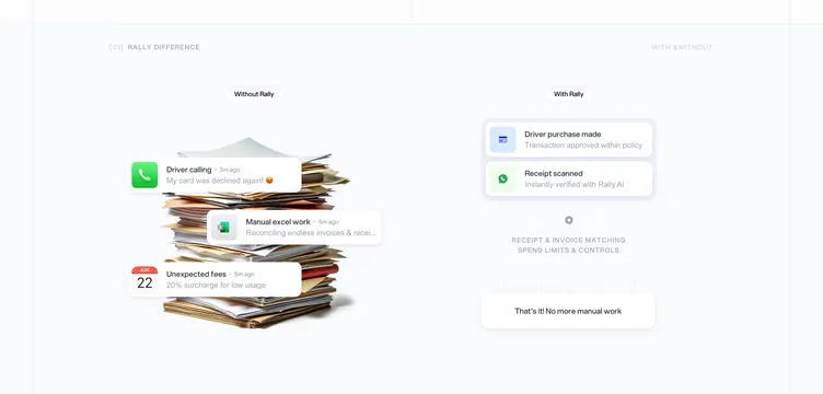
A two-column "with and without" story that contrasts a messy pile of receipts and panicked alerts against a few calm, resolved notification cards.
Summary
A before-and-after comparison that sells the product emotionally: the "Without" side is a chaotic stack of paper receipts and anxious push notifications, while the "With" side is two tidy, resolved notification cards and a "no more manual work" close.
Visual description
Thin dark bands top and bottom frame a light center. A small "[01] Rally difference" label sits top-left, "With & Without" top-right. The left column ("Without Rally") layers floating notification cards over a photographic pile of crumpled receipts: a red phone alert ("My card was declined again", with an emoji), a green spreadsheet alert ("Manual excel work"), and a calendar alert ("Unexpected fees, 20% surcharge"). The right column ("With Rally") shows two clean cards ("Driver purchase made", "Receipt scanned") above faint feature labels and a closing card: "That's it! No more manual work."
Key takeaway
Using real-feeling product notifications as the storytelling unit, and a literal paper-pile photo to make "the old way" feel physically stressful. The emotional contrast (panic versus calm) does the persuading before any feature is named.
Reuse notes
Great for products replacing a manual, anxiety-laden workflow. Needs convincing notification mockups and one tactile "mess" visual to anchor the left side. Keep the "after" side sparse so calm reads as the payoff. The emoji keeps it human but skews casual, so judge against brand tone.
More comparison sections
See all











More like this
Keep what you find
A free account saves references to boards and can send you a weekly email of picks based on what you save.
To see every result, go Pro.