Preview image. Unlock full-res
Midnight Command Center
Color palette
Primary action buttons, accented text within headlines to denote emphasis, interactive elements
Orange outline accent for tags, dividers, and focused UI edges. Do not promote it to the primary CTA color
Decorative icons, badge text and borders, sub-navigation highlights
Subtler violet accents, outlines for supporting elements
Primary page background, base surface
Card backgrounds, elevated section backgrounds
Muted text, hairline borders, placeholder text for dark surfaces
Secondary body text, supporting details
Tertiary text, subtle dividers, inactive states
Primary headings, prominent body text, main navigational elements
Dark borders and separators for elevated surfaces and inverted UI. Do not promote it to the primary CTA color
Typography
- Weights
- 400, 500, 600, 700
- Sizes
- 12px, 13px, 14px, 15px, 16px, 17px, 18px, 19px, 20px, 26px, 29px
- Line height
- 1.5, 1.6, 1.7, 1.75, 1.8, 1.85
- Letter spacing
- 0.0300em
- Fallback
- system-ui, sans-serif
Standard body text, descriptive labels, secondary navigation, and general UI elements. Its slightly wider tracking ensures legibility at smaller sizes on dark backgrounds.
- Weights
- 500, 600, 700, 800
- Sizes
- 12px, 13px, 14px, 16px, 17px, 20px, 22px, 44px, 48px, 60px, 64px, 80px
- Line height
- 1, 1.06, 1.1, 1.25, 1.3, 1.6
- Letter spacing
- -0.0400em, -0.0300em, -0.0200em, -0.0100em, 0.0200em, 0.0600em, 0.0800em, 0.1000em
- Fallback
- Space Mono, monospace
Primary headlines, emphatic call-outs, and impactful statements. Its geometric structure and tight tracking (especially at large sizes) give it a modern, almost technical edge, creating a sense of authority and precision.
Spacing & shape
Components
Filled with Flare Orange (#f7931a) background and Black Ink (#000000) text. Padding is 16px vertical, 36px horizontal. Border radius is 10px. Uses Space Grotesk 16px, weight 500.
Ghost button with an Orbital Violet (#8b5fc8) text color. Padding is 10px vertical, 16px horizontal. Border radius is 12px. Uses Inter 16px, weight 500.
Background is Slate Card (#12151c). Padding is 48px vertical, 36px horizontal. Border radius is 16px on the top-left, with other corners sharp (or right corners sharp on some variants). No box shadow.
Background is Slate Card (#12151c). Padding is 48px vertical, 36px horizontal. All corners are sharp (0px radius). No box shadow.
Background is rgba(107, 63, 160, 0.15), text color is Orbital Violet (#8b5fc8). Padding is 8px vertical, 12px left, 16px right. Border radius is 100px (pill shape).
Transparent background, text color is Pure White (#ffffff). Padding is 16px vertical, 36px horizontal. Border radius is 12px. Uses Space Grotesk 16px, weight 500.
Guidelines
- Always use Deep Midnight (#0a0c10) as the base page background for consistency in dark mode.
- Emphasize key words in headlines with Flare Orange (#f7931a) to draw immediate attention and convey importance.
- Apply the 100px radius for all badges to create clear, pill-shaped elements.
- Use Space Grotesk for all headlines and subheadings to maintain a sharp, impactful typographic tone, leveraging its tight letter spacing at larger sizes.
- Ensure generous vertical spacing between sections, using the sectionGap of '48px' to create breathing room.
- Implement asymmetric radii of 16px (e.g., 16px 0 0 16px or 0 16px 16px 0) on cards to add a distinctive, modern edge.
- Use Orbital Violet (#8b5fc8) sparingly for decorative UI elements, icons, and subtle textual accents, ensuring it supports and doesn't compete with Flare Orange.
- Never introduce additional primary accent colors; Flare Orange (#f7931a) and Orbital Violet (#8b5fc8) are the only brand accents permitted.
- Avoid heavy box shadows; elevation should be primarily communicated through subtle borders and background variations like Slate Card (#12151c).
- Do not use generic system fonts; always prioritize Inter and Space Grotesk to maintain brand identity.
- Do not excessively bold body text; use Inter at weights 400 or 500, reserving heavier weights of Space Grotesk for headlines only.
- Avoid tight element spacing; maintain an adequate elementGap of '24px' to prevent visual clutter.
- Do not place text directly on complex photographic backgrounds; use either solid color overlays or clearly defined text blocks to ensure legibility.
- Do not use bright or light backgrounds for main content sections; strictly adhere to the established dark theme.
About this system
ShowHide
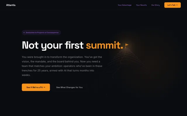
Atlantis uses a high-contrast dark theme, creating a serious and impactful atmosphere. The design is dominated by deep space blacks and stark whites, with a single luminous orange accent for calls to action and critical highlights, balanced by a subtle, resonant purple for supporting elements. Typography is bold and concise, emphasizing clear messaging over visual noise. Surfaces are mostly flat, with minimal elevation implied through light borders rather than heavy shadows, and cards often feature asymmetric corner radii.
The page primarily follows a max-width contained model, typically centered. The hero section is full-bleed with Deep Midnight background, featuring a centered headline with accented text and calls to action. Subsequent sections alternate between full-width black bands and contained content blocks, creating a consistent vertical rhythm. Content often arranges as stacked centered elements or two-column layouts, with text-heavy blocks on the left and supporting visuals (or sometimes text) on the right. There's a notable absence of dense card grids, favoring individual, impactful content blocks. The site navigation is a sticky top bar, minimally styled, offering key links and a prominent primary action button.
The site uses a combination of abstract, wireframe-like geometric graphics and occasional illustrative elements to convey complex concepts. Photography is largely absent from UI, replaced by visual metaphors of progression and structure. Icons are simple, outlined, and monochromatic, with a very light stroke weight, primarily using Pure White or Ghostly Gray, occasionally accented with Orbital Violet. The overall density of imagery is low, allowing text and typography to dominate, supporting the precise, authoritative tone.
Reminiscent of Linear, Vercel, PluralSight (dark mode).
# Atlantis Technology — Style Reference
> Midnight Command Center

**Theme:** dark

**Site:** https://www.atlantistech.com

Atlantis uses a high-contrast dark theme, creating a serious and impactful atmosphere. The design is dominated by deep space blacks and stark whites, with a single luminous orange accent for calls to action and critical highlights, balanced by a subtle, resonant purple for supporting elements. Typography is bold and concise, emphasizing clear messaging over visual noise. Surfaces are mostly flat, with minimal elevation implied through light borders rather than heavy shadows, and cards often feature asymmetric corner radii.

## Tokens — Colors

| Name | Value | Token | Role |
|------|------|------|------|
| Flare Orange | `#f7931a` | `--color-flare-orange` | Primary action buttons, accented text within headlines to denote emphasis, interactive elements |
| Amber Glow | `#ffad42` | `--color-amber-glow` | Orange outline accent for tags, dividers, and focused UI edges. Do not promote it to the primary CTA color |
| Orbital Violet | `#8b5fc8` | `--color-orbital-violet` | Decorative icons, badge text and borders, sub-navigation highlights |
| Deep Current Violet | `#6b3fa0` | `--color-deep-current-violet` | Subtler violet accents, outlines for supporting elements |
| Deep Midnight | `#0a0c10` | `--color-deep-midnight` | Primary page background, base surface |
| Slate Card | `#12151c` | `--color-slate-card` | Card backgrounds, elevated section backgrounds |
| Ghostly Gray | `#b5b6b7` | `--color-ghostly-gray` | Muted text, hairline borders, placeholder text for dark surfaces |
| Fog Whisper | `#858688` | `--color-fog-whisper` | Secondary body text, supporting details |
| Shadow Touch | `#545558` | `--color-shadow-touch` | Tertiary text, subtle dividers, inactive states |
| Pure White | `#ffffff` | `--color-pure-white` | Primary headings, prominent body text, main navigational elements |
| Black Ink | `#000000` | `--color-black-ink` | Dark borders and separators for elevated surfaces and inverted UI. Do not promote it to the primary CTA color |

## Tokens — Typography

### Inter
- **Substitute:** system-ui, sans-serif
- **Weights:** 400, 500, 600, 700
- **Sizes:** 12px, 13px, 14px, 15px, 16px, 17px, 18px, 19px, 20px, 26px, 29px
- **Line height:** 1.5, 1.6, 1.7, 1.75, 1.8, 1.85
- **Letter spacing:** 0.0300em
- **Role:** Standard body text, descriptive labels, secondary navigation, and general UI elements. Its slightly wider tracking ensures legibility at smaller sizes on dark backgrounds.

### Space Grotesk
- **Substitute:** Space Mono, monospace
- **Weights:** 500, 600, 700, 800
- **Sizes:** 12px, 13px, 14px, 16px, 17px, 20px, 22px, 44px, 48px, 60px, 64px, 80px
- **Line height:** 1, 1.06, 1.1, 1.25, 1.3, 1.6
- **Letter spacing:** -0.0400em, -0.0300em, -0.0200em, -0.0100em, 0.0200em, 0.0600em, 0.0800em, 0.1000em
- **Role:** Primary headlines, emphatic call-outs, and impactful statements. Its geometric structure and tight tracking (especially at large sizes) give it a modern, almost technical edge, creating a sense of authority and precision.

## Tokens — Type Scale

Perfect Fourth (1.333) from 16px base.

| Role | Size | Line height | Letter spacing |
|------|------|------|------|
| caption | 12px | 1.5 | 0.36px |
| body-sm | 14px | 1.7 | 0.42px |
| body | 16px | 1.8 | 0.48px |
| subheading | 20px | 1.6 | -0.4px |
| heading-sm | 26px | 1.3 | -0.52px |
| heading | 44px | 1.1 | -0.88px |
| heading-lg | 60px | 1.06 | -1.8px |
| display | 80px | 1 | -3.2px |

## Tokens — Spacing

- **Section gap:** 48px
- **Card padding:** 48px
- **Element gap:** 24px

## Tokens — Radius

- **Buttons:** 10px
- **Cards:** 16px
- **badges:** 100px
- **navigation:** 12px

## Layout

The page primarily follows a max-width contained model, typically centered. The hero section is full-bleed with Deep Midnight background, featuring a centered headline with accented text and calls to action. Subsequent sections alternate between full-width black bands and contained content blocks, creating a consistent vertical rhythm. Content often arranges as stacked centered elements or two-column layouts, with text-heavy blocks on the left and supporting visuals (or sometimes text) on the right. There's a notable absence of dense card grids, favoring individual, impactful content blocks. The site navigation is a sticky top bar, minimally styled, offering key links and a prominent primary action button.

## Imagery

The site uses a combination of abstract, wireframe-like geometric graphics and occasional illustrative elements to convey complex concepts. Photography is largely absent from UI, replaced by visual metaphors of progression and structure. Icons are simple, outlined, and monochromatic, with a very light stroke weight, primarily using Pure White or Ghostly Gray, occasionally accented with Orbital Violet. The overall density of imagery is low, allowing text and typography to dominate, supporting the precise, authoritative tone.

## Components

### Primary Action Button
*Call-to-action button for initiating key user actions.*

Filled with Flare Orange (#f7931a) background and Black Ink (#000000) text. Padding is 16px vertical, 36px horizontal. Border radius is 10px. Uses Space Grotesk 16px, weight 500.

### Navigation Link Button
*Primary navigation element in the header.*

Ghost button with an Orbital Violet (#8b5fc8) text color. Padding is 10px vertical, 16px horizontal. Border radius is 12px. Uses Inter 16px, weight 500.

### Feature Card (Asymmetric)
*Container for showcasing key features or content blocks.*

Background is Slate Card (#12151c). Padding is 48px vertical, 36px horizontal. Border radius is 16px on the top-left, with other corners sharp (or right corners sharp on some variants). No box shadow.

### Content Card (Standard)
*Generic card for content sections, no distinct corner treatment.*

Background is Slate Card (#12151c). Padding is 48px vertical, 36px horizontal. All corners are sharp (0px radius). No box shadow.

### Accent Badge
*Small informational tag or category label.*

Background is rgba(107, 63, 160, 0.15), text color is Orbital Violet (#8b5fc8). Padding is 8px vertical, 12px left, 16px right. Border radius is 100px (pill shape).

### Ghost Link Button
*Secondary action or informational link, often accompanying a primary button.*

Transparent background, text color is Pure White (#ffffff). Padding is 16px vertical, 36px horizontal. Border radius is 12px. Uses Space Grotesk 16px, weight 500.

## Guidelines

### Do

- Always use Deep Midnight (#0a0c10) as the base page background for consistency in dark mode.
- Emphasize key words in headlines with Flare Orange (#f7931a) to draw immediate attention and convey importance.
- Apply the 100px radius for all badges to create clear, pill-shaped elements.
- Use Space Grotesk for all headlines and subheadings to maintain a sharp, impactful typographic tone, leveraging its tight letter spacing at larger sizes.
- Ensure generous vertical spacing between sections, using the sectionGap of '48px' to create breathing room.
- Implement asymmetric radii of 16px (e.g., 16px 0 0 16px or 0 16px 16px 0) on cards to add a distinctive, modern edge.
- Use Orbital Violet (#8b5fc8) sparingly for decorative UI elements, icons, and subtle textual accents, ensuring it supports and doesn't compete with Flare Orange.

### Don't

- Never introduce additional primary accent colors; Flare Orange (#f7931a) and Orbital Violet (#8b5fc8) are the only brand accents permitted.
- Avoid heavy box shadows; elevation should be primarily communicated through subtle borders and background variations like Slate Card (#12151c).
- Do not use generic system fonts; always prioritize Inter and Space Grotesk to maintain brand identity.
- Do not excessively bold body text; use Inter at weights 400 or 500, reserving heavier weights of Space Grotesk for headlines only.
- Avoid tight element spacing; maintain an adequate elementGap of '24px' to prevent visual clutter.
- Do not place text directly on complex photographic backgrounds; use either solid color overlays or clearly defined text blocks to ensure legibility.
- Do not use bright or light backgrounds for main content sections; strictly adhere to the established dark theme.

## Agent Prompt Guide

Quick Color Reference:
text: #ffffff
background: #0a0c10
border: #b5b6b7
accent: #8b5fc8
primary action: #f7931a (filled action)

Example Component Prompts:
1. Create a Primary Action Button: #f7931a background, #000000 text, 9999px radius, compact pill padding. Use this filled treatment for the main CTA.
2. Create a Feature Card: Slate Card (#12151c) background, 48px vertical and 36px horizontal padding. Set border-radius to 16px 0 0 16px. Inside, a heading 'You're building something that matters.' in Pure White (#ffffff), Space Grotesk 44px weight 700. Include a small Accent Badge 'Dedicated to Projects of Consequence'.
More like this








Keep what you find
A free account saves references to boards and can send you a weekly email of picks based on what you save.
To see every result, go Pro.